How to insert this "burger" menu into my already made retractable menu

Asked

Viewed 1,038 times

3

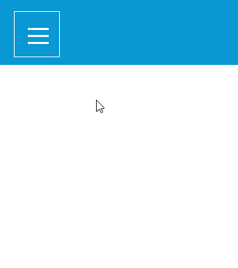
I’m having trouble inserting an animated hamburger side menu on my already ready site. I have the base of a site with a fixed header and a retractable menu that opens laterally, and the icon to open it is a png img, I would like to exchange for this animated menu that I made separate with the help of a tutorial, already tried in several ways and can not

Below the CSS of the animated menu

*,
*:before,
*:after {
    margin: 0;
    padding: 0;
 ;
}

body {
    background: #81ecec;
}

.mburg {

    border-radius: 50%;
    width: 60px;
    height: 60px;
    position: fixed;
    top: 25px;
    left: 25px;
}

.hamburguer {
    position: relative;
    display: block;
    background: #fff;
    width: 30px;
    height: 3px;
    top: 29px;
    left: 15px;
    transition: .5s ease-in-out;
}

.hamburguer:before,
.hamburguer:after {
    background: #fff;
    content: '';
    display: block;
    width: 100%;
    height: 100%;
    position: absolute;
    transition: .5s ease-in-out;
}

.hamburguer:before {
    top: -10px;
}

.hamburguer:after {
    bottom: -10px;
}

input {
    display: none;
}

input:checked ~ label .hamburguer {
    transform: rotate(45deg);
}

input:checked ~ label .hamburguer:before {
    transform: rotate(90deg);
    top: 0;
}

input:checked ~ label .hamburguer:after {
    transform: rotate(90deg);
    bottom: 0;
}

Below the HTML of the animated menu

<label for="menu-hamburguer">
    <div class="mburg">
        <span class="hamburguer"></span>
    </div>
</label>

Below the CSS of the base site I wish to put the animated menu

*{
    margin: 0;
    padding: 0;
}
/* cabeçalho fixo */
.menu{
    background: #0998d3; 
    width: 100%;
    height: 37px;
    padding: 30px 0;
    position: fixed;
    top: 0;
    left: 0;
}   
#logo{
    position:absolute;
    top:50%;
    left:50%;
    transform:translate(-50%,-50%);
    -ms-transform:translate(-50%,-50%)
}
/* menu retrail lateral */
    body{
        background-color: #ffffff;
        font-family: 'Just Another Hand', cursive;
        overflow-X: hidden;
    }

    #check{
        display: none;
    }

    #icone{
        cursor: pointer;
        padding: 32px;
        position: fixed;
        z-index: 1;
    }

    .barra{
        background-color: #0998d3;
        height: 100%;
        width: 250px;
        position: fixed;
        transition: all .2s linear;
        left: -250px;

    }

    nav{
        width: 100%;
        position: absolute;
        top: 80px;
    }


    nav a{
        text-decoration: none;

    }

    .Link {
        background-color: #0aa9eb;
        padding: 20px;
        font-family: 'Gotham';
        font-size: 12pt;
        transition: all .3s linear;
        color: #ffffff;
        border-bottom: 1px solid #0998d3;
        opacity: 0;


    }

    .Link:hover{
        background-color: #076992;
        color: #ffffff;

    }

    #check:checked ~ .barra{
        transform: translateX(250px);
    }

    #check:checked ~ .barra nav a .Link{
        opacity: 1;
        transition-delay: .3s;
    }

    #banner1{
        padding-top: 97px;
        width: 100%;

    }

Below the HTML of the site I want to insert the animated menu

<header>


                <!-- menu retrátil lateral esquerda -->

        <input type="checkbox" id="check">
                    <label id="icone" for="check"><img src="icone.png"></label>
                        <div class="barra">
                            <nav>
                                <a href="#"><div class="Link">Home</div></a>
                                <a href="#"><div class="Link">Notícias</div></a>
                                <a href="#"><div class="Link">Informativos</div></a>
                                <a href="#"><div class="Link">Curiosidades</div></a>
                                <a href="#"><div class="Link">Sobre</div></a>
                            </nav>
                        </div>
        <!-- barra fixa azul horizontal -->

        <nav class="menu"> 
            <a href="index.html">
                <img src="logo.png" id="logo">
            </a>
        </nav>
    </header>

1 answer

2


Guy just include the code of hamburger-menu at the end and adjust the position of the label, I put a white border to facilitate viewing.

inserir a descrição da imagem aqui

Follow the image code above

html,
body {
  width: 100%;
  height: 100%;
  margin: 0;
  padding: 0;
}

* {
  margin: 0;
  padding: 0;
}

/* cabeçalho fixo */
.menu {
  background: #0998d3;
  width: 100%;
  height: 37px;
  padding: 30px 0;
  position: fixed;
  top: 0;
  left: 0;
}

#logo {
  position: absolute;
  top: 50%;
  left: 50%;
  transform: translate(-50%, -50%);
  -ms-transform: translate(-50%, -50%)
}

/* menu retrail lateral */
body {
  background-color: #ffffff;
  font-family: 'Just Another Hand', cursive;
  overflow-X: hidden;
}

#check {
  display: none;
}

#icone {
  cursor: pointer;
  padding: 32px;
  position: fixed;
  z-index: 1;

  border: 1px #fff solid;
  top: 20px;
  left: 20px;
}

.barra {
  background-color: #0998d3;
  height: 100%;
  width: 250px;
  position: fixed;
  transition: all .2s linear;
  left: -250px;

}

nav {
  width: 100%;
  position: absolute;
  top: 80px;
}


nav a {
  text-decoration: none;

}

.Link {
  background-color: #0aa9eb;
  padding: 20px;
  font-family: 'Gotham';
  font-size: 12pt;
  transition: all .3s linear;
  color: #ffffff;
  border-bottom: 1px solid #0998d3;
  opacity: 0;


}

.Link:hover {
  background-color: #076992;
  color: #ffffff;

}

#check:checked~.barra {
  transform: translateX(250px);
}

#check:checked~.barra nav a .Link {
  opacity: 1;
  transition-delay: .3s;
}

#banner1 {
  padding-top: 97px;
  width: 100%;

}


.mburg {

  border-radius: 50%;
  width: 60px;
  height: 60px;
  position: fixed;
  top: 25px;
  left: 25px;
}

.hamburguer {
  position: relative;
  display: block;
  background: #fff;
  width: 30px;
  height: 3px;
  top: 29px;
  left: 15px;
  transition: .5s ease-in-out;
}

.hamburguer:before,
.hamburguer:after {
  background: #fff;
  content: '';
  display: block;
  width: 100%;
  height: 100%;
  position: absolute;
  transition: .5s ease-in-out;
}

.hamburguer:before {
  top: -10px;
}

.hamburguer:after {
  bottom: -10px;
}

input {
  display: none;
}

input:checked~label .hamburguer {
  transform: rotate(45deg);
}

input:checked~label .hamburguer:before {
  transform: rotate(90deg);
  top: 0;
}

input:checked~label .hamburguer:after {
  transform: rotate(90deg);
  bottom: 0;
}
<header>
  <!-- menu retrátil lateral esquerda -->
  <input type="checkbox" id="check">
  <label id="icone" for="check"></label>
  <div class="barra">
    <nav>
      <a href="#">
        <div class="Link">Home</div>
      </a>
      <a href="#">
        <div class="Link">Notícias</div>
      </a>
      <a href="#">
        <div class="Link">Informativos</div>
      </a>
      <a href="#">
        <div class="Link">Curiosidades</div>
      </a>
      <a href="#">
        <div class="Link">Sobre</div>
      </a>
    </nav>
  </div>
  <!-- barra fixa azul horizontal -->

  <nav class="menu">
    <a href="index.html">
      <img src="logo.png" id="logo">
    </a>
  </nav>

  <label for="menu-hamburguer">
    <div class="mburg">
      <span class="hamburguer"></span>
    </div>
  </label>
</header>

  • Thank you very much man, it worked, it helped a lot. I’m beginner and I’m still understanding, vlw same

  • 1

    @Lucasrm without problems my dear, continue studying abs

Browser other questions tagged

You are not signed in. Login or sign up in order to post.