You can use a helper to help you scale a fixed size according to the screen resolution on which you are running your application.
In Flutter we can identify the size of the current screen through the Mediaquery as:
MediaQuery.of(context).size.width // imprime o tamanho da largura da tela
MediaQuery.of(context).size.height // imprime o tamanho da altura da tela
Based on this size we can make some calculation similar to:
Standard size = 40
If the width of the screen is greater than 600, is a tablet! -> 40 * 2 = 60
If the width of the screen is greater than 320, is a small screen! -> 40 * 0.8 = 32
600 because the tablets start from this resolution, and 320 because the smaller screens (iphone 4s and 5s) have this size of width.
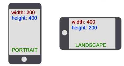
It turns out that depending on the way we’re using the app (PORTRAIT/LANDSCAPE) the width and height are reversed.
So to avoid this problem, we can always take the smallest side for validation, with the:
MediaQuery.of(context).size.shortestSide
Based on this we can create this helper:
class SizeConfig {

  final MediaQueryData mediaQueryData;

  SizeConfig({this.mediaQueryData});

  static SizeConfig of(BuildContext context) =>
      SizeConfig(mediaQueryData: MediaQuery.of(context));

  double dynamicScaleSize({double size, double scaleFactorTablet, double scaleFactorMini}) {
    if(isTablet()) {
      final scaleFactor = scaleFactorTablet ?? 2;
      return size * scaleFactor;
    }

    if(isMini()) {
      final scaleFactor = scaleFactorMini ?? 0.8;
      return size * scaleFactor;
    }

    return size;
  }

  /// Defines device type based on logical device pixels. Bigger than 600 means it is a tablet
  bool isTablet() {
    final shortestSide = mediaQueryData.size.shortestSide;
    return shortestSide > 600;
  }

  /// Defines device type based on logical device pixels. Less or equal than 320 means it is a mini device
  bool isMini() {
    final shortestSide = mediaQueryData.size.shortestSide;
    return shortestSide <= 320;
  }
}
The SizeConfig above keeps by default a multiplication factor of 2 for tablets and 0.8 for mini, values based on my own experience of use. It is also possible to pass a custom value depending on usage.
If there is a need to include other screen sizes this same class can be changed, but so far I have not found this need.
You can initialize it with the constructor, or use it directly with the of():
final sizeConfig = SizeConfig(mediaQueryData: MediaQuery.of(context));
SizeConfig.of(context);
In practice:
void main() => runApp(MyApp());

class MyApp extends StatelessWidget {
  @override
  Widget build(BuildContext context) {
    return MaterialApp(
      title: 'Flutter Demo',
      home: Stack(
        children: <Widget>[SizeWidget()],
      ),
    );
  }
}

class SizeWidget extends StatelessWidget {
  @override
  Widget build(BuildContext context) {
    final sizeConfig = SizeConfig(mediaQueryData: MediaQuery.of(context));

    return SafeArea(
      child: Scaffold(
      body: Center(
        child: Column(
          crossAxisAlignment: CrossAxisAlignment.center,
          mainAxisAlignment: MainAxisAlignment.spaceEvenly,
          children: <Widget>[
            Container(
              color: Colors.blue,
              width: sizeConfig.dynamicScaleSize(size: 50),
              height: sizeConfig.dynamicScaleSize(size: 50),
            ),
            SizedBox(
              height: sizeConfig.dynamicScaleSize(size: 40, scaleFactorTablet: 3.5),
              width: sizeConfig.dynamicScaleSize(size: 40, scaleFactorTablet: 2),
              child: Container(
                color: Colors.red,
              ),
            ),
            Text(
              'Tamanho do Texto',
              style: TextStyle(fontSize: SizeConfig.of(context).dynamicScaleSize(size: 20, scaleFactorTablet: 2)),
            )
          ],
        ),
      ),
    ));
  }
}
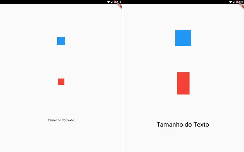
Result on a cell phone 'normal':

On tablet without scale factor and scale factor:
the/