-1
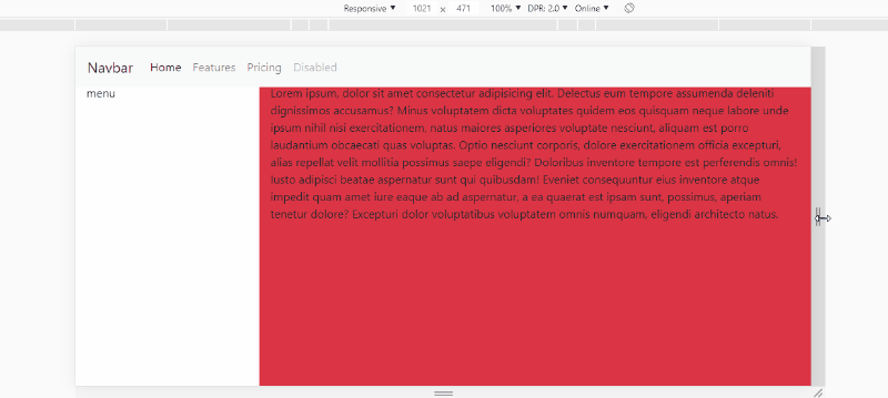
I have a div that is my vertical menu, next to it I want to put a div that fills all the remaining space that will be where will load my content, but what happens is that one div is overwriting the other when I decrease the browser size:
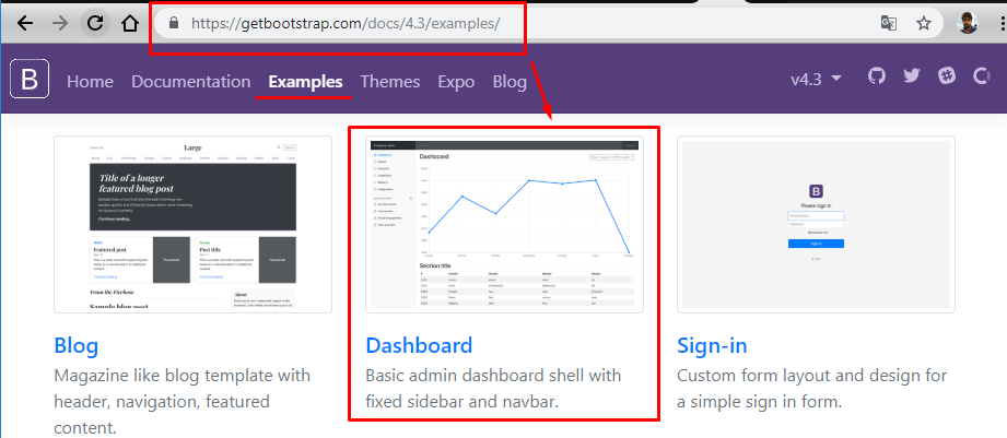
I posted a Jsfiddle with css pro post not getting so long
<div class="row ">
    <div class="col col-sm-2">

      <ul class="side-menu">

      <div class="side-menu-user-infos">
          <div class="side-menu-user-photo">
              <img src="" alt="">
          </div>
          <div *ngIf="(user$ | async) as username; else login">
              <div class="side-menu-user-name">
                  {{ username.username }}
              </div>
          </div>
          <div class="side-menu-user-options">
              <i class="fas fa-user-cog"></i>
              <i class="fas fa-power-off" (click)="logout()"></i>
          </div>

      </div>

      <li>
          <a>
              <span class="fas fa-chalkboard"></span>
              Menu
          </a>
      </li>
      <li>
          <a>
              <span class="fas fa-user-plus"></span>
              Menu
          </a>
      </li>
      <li>
          <a>
              <span class="fas fa-cart-plus"></span>
              Menu
          </a>
      </li>
      <li>
          <a>
              <span class="fas fa-store"></span>
              Menu
          </a>
      </li>
      <li>
          <a>
              <span class="fas fa-file-alt"></span>
              Menu
          </a>
      </li>
      <li>
          <a>
              <span class="fas fa-chart-bar"></span>
              Menu
          </a>
      </li>
      <li>
          <a>
              <span class="fas fa-cog"></span>
              Menu
          </a>
      </li>
   </ul>
</div>

<div class="content">
    <div class="form-group">
          <label for="exampleInputEmail1">Email address</label>
          <input type="email" class="form-control" id="exampleInputEmail1" aria-describedby="emailHelp" placeholder="Enter email">
          <small id="emailHelp" class="form-text text-muted">We'll never share your email with anyone else.</small>
        </div>
        <div class="form-group">
          <label for="exampleInputPassword1">Password</label>
          <input type="password" class="form-control" id="exampleInputPassword1" placeholder="Password">
        </div>
        <div class="form-check">
          <input type="checkbox" class="form-check-input" id="exampleCheck1">
          <label class="form-check-label" for="exampleCheck1">Check me out</label>
        </div>
        <button type="submit" class="btn btn-primary">Submit</button>
</div>


<router-outlet></router-outlet>
My Jsfiddle: https://jsfiddle.net/cxbdpw8r/1/
does so in the
contentputs awidthUntil you think it’s good, over it overlapping the menu leaves responsive, enters this site https://mydevice.io takes the size of your screen and dividescontent / tamanho da telaand so for all Ivs, remembering that erases the value dps of the comma counts two houses and at the end of the result puts the sign%, research onmedia queriesandviewport– goio