Distorted frame in CSS for video overhead

Asked

Viewed 240 times

0

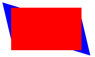
How would I create a stylized frame in css? I want to put a youtube video on my site, but in the background I would like to make a stylized frame as I tried to draw in the image below, with some color.

inserir a descrição da imagem aqui

I wanted to know how I 'draw' it in css, I know how to square, but I can’t make it distort you know?

 <style type="text/css">

div.retangulo {
 line-height:0;
 width:200px;
 height:160px;
 border: 25px solid #00f;
 }


</style>
  • Here are some links to see how it can be done: https://www.maujor.com/tutorial/propriedades-css-para-stilizaca-de-bordas.php, https://www.maujor.com/tutorial/css3-bordas-imagens.php, https://www.maujor.com/tutorial/molduras.php

2 answers

3

Ricardo, you can use the polygons to do this.

<html><head></head>
<body>
    <style>
#imagem {
    background: red;
    width: 240px;
    height: 144px;
    float: left;
    margin-left: 30px;
    margin-top: 18px;
}
#moldura {
    background: blue;
    width: 300px;
    height: 180px;
    -webkit-clip-path: polygon(100% 100%, 90% 30%, 90% 10%, 20% 10%, 0% 0%, 10% 70%, 10% 90%, 80% 90%);
    clip-path: polygon(100% 100%, 90% 30%, 90% 10%, 20% 10%, 0% 0%, 10% 70%, 10% 90%, 80% 90%);
}
    </style>
    <div id="moldura">
        <div id="imagem">

        </div>
    </div>

</body>
</html>

Resultado

This site can help you: https://bennettfeely.com/clippy/

  • that big tool bug

  • Yes, you create a div frame and inside it goes the video, and the frame you model with this method.

  • Great reference Rickpro!

2


Here’s a model using pseudo-elemento in a box that will have the iframe video inside. Cat jump is to use transform: skew(15deg, 5deg); in the pseudo box element this will "bend" the element in the way you want. You can play with these deg to see what pleases you most.

inserir a descrição da imagem aqui

Follow the image code above:

html, body {
  width: 100%;
  height: 100%;
  margin: 0;
  padding: 0;
}
  
.box {
  margin-top: 50px;

  position: relative;
  display: flex;
  justify-content: center;
  align-items: center;
}
.box::after {
  content: "";
  position: absolute;
  top: -20px;
  margin: auto;
  z-index: -1;
  width: 600px;
  height: 355px;
  background-color: red;
  transform: skew(15deg, 5deg);
}

  
<div class="box">
  <iframe width="560" height="315" src="https://www.youtube.com/embed/g76sAYHhEus" frameborder="0" allow="accelerometer; autoplay; encrypted-media; gyroscope; picture-in-picture" allowfullscreen></iframe>
</div>

Browser other questions tagged

You are not signed in. Login or sign up in order to post.