0
all right? Well, I come to you through this topic to ask you the following question:
I have a website from which I am developing the CSS process of it. And of course, to get into it, I decided to use the [@media only screen and] method it works on absolutely almost everything, because, I had a problem that I can’t solve.
That code:
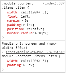
@media only screen and (max-width: 540px){.module .content .items .item {
width: calc(100%/ 3);
padding: 5px;}
His pattern (on Desktop screen):
.module .content .items .item {
width: calc(100%/ 5);
float: left;
margin: 0;
padding: 1px;
position: relative;
border-radius: 10px;}
The difference between the two is padding and width. Because, in one when the screen is Desktop, it shows (100% / 5) ie, 5 items per row, already in mobile, it should show (100% / 3) ie 3 items per row. However, I do not know why water loads it does not activate the mode @media only screen of these classes in mobile.
No need to close the keys,
}, of@media?– Woss