Div exceeding size inside another div

Asked

Viewed 239 times

0

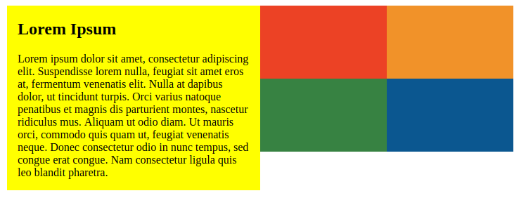
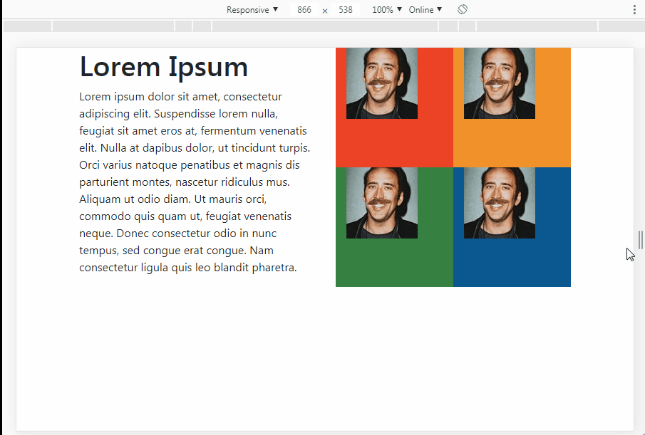
I am working with Bootstrap and I am trying to make a 'table' with two columns. Inside the right column I want to place another 'table' with 4 cells, each with 100x100px images. All right so far, but when resizing the page I would like the height of the right column to follow the left column, which is not happening.

Follow the code so far:

HTML:

  <section>
    <div class="container">
      <div class="row">
        <div class="col-sm left">
          <h1>Lorem Ipsum</h1>

          <p>
            Lorem ipsum dolor sit amet, consectetur adipiscing elit. Suspendisse lorem nulla, feugiat sit amet eros at, fermentum venenatis elit. Nulla at dapibus dolor, ut tincidunt turpis. Orci varius natoque penatibus et magnis dis parturient montes, nascetur ridiculus mus. Aliquam ut odio diam. Ut mauris orci, commodo quis quam ut, feugiat venenatis neque. Donec consectetur odio in nunc tempus, sed congue erat congue. Nam consectetur ligula quis leo blandit pharetra.
          </p>
        </div>
        <div class="col-sm right">
          <div class="row">
            <div class="col-sm red">
              <img src="https://i.imgur.com/OZ3NldE.png" alt="" class="rounded float-left">
            </div>
            <div class="col-sm orange">
              <img src="https://i.imgur.com/OZ3NldE.pngg" alt="" class="rounded float-right">
            </div>
          </div>
          <div class="row">
            <div class="col-sm green">
              <img src="https://i.imgur.com/OZ3NldE.png" alt="" class="rounded float-left">
            </div>
            <div class="col-sm blue">
              <img src="https://i.imgur.com/OZ3NldE.png" alt="" class="rounded float-right">
            </div>
          </div>
        </div>
      </div>

    </div>

  </section>

CSS

div.left {
  background-color: yellow;
}

div.red {
  background-color: #EC4225;
  min-height: 100%;
  height: 100%;
}

div.orange {
  background-color: #F19229;
  min-height: 100%;
  height: 100%;
}

div.green {
  background-color: #378242;
  min-height: 100%;
  height: 100%;
}

div.blue {
  background-color: #0B5790;
  min-height: 100%;
  height: 100%;
}

fiddle

Sample image of what’s happening when I resize: inserir a descrição da imagem aqui

  • Which version of bootstrap?

  • I’m using version 4.1

1 answer

1

You can create a container with class d-flex, similar to what would be a .row, and within the col- divided as desired, each one being 50% of the father’s width and 50% of the height. Since the father’s height is the same as his brother’s, which in this case is div with the text.

inserir a descrição da imagem aqui

Follow the image code above.

div.red {
  background-color: #EC4225;
  min-height: 100%;
  height: 100%;
}

div.orange {
  background-color: #F19229;
  min-height: 100%;
  height: 100%;
}

div.green {
  background-color: #378242;
  min-height: 100%;
  height: 100%;
}

div.blue {
  background-color: #0B5790;
  min-height: 100%;
  height: 100%;
}

    
<link rel="stylesheet" type="text/css" media="screen" href="https://maxcdn.bootstrapcdn.com/bootstrap/4.1.0/css/bootstrap.min.css" />

<section>
  <div class="container">
    <div class="row">

      <div class="col-sm-6">
        <h1>Lorem Ipsum</h1>
        <p>
          Lorem ipsum dolor sit amet, consectetur adipiscing elit. Suspendisse lorem nulla, feugiat sit amet eros at, fermentum venenatis elit. Nulla at dapibus dolor, ut tincidunt turpis. Orci varius natoque penatibus et magnis dis parturient montes, nascetur ridiculus mus. Aliquam ut odio diam. Ut mauris orci, commodo quis quam ut, feugiat venenatis neque. Donec consectetur odio in nunc tempus, sed congue erat congue. Nam consectetur ligula quis leo blandit pharetra.
        </p>
      </div>
      <div class="col-sm-6">
        <div class="d-flex h-50 flex-wrap">
            <div class="col-6 red"><img src="https://placecage.com/100/100" alt=""></div>
            <div class="col-6 orange"><img src="https://placecage.com/100/100" alt=""></div>
            <div class="col-6 green"><img src="https://placecage.com/100/100" alt=""></div>
            <div class="col-6 blue"><img src="https://placecage.com/100/100" alt=""></div>
        </div>
      </div>

    </div>
  </div>
</section>

Browser other questions tagged

You are not signed in. Login or sign up in order to post.