1
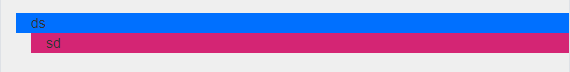
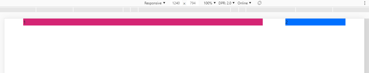
Sorry to ask, it’s kind of silly but I need help. I’m using Bootstrap to make it easier when it comes to grids... I need two Ivs on the page, one with col-Md-9 and another with col... and to separate them, I am using margin in the smallest that is on the right, however, when resized to smaller screens (with a max-width media query: 768px) the margin is still there, even if I put it as "0" inside the media query... What to do?

/*Div pai*/
.corpo_anunciar{
  display: flex;
  flex-direction: row;
  flex-wrap: wrap-reverse;
  justify-content: space-between;
}

/*DIV ROSA */
.corpo_anuncios{
  background-color: #D42574;
  margin-left: 30px;
}

/*DIV AZUL*/
.filtros{
  background-color: #0070FF;
  margin-left: 15px;
}

@media only screen and (max-width: 768px){

  .corpo_anunciar{
     margin: 0;
     padding: 0;
     width: 100%;
   }

  .corpo_anuncios{
     margin: 0px;
     width: 100%;
   }

  .filtros{
     margin: 0;
     width: 100%;
   }
}
How did you do the media query? Put it tb in the code, because any little mistake may not work.
– Sam
edited already bro, thanks for the touch...
– Filipe Oliveira
put your html in too
– Mateus