Overflow of text in flex elements

Asked

Viewed 217 times

0

Hello, I have a problem with making the content I have inside the div with the class "box-center" inside the div Pai "wrapper".

Someone can tell me compo I can solve the problem, I’ve tried the flex-wrapper property but still can’t solve.

The code in question is here:

.wrapper {
  width: 300px;
  height: 500px;
  background-color: aqua;
}

.top {
  display: flex;
  align-items: center;
}

.number {
  flex: 1 1;
  font-size: 14;
  font-weight: bold;
}

.box {
    display: flex;
    flex: 1 1;
    flex-wrap: wrap;
}

.box-left {
  background-color: red;
  margin-right: auto;
  width: 22px;
}

.box-center {
  flex: 1 1;
  background-color: blue;
  width: 100%;
  white-space: nowrap;
  overflow: hidden;
  text-overflow: ellipsis;
  min-width: auto;
}

.box-right {
  background-color: yellow;
  margin-left: auto;
  width: 22px;
}
<div class="wrapper">
  <div class="top">
    <div class="number">
     1º
    </div>
    <div class="box">
    <div class="box-left">
      A
    </div>
    <div class="box-center">
    Bfdfskjfkdjfjsdfjsdjfksdjfkjsdklfjdskjfdsjflkdsjlkfdsfkdsjfklsjfksfdskjsdfdsjksdjfksdjfksdjfkdsj
    </div>
    <div class="box-right">
    C
    </div>
  </div>
  </div>
</div>

The intended result would be something like this: inserir a descrição da imagem aqui

5 answers

0

I believe that flex-grow be useful in that case (see this response). The flex-grow divides the widths of the child elements of a flexbox. Now, for the text-overflow: ellipsis; work, you need to set min-width: 0; in class .box (source). Behold:

.wrapper {
  width: 300px;
  height: 500px;
  background-color: aqua;
}

.top {
  display: flex;
  align-items: center;
}

.number {
 flex-grow: 1;
  font-size: 14;
  font-weight: bold;
}

.box {
    display: flex;
    xflex-wrap: wrap;
    flex-grow: 9;
    min-width: 0;

}

.box-left {
  background-color: red;
 flex-grow: 1;
}

.box-center {
  background-color: blue;
  white-space: nowrap;
  overflow: hidden;
  text-overflow: ellipsis;
 flex-grow: 8;
}

.box-right {
  background-color: yellow;
 flex-grow: 1;
}
<div class="wrapper">
   <div class="top">
      <div class="number">
         1º
      </div>
      <div class="box">
         <div class="box-left">
            A
         </div>
         <div class="box-center">
            Bfdfskjfkdjfjsdfjsdjfksdjfkjsdklfjdskjfdsjflkdsjlkfdsfkdsjfklsjfksfdskjsdfdsjksdjfksdjfksdjfkdsj
         </div>
         <div class="box-right">
            C
         </div>
      </div>
   </div>
</div>

You can adjust the widths by changing the value of the flex-grow, where the value 1, in this case, it means 10% of the container.

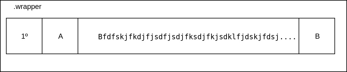
  • I want to see all Divs (number, .box, .box-container, .box-right), but only a . box-container has over-flow

0

Hello,

Do it that way, buddy.

<style>
.wrapper {
  width: 300px;
  height: 500px;
  background-color: aqua;
}
.flex {
    display: flex
}

.flex .truncate {
    min-width: 0;
    flex:1;
    white-space: nowrap;
    overflow: hidden;
    text-overflow: ellipsis;
}
</style>

<div class="wrapper">
<div class="flex">
<div class="box number">
1º
</div>
<div class="box">
A
</div>
<div class="box truncate">
<span> Bfdfskjfkdjfjsdfjsdjfksdjfkjsdklfjdskjfdsjflkdsjlkfdsfkdsjfklsjfksfdskjsdfdsjksdjfksdjfksdjfkdsj</span>
</div>
<div class="box">
C
</div>
</div>
</div>

Note that I gave a modified in its structure.

I hope it helps!

0


Look maybe it’s not the solution you were hoping for but making a calc() in the width from Box you can adjust, the deal is that in calc() you have to cut down the width of the div.number.

Type like this, width: Calc(100% - 13px); where 13px is the width of div with the number .

Follow the example

.wrapper {
  width: 300px;
  height: 500px;
  background-color: aqua;
}

.top {
  display: flex;
  align-items: center;
}

.number {
  flex: 1 1;
  font-size: 14;
  font-weight: bold;
}

.box {
  display: flex;
  flex: 1 1;
  flex-wrap: wrap;
  width: calc(100% - 13px);
}

.box-left {
  background-color: red;
  margin-right: auto;
  width: 22px;
}

.box-center {
  flex: 1 1;
  background-color: blue;
  width: 100%;
  white-space: nowrap;
  overflow: hidden;
  text-overflow: ellipsis;
  min-width: auto;
}

.box-right {
  background-color: yellow;
  margin-left: auto;
  width: 22px;
}
<div class="wrapper">
  <div class="top">

    <div class="number">
      1º
    </div>

    <div class="box">
      <div class="box-left">
        A
      </div>
      <div class="box-center">
        Bfdfskjfkdjfjsdfjsdjfksdjfkjsdklfjdskjfdsjflkdsjlkfdsfkdsjfklsjfksfdskjsdfdsjksdjfksdjfksdjfkdsj
      </div>
      <div class="box-right">
        C
      </div>
    </div>

  </div>
</div>

0

Hello,

I’ve made the following changes:

  • In the top class, I added flex: 1 1; and the flex-direction: row;
  • In the number class, I added display: flex;
  • In the box class, I added ```overflow: Hidden;````

I hope I’ve helped!

.wrapper {
  width: 300px;
  height: 500px;
  background-color: aqua;
}

.top {
  display: flex;
  flex: 1 1;
  align-items: center;
  flex-direction: row;
}

.number {
  display: flex;
  flex: 1 1;
  font-size: 14;
  font-weight: bold;
}

.box {
    display: flex;
    flex: 1 1 100%;
    flex-wrap: wrap;
    overflow: hidden;
}

.box-left {
  background-color: red;
  margin-right: auto;
  width: 22px;
}

.box-center {
  flex: 1 1;
  background-color: blue;
  width: 100%;
  white-space: nowrap;
  overflow: hidden;
  text-overflow: ellipsis;
  min-width: auto;
}

.box-right {
  background-color: yellow;
  margin-left: auto;
  width: 22px;
}
<div class="wrapper">
  <div class="top">
    <div class="number">
     1º
    </div>
    <div class="box">
    <div class="box-left">
      A
    </div>
    <div class="box-center">
    Bfdfskjfkdjfjsdfjsdjfksdjfkjsdklfjdskjfdsjflkdsjlkfdsfkdsjfklsjfksfdskjsdfdsjksdjfksdjfksdjfkdsj
    </div>
    <div class="box-right">
    C
    </div>
  </div>
  </div>
</div>

0

Would that be it? If yes, I recommend this link of origamid insert link description here on flex display. Is very good!

.wrapper {
  display: flex;
  height: 100px;
  padding: 10px;
  border: 2px solid red;
}
  
.child{
  display:flex;
  padding:5px;
  justify-content:center;
  align-items:center;
  flex:1;
  border:1px solid black;
}

.big-child{
  flex: 2;
} 
  
<div class="wrapper">

<div class="child">
  <h4>1º</h4>
</div>

<div class="child">
  <h4>A</h4>
</div> 

<div class="child big-child">
  <h4>Bfdfskjfkdjfjsdfjsdjfksdjfkjsdklfjdskjf
  dsjflkdsjlkfdsfkdsjfklsjfksfdskjsdfdsjksdjfksdjfksdjfkdsj 
  </h4>
</div>

<div class="child">
  <h4>C</h4>
</div>

</div>

Browser other questions tagged

You are not signed in. Login or sign up in order to post.