How to make a scroll bar

Asked

Viewed 4,467 times

1

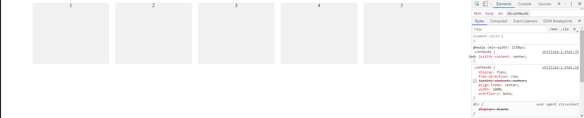
I’m making a bunch of cards, and when the screen is big they look normal, but when I cut them down they get small. I wanted to create a scroll bar so that when it was on smaller screens, the size of the cards would be the same, but with the scroll bar. I tried using the overflow-x to try to stay responsive, but did not succeed. In case I want a horizontal scrollbar.

My code:

<!DOCTYPE html>
<html>
<head>
<title>Exemplo</title>
<meta charset="utf-8">
<style type="text/css">
  .conteudo{
    display: flex;
    flex-direction: row;
    justify-content: center;
    align-items: center;
    width: 100%;
  }
  .card{
    background-color: #f1f1f1;
      width: 250px;
      margin: 10px;
      height: 200px;
      text-align: center;
    }
  }
</style>
</head>
 <body>
<div style="overflow-x: auto">
  <div class="conteudo">
    <div class="card">1</div>
    <div class="card">2</div>
    <div class="card">3</div>
    <div class="card">4</div>
    <div class="card">5</div>
  </div>
</div>
</body>

3 answers

3

You put the overflow-X in the wrong element, you put in a div outside, it had to be in div from within the div .conteudo.

inserir a descrição da imagem aqui

Besides, like you’re wearing flex you have to define a min-width to the card and not a width simple.

Another thing you need to do for the horizontal scroll to work as expected is just add the justify-content: center; only when the screen is larger than 1330px!

Follow the image code above.

html,
body {
    width: 100%;
    height: 100%;
    margin: 0;
    padding: 0;
}

.conteudo {
    display: flex;
    flex-direction: row;
    /* justify-content: center; */
    align-items: center;
    width: 100%;
    overflow-x: auto;
}

.card {
    background-color: #f1f1f1;
    min-width: 250px;
    margin: 10px;
    height: 200px;
    text-align: center;
}
@media (min-width:1330px) {
    .conteudo {
        justify-content: center;
    }
}
<div>
    <div class="conteudo">
        <div class="card">1</div>
        <div class="card">2</div>
        <div class="card">3</div>
        <div class="card">4</div>
        <div class="card">5</div>
    </div>
</div>

2


If you want a scroll bar horizontal (and not vertical as you state at the end of your question), your code is right, only What you need to do for cards to always be the same width is to change the property width: 250px; for min-width: 250px;.

The estate min-width, inside a flexbox, latch the width of the element at the specified value (250px), creating, thus, the horizontal scroll if you decrease the screen to a smaller width:

.conteudo{
   display: flex;
   flex-direction: row;
   justify-content: center;
   align-items: center;
   width: 100%;
}
.card{
   background-color: #f1f1f1;
   min-width: 250px;
   margin: 10px;
   height: 200px;
   text-align: center;
}
<div style="overflow-x: auto">
  <div class="conteudo">
    <div class="card">1</div>
    <div class="card">2</div>
    <div class="card">3</div>
    <div class="card">4</div>
    <div class="card">5</div>
  </div>
</div>

0

In case you need to specify a maximum size for the bar to be created:

.conteudo{
    display: flex;
    flex-direction: row;
    justify-content: center;
    align-items: center;
    width: 100%;
    max-height: 80px; 
  }

On the last line set the maximum height to 80px, and automatically created the vertical scrollbar.

  • Dude I wanted horizontal bar, but vlw, you know how to put horizontal

Browser other questions tagged

You are not signed in. Login or sign up in order to post.