How to make a DIV occupy the right space?

Asked

Viewed 919 times

0

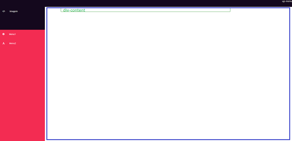
Good evening, I’m mounting the layout of a learning project of mine, I need to make the div occupy the space equal to blue image below inserir a descrição da imagem aqui

My code is this::

My HTML and CSS are below:

@import 'https://fonts.googleapis.com/css?family=Roboto';
.left-menu {
  font-family: 'Roboto', sans-serif;
  position: fixed;
  top: 50px;
  left: 0;
  margin: 0;
  padding: 0;
  height: 100%;
  width: 300px;
  list-style-type: none;
  background: #f32c52;
  overflow: hidden;
  transition: width .5s;
}

.left-menu:hover {
  width: 300px;
}

.left-menu li {
  width: 300px;
}

.left-menu li span {
  font-size: 1rem;
  margin: 20px 30px 0 22px;
}

.left-menu li a {
  display: block;
  font-size: .9rem;
  text-decoration: none;
  color: #FFF;
  height: 60px;
}

.left-menu li a:hover {
  background: #ffff;
}


.left-menu li:first-child a {
  background: #14081d;
  display: block;
  height: 150px;
}

.up-menu {
  background:#14081d;
  position: fixed;
  top: 0px;
  left: 0;
  width: 100%;
  height: 50px;
  color: white;
  text-align: right;
}

.content {
  border: solid 1px green;
  color: green;
  margin-top: 56px;  
  width: 100%;
  height: 100%
}
<link rel="stylesheet" type="text/css"
 href="https://maxcdn.bootstrapcdn.com/font-awesome/4.7.0/css/font-awesome.min.css" />


<ul class="left-menu">  
  <li>
      <a href="#"><span class="fa fa-code"></span>Imagem</a>
    </li>
    <li><a href="#"><span class="fa fa-cog"></span>Menu1</a></li>
    <li>
      <a href="#"><span class="fa fa-font"></span>Menu2</a>
    </li>
</ul>

<div class="up-menu">
  up-menu
</div>

<div class="content">
  div-content
</div>

I can’t make my "div-content" look like the drawing I made with the blue square because no margin or size that apply to div content works :(

1 answer

0


You would need to use the calc to adjust the dimensions of the div, discounting the width of the side column on the width and the height of the upper bar in the height, but it is also necessary to adjust the height of the html, body in 100% and remove the natural margin of the body. So add to your CSS:

html, body{
   height: 100%;
   margin: 0;
}

And change the width and the height of div.content, adding also a margin-left so that the div is not below the column, which is fixed:

.content {
  border: solid 1px green;
  color: green;
  margin-top: 60px;
  margin-left: 310px;
  width: calc(100% - 320px);
  height: calc(100% - 70px);
}

So the div will have an external spacing of 10px (that you adjust by changing the values 320px and 70px.

Behold:

@import 'https://fonts.googleapis.com/css?family=Roboto';

html, body{
   height: 100%;
   margin: 0;
}

.left-menu {
  font-family: 'Roboto', sans-serif;
  position: fixed;
  top: 50px;
  left: 0;
  margin: 0;
  padding: 0;
  height: 100%;
  width: 300px;
  list-style-type: none;
  background: #f32c52;
  overflow: hidden;
  transition: width .5s;
}

.left-menu:hover {
  width: 300px;
}

.left-menu li {
  width: 300px;
}

.left-menu li span {
  font-size: 1rem;
  margin: 20px 30px 0 22px;
}

.left-menu li a {
  display: block;
  font-size: .9rem;
  text-decoration: none;
  color: #FFF;
  height: 60px;
}

.left-menu li a:hover {
  background: #ffff;
}


.left-menu li:first-child a {
  background: #14081d;
  display: block;
  height: 150px;
}

.up-menu {
  background:#14081d;
  position: fixed;
  top: 0px;
  left: 0;
  width: 100%;
  height: 50px;
  color: white;
  text-align: right;
}

.content {
  border: solid 1px green;
  color: green;
  margin-top: 60px;
  margin-left: 310px;
  width: calc(100% - 320px);
  height: calc(100% - 70px);
}
<link rel="stylesheet" type="text/css" href="https://maxcdn.bootstrapcdn.com/font-awesome/4.7.0/css/font-awesome.min.css" />

<ul class="left-menu">  
  <li>
      <a href="#"><span class="fa fa-code"></span>Imagem</a>
    </li>
    <li><a href="#"><span class="fa fa-cog"></span>Menu1</a></li>
    <li>
      <a href="#"><span class="fa fa-font"></span>Menu2</a>
    </li>
</ul>

<div class="up-menu">
  up-menu
</div>

<div class="content">
  div-content
</div>

  • Thanks sam! These posts with explanations are essential for those who are starting.

  • Strange that in your example works, mine in Ctrl c + Ctrl v does not work

  • So maybe there’s something else in CSS

  • relates to the use of bootstrap ???

  • Yes, of course. Bootstrap has its own grid system.

  • Is there anything I can do to eliminate bootstrap and apply css?

  • Just don’t use the bootstrap.

  • The problem is that I would lose all my other styles on the other kk pages

  • Just don’t load the bootstrap just on that page.

Show 4 more comments

Browser other questions tagged

You are not signed in. Login or sign up in order to post.