How to shadow a text

Asked

Viewed 294 times

1

Good morning, in a project that I’m developing it has a kind of "shadow" to leave a white text more visible inside the image, the problem is that I’ve tried both Text-Shadow and Box-Shadow in the text div but it does not have the expected result, Text managed to put a shadow but a shadow not so highlighted. I would like a help on how to proceed, here is the image of Wireframe of the site, HTML, and CSS.

Wireframe: inserir a descrição da imagem aqui

.item-segmento {
  text-align: center;
  margin: 25px 0;
  overflow: hidden;
}

.item-segmento span {
  transition: all .5s ease;
  color: #FFF;
  font-size: 18px;
  text-transform: uppercase;
  text-shadow: 0px 0px 20px #000000;
}

.img-segmento {
  height: 300px;
  margin-bottom: 10px;
  position: relative;
}

.img-segmento>img {
  object-fit: cover;
  width: 100%;
  height: 100%;
  border-radius: 100%;
}

.img-segmento .segmento-titulo {
  transition: all .5s ease;
  position: absolute;
  top: 5%;
  left: 5%;
  width: 90%;
  height: 90%;
  display: table;
  color: #FFF;
}

.item-segmento .segmento-titulo>div {
  color: #FFF;
  vertical-align: middle;
  display: table-cell;
}
<div class="item-segmento col-xs-12 col-sm-6 col-md-4">
  <a href="segmento.php?id=1">
    <div class="img-segmento">
      <img src="https://picsum.photos/200/300" alt="Lorem ipsum dolor sit amet, consectetur adipiscing elit.">
      <div class="segmento-titulo">
        <div>
          <span>Lorem ipsum dolor sit amet, consectetur adipiscing elit.</span>
        </div>
      </div>
    </div>
  </a>
</div>

  • 1

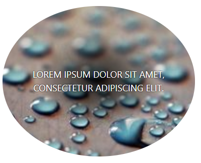
    Alex has you edit the question and put an image of how you would like it to look? Because it seems the text-shadow is already working, I just did not understand the effect you want.

  • Anderson the way I want it to stay, it’s just like what’s in Wireframe.

4 answers

1

Try

text-shadow: 2px 2px #FF0000;

1

Use the attribute in your css

for text use

text-shadow: 0 0 3px #000;

for Divs use

box-shadow: 0 0 5px #000;

it is good you give a studied on these attributes to facilitate in the editing of your styles.

1


I think that the best way for this effect is not with text-shadow but by placing a radial-gradient behind the text.

inserir a descrição da imagem aqui

In class . img-segment . segment-title vc places the gradient at the bottom, going from black to transparent. After that you put the text-shadow smaller to give more definition in the letters. Vc can control the size and color of the radial-gradient in this property

background-image: radial-gradient(at center, rgba(0,0,0,95) 0%,Transparent 50%, Transparent 50%);

Would that be the fit.

  .item-segmento {
    text-align: center;
    margin: 25px 0;
    overflow: hidden;
  }
  
  .item-segmento span {
    transition: all .5s ease;
    color: #FFF;
    font-size: 18px;
    text-transform: uppercase;
    text-shadow: 0px 0px 3px #000000;
  }
  
  .img-segmento {
    height: 300px;
    margin-bottom: 10px;
    position: relative;
  }
  
  .img-segmento>img {
    object-fit: cover;
    width: 100%;
    height: 100%;
    border-radius: 100%;
  }
  
  .img-segmento .segmento-titulo {
    transition: all .5s ease;
    position: absolute;
    top: 5%;
    left: 5%;
    width: 90%;
    height: 90%;
    display: table;
    color: #FFF;
    background-image: radial-gradient(at center, rgba(0,0,0,0.95) 0%,transparent 50%, transparent 50%);
  }
  
  .item-segmento .segmento-titulo>div {
    color: #FFF;
    vertical-align: middle;
    display: table-cell;
  }
<link rel="stylesheet" type="text/css" media="screen" href="https://stackpath.bootstrapcdn.com/bootstrap/4.2.1/css/bootstrap.min.css" />

<div class="item-segmento col-xs-12 col-sm-6 col-md-4">
  <a href="segmento.php?id=1">
    <div class="img-segmento">
      <img src="https://placekitten.com/200/300" alt="Lorem ipsum dolor sit amet, consectetur adipiscing elit.">
      <div class="segmento-titulo">
        <div>
          <span>Lorem ipsum dolor sit amet, consectetur adipiscing elit.</span>
        </div>
      </div>
    </div>
  </a>
</div>

  • 1

    It worked perfectly. You have my sincere thanks friend, hug!

  • 1

    I’m glad I could help

1

Apparently the text-shadow is working, if you do not like the result I recommend you use filters, as in the example:

Filtro de brilho

In the second image I just used the filter: brightness(60%);, so the text becomes more visible.

Browser other questions tagged

You are not signed in. Login or sign up in order to post.