Bootstrap - Overlay Div

Asked

Viewed 1,424 times

0

I have a doubt and I would like your help, I already researched a lot and did not find a solution.

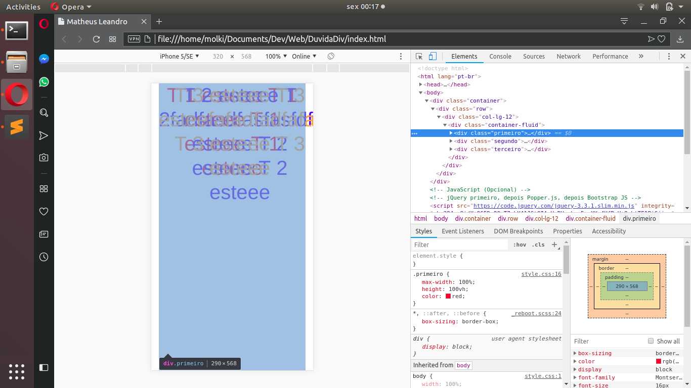
I’m trying to position a div over a div. I found some ways to do this on the internet, however, I did not really like the result and would like to know if there is another alternative.

One of the ways I found was to put the position as Absolute and set the top to zero in the second Div. This way, the second Div is over the first Div, however, ends up "escaping / leaking" on the right side, not respecting the first Div.

inserir a descrição da imagem aqui

The following is an example of a code:

(migrated from Jsfiddle)

body{
	width: 100%;
	height: 100vh;
	font-family: "Montserrat", "Helvetica", arial, sans-serif;
    font-weight: 600;
    text-align: center;
}
.container {
	max-width: 100%;
	height: 100vh;
	/*overflow:hidden;*/
}
.container-fluid {
	padding: 0;
}
.primeiro {
	max-width: 100%;
	height: 100vh;
	color: red;
}
.segundo {
	max-width: 100%;
	height: 100vh;
	color: blue;
	position: absolute;
	top: 0;
}
.terceiro {
	max-width: 100%;
	height: 100vh;
	color: orange;
	position: absolute;
	top: 0;
}
<!DOCTYPE html>
<html lang="pt-br">
  <head>    
    <title>Matheus Leandro</title>
    <!-- Meta tags Obrigatórias -->
    <meta charset="utf-8">
    <meta name="viewport" content="width=device-width, initial-scale=1, shrink-to-fit=no">
	<!-- Bootstrap CSS -->
    <link rel="stylesheet" href="https://stackpath.bootstrapcdn.com/bootstrap/4.1.3/css/bootstrap.min.css" integrity="sha384-MCw98/SFnGE8fJT3GXwEOngsV7Zt27NXFoaoApmYm81iuXoPkFOJwJ8ERdknLPMO" crossorigin="anonymous">
	<!-- CSS -->
    <link rel="stylesheet" href="css/style.css">

	<!--[if lt IE 9]>
	<script src="//html5shiv.googlecode.com/svn/trunk/html5.js"></script>
	<![endif]-->

  </head>
  <body>

    <div class="container">
        <div class="row">
            <div class="col-lg-12">
                <div class="container-fluid">
                    <div class="primeiro">
                        <h1>T 1 esteee T 1 esteee T 1 esteee T 1 esteee</h1>
                    </div>
                    <div class="segundo">
                        <h1>T 2 esteee T 2fadfasdfasfasfdfsasff esteee T 2 esteee T 2 esteee</h1>
                    </div>
                    <div class="terceiro">
                        <h1>T 3 esteee T 3 esteefafadfadfafasfse T 3 esteee T 3 esteee</h1>
                    </div>
                </div>
            </div>
        </div>
    </div>

    <!-- JavaScript (Opcional) -->
    <!-- jQuery primeiro, depois Popper.js, depois Bootstrap JS -->
    <script src="https://code.jquery.com/jquery-3.3.1.slim.min.js" integrity="sha384-q8i/X+965DzO0rT7abK41JStQIAqVgRVzpbzo5smXKp4YfRvH+8abtTE1Pi6jizo" crossorigin="anonymous"></script>
    <script src="https://cdnjs.cloudflare.com/ajax/libs/popper.js/1.14.3/umd/popper.min.js" integrity="sha384-ZMP7rVo3mIykV+2+9J3UJ46jBk0WLaUAdn689aCwoqbBJiSnjAK/l8WvCWPIPm49" crossorigin="anonymous"></script>
    <script src="https://stackpath.bootstrapcdn.com/bootstrap/4.1.3/js/bootstrap.min.js" integrity="sha384-ChfqqxuZUCnJSK3+MXmPNIyE6ZbWh2IMqE241rYiqJxyMiZ6OW/JmZQ5stwEULTy" crossorigin="anonymous"></script>
    </body>
</html>

Note: the first Div (which should be respected) is with the red letters, if you observe, the second Div (blue) and the third Div (orange) are larger (right side mainly) than the first.

1 answer

0


Their div are elements brothers and does not limit the width by basing it on each other. Unless you set a static width for everyone and position them equally.

When you applied the position: absolute without the parent element being with position: relative, the elements started to follow the flow of the page, instead of the parent element.

An alternative is the parent element having the position: relative while the children stay with position: absolute. Such a way that you will use the size of the parent element to delimit the width of the children. This means that the children will be relative to the father.

Practical example:

body {
    margin: 0;
}
div.pai {
    position: relative;
    width: 500px;
    height: 100vh;
    background-color: rgb(220, 220, 220);
}
div.filhos {
    position: absolute;
    top: 0;
    width: 100%;
}
div.filhos:nth-child(1) {
    background-color: rgba(255, 255, 180, 0.5);
}
div.filhos:nth-child(2) {
    background-color: rgba(255, 180, 255, 0.5);
    margin: 10px;
}
div.filhos:nth-child(3) {
    background-color: rgba(180, 255, 255, 0.5);
    margin: 20px;
}
<div class="pai">
    <div class="filhos">Lorem ipsum dolor sit amet, consectetur adipisicing elit. Quos tempora, maxime tenetur corporis deserunt ullam odio error cupiditate excepturi labore magnam autem ipsum blanditiis consequatur amet dolorum. Atque, soluta, modi.</div>
    <div class="filhos">Lorem ipsum dolor sit amet, consectetur adipisicing elit. Quia blanditiis cumque nihil fuga, sit porro hic recusandae nobis non assumenda deleniti dolores ut possimus error cupiditate obcaecati, laudantium quis quam.</div>
    <div class="filhos">Lorem ipsum dolor sit amet, consectetur adipisicing elit. Eum fugit nesciunt velit error, voluptatem, adipisci molestiae sed rerum reprehenderit provident qui. Aliquam officiis nostrum sapiente harum rem, commodi voluptate non!</div>
</div>

Note: I put a margin on the last two elements in order to move them for better viewing.


Applied to your code:

body{
    width: 100%;
    height: 100vh;
    font-family: "Montserrat", "Helvetica", arial, sans-serif;
    font-weight: 600;
    text-align: center;
}
.container {
    max-width: 100%;
    height: 100vh;
    /*overflow:hidden;*/
}
.container-fluid {
    padding: 0;
}
.pai {
    position: relative;
}
.primeiro {
    max-width: 100%;
    height: 100vh;
    color: red;
    position: absolute;
    top: 0;
}
.segundo {
    max-width: 100%;
    height: 100vh;
    color: blue;
    position: absolute;
    top: 0;
}
.terceiro {
    max-width: 100%;
    height: 100vh;
    color: orange;
    position: absolute;
    top: 0;
}
<meta name="viewport" content="width=device-width, initial-scale=1, shrink-to-fit=no">
<!-- Bootstrap CSS -->
<link rel="stylesheet" href="https://stackpath.bootstrapcdn.com/bootstrap/4.1.3/css/bootstrap.min.css" integrity="sha384-MCw98/SFnGE8fJT3GXwEOngsV7Zt27NXFoaoApmYm81iuXoPkFOJwJ8ERdknLPMO" crossorigin="anonymous">

<div class="container">
    <div class="row">
        <div class="col-lg-12">
            <div class="container-fluid pai">
                <div class="primeiro">
                    <h1>T 1 esteee T 1 esteee T 1 esteee T 1 esteee</h1>
                </div>
                <div class="segundo">
                    <h1>T 2 esteee T 2fadfasdfasfasfdfsasff esteee T 2 esteee T 2 esteee</h1>
                </div>
                <div class="terceiro">
                    <h1>T 3 esteee T 3 esteefafadfadfafasfse T 3 esteee T 3 esteee</h1>
                </div>
            </div>
        </div>
    </div>
</div>

<!-- JavaScript (Opcional) -->
<!-- jQuery primeiro, depois Popper.js, depois Bootstrap JS -->
<script src="https://code.jquery.com/jquery-3.3.1.slim.min.js" integrity="sha384-q8i/X+965DzO0rT7abK41JStQIAqVgRVzpbzo5smXKp4YfRvH+8abtTE1Pi6jizo" crossorigin="anonymous"></script>
<script src="https://cdnjs.cloudflare.com/ajax/libs/popper.js/1.14.3/umd/popper.min.js" integrity="sha384-ZMP7rVo3mIykV+2+9J3UJ46jBk0WLaUAdn689aCwoqbBJiSnjAK/l8WvCWPIPm49" crossorigin="anonymous"></script>
<script src="https://stackpath.bootstrapcdn.com/bootstrap/4.1.3/js/bootstrap.min.js" integrity="sha384-ChfqqxuZUCnJSK3+MXmPNIyE6ZbWh2IMqE241rYiqJxyMiZ6OW/JmZQ5stwEULTy" crossorigin="anonymous"></script>

Browser other questions tagged

You are not signed in. Login or sign up in order to post.