1
I’m developing a website using Bootstrap and HTML, I’m gonna make you flexible
for the desktop and mobile platform. However, I cannot understand why the property
col-xs(phones) not work.
Follow the code snippet:
<!DOCTYPE html>
<html lang="pt">

<head>

  <meta charset="utf-8">
  <meta http-equiv="X-UA-Compatible" content="IE=edge">
  <meta name="viewport" content="width=device-width, initial-scale=1, shrink-to-fit=no">
  <meta name="description" content="">
  <meta name="author" content="">

  <title>test-Col.xs.md.lg</title>

  <!-- Custom fonts for this template -->
  <link rel="stylesheet" href="https://stackpath.bootstrapcdn.com/bootstrap/4.3.1/css/bootstrap.min.css" integrity="sha384-ggOyR0iXCbMQv3Xipma34MD+dH/1fQ784/j6cY/iJTQUOhcWr7x9JvoRxT2MZw1T" crossorigin="anonymous">

  <link href="https://fonts.googleapis.com/css?family=Nunito:200,200i,300,300i,400,400i,600,600i,700,700i,800,800i,900,900i" rel="stylesheet">

  <!-- Custom styles for this template-->
  <link href="css/sb-admin-2.min.css" rel="stylesheet">

</head>

<body class="bg-gradient-primary">

  <div class="container">

    <div class="card o-hidden border-0 shadow-lg my-5">
      <div class="card-body p-0">
        <!-- Nested Row within Card Body -->
        <div class="row">
          <div class="col-lg-12 ">
            <div class="p-5">

              <form class="user">
                <div class="form-group row">
                  <div class="col-lg-6 col-md-2 col-xs-3">
                    <input type="password" class="form-control form-control-user" id="exampleInputPassword" placeholder="Password">
                  </div>
                  <div class="col-lg-6 col-md-10 col-xs-3">
                    <input type="password" class="form-control form-contr   pleRepeatPassword" placeholder="Repeat Password">
                  </div>
                </div>
                <a href="#" class="btn btn-primary btn-user btn-block">
                  Cadastrar
                </a>
                <hr>
              </form>
              <hr>
            </div>
          </div>
        </div>
      </div>
    </div>

  </div>

  <!-- Bootstrap core JavaScript-->
  <script src="vendor/jquery/jquery.min.js"></script>
  <script src="vendor/bootstrap/js/bootstrap.bundle.min.js"></script>

  <!-- Core plugin JavaScript-->
  <script src="vendor/jquery-easing/jquery.easing.min.js"></script>

  <!-- Custom scripts for all pages-->
  <script src="js/sb-admin-2.min.js"></script>

</body>

</html>
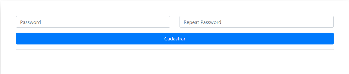
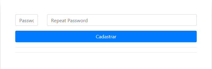
The Annexes below demonstrate the performance of the application in the following dimensions: lg(Arger desktops), md(desktops), Xs(phones).
Adaptation in lg:
Adaptation in md:
Adaptation in xs:
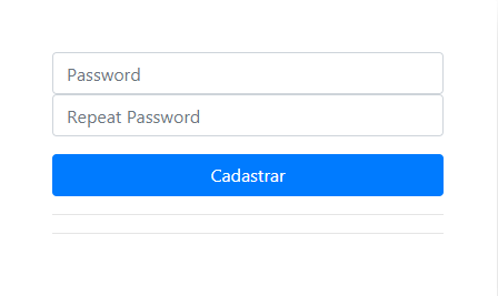
By placing code in both fields col-xs-3 I believe that in the third image, the fields should be laterally positioned.
Hunch: I believe that the reason the behavior in "Xs" is not happening, must be because of the tests I am running, simply reducing the size of the browser by clicking and dragging in the browser Vertice.

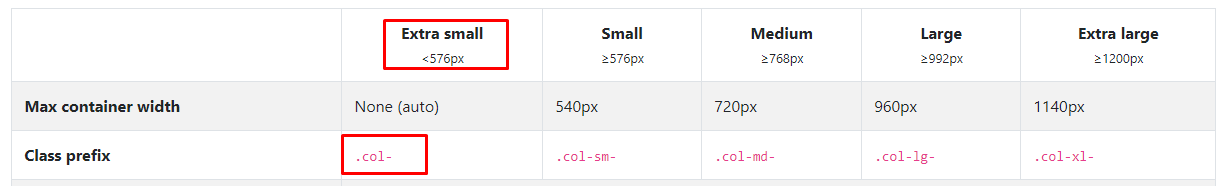
Thanks Ugo, although I’ve seen this col-nº, I had no idea that he came to replace the
xs, thanks for the tip of using the mediummd, however, the application will only be used by notebook and mobile in some cases. I believe it would not be necessary in my scenario.– RXSD
@Andréfilipe maybe yes, maybe no, has inside that looks at the phone in Landscape, has cell phone with screen size tablet, etc... I do not know if it is worth risking only for half a dozen characters... it is only an opinion, but do a search with your users to be sure ;)
– hugocsl
It is actually a single user, the client, that will use the application in notebook and mobile, in format Portrait only.
– RXSD
But it’s worth implementing, thank you!
– RXSD