Footer does not remain at the bottom of the page

Asked

Viewed 397 times

2

I have the following footer:

<footer class="page-footer font-small footer-fundo-cinza">
    <div class="container">
        <div class="row pt-3">
            <div class="col-md-4">
             ...
            </div>
         </div>
    </div>
</footer>


footer{
  position: absolute;
  width: 100%;
  bottom: 0;
}

It works well when the page does not have scroll, but when it has scroll it is not at the end of scroll, it is at the end of the first page, example:

inserir a descrição da imagem aqui

This is my angular structure:

<div>
  <app-cabecalho></app-cabecalho>
</div>

<router-outlet (activate)="onActivate($event)"></router-outlet>

<app-rodape></app-rodape>

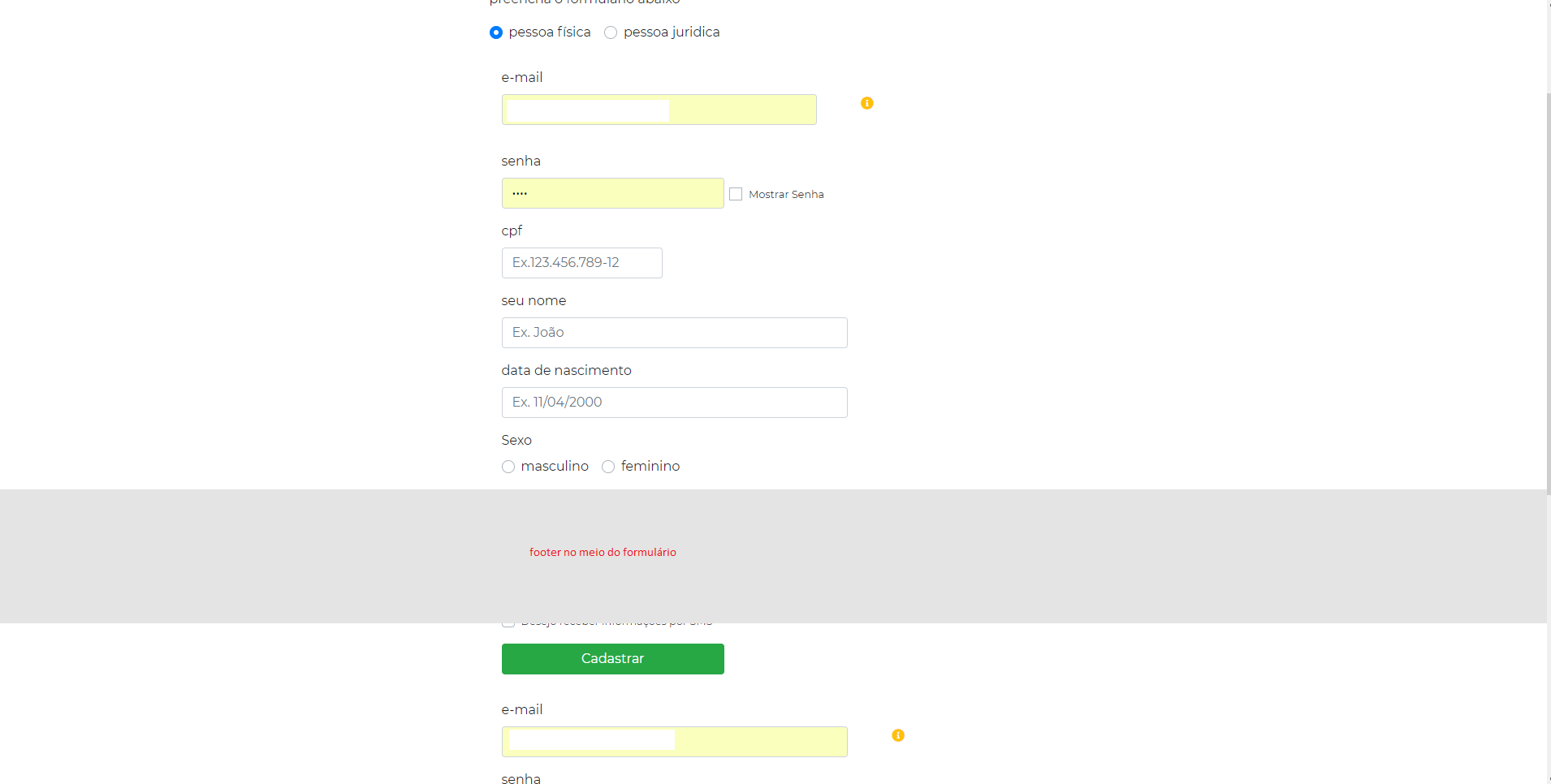
The app-rodape is the footer and in the router-outlet the form of the image is shown.

The form component has the following structure:

<div class="container">

    <div class="row justify-content-md-center">
        <div class="col col-lg-8">
            <div class="container">

                <div class="row">
                    <div class="col-md-12">
                        <p class="divisor is-3"><span>preencha o formulário abaixo</span></p>
                    </div>
                </div>

If I remove the property bottom: 0 the footer is positioned at the end of the document, but on the other screens where there is no scroll it does not remain at the end of the screen.

In this project the bootstrap is being used.

  • 2

    Ever tried to replace position: absolute; for position: fixed; to see if it fits you?

  • Yes, but I don’t want the footer to be fixed, I hope it appears only at the end of the scroll

3 answers

2

Since Bootstrap has flex classes, you just have to put the container of the form with flex-direction column, after you put the form with flex-grow:1, and the footer with margin-top:auto. https://getbootstrap.com/docs/4.0/utilities/flex/

inserir a descrição da imagem aqui

Follow the image code above:

.row.grow {
  flex-grow: 1;
}
  <link rel="stylesheet" type="text/css" media="screen" href="https://stackpath.bootstrapcdn.com/bootstrap/4.2.1/css/bootstrap.min.css" />

<html class="h-100">
<body class="h-100">

  <div class="container h-100">
    <div class="row justify-content-md-center h-100">
      <div class="col col-lg-8 d-flex flex-column ">

        <div class="row grow">
          <div class="col-md-12">
            <p class="divisor is-3"><span>preencha o formulário abaixo</span></p>
            <form>
              <div class="form-group">
                <label for="exampleInputEmail1">Email address</label>
                <input type="email" class="form-control" id="exampleInputEmail1" aria-describedby="emailHelp"
                  placeholder="Enter email">
                <small id="emailHelp" class="form-text text-muted">We'll never share your email with anyone else.</small>
              </div>
              <div class="form-group">
                <label for="exampleInputPassword1">Password</label>
                <input type="password" class="form-control" id="exampleInputPassword1" placeholder="Password">
              </div>
              <div class="form-check">
                <input type="checkbox" class="form-check-input" id="exampleCheck1">
                <label class="form-check-label" for="exampleCheck1">Check me out</label>
              </div>
              <button type="submit" class="btn btn-primary">Submit</button>
            </form>
            <p>
              Lorem ipsum dolor, sit amet consectetur adipisicing elit. Sequi illum ullam, dolorem, nesciunt ut, laudantium aperiam soluta magnam aliquid ad similique facilis temporibus! Tempore commodi in amet nobis maxime repellat dolores tempora ad porro dolorum impedit adipisci dignissimos ex facilis hic, reiciendis ea. Unde iure nam quo fugit cupiditate qui quia ratione inventore suscipit impedit odio quam dicta perspiciatis ducimus minima deleniti, eum accusantium doloribus, vel autem hic fugiat ad quasi. Ab, repudiandae natus dolore dignissimos iure esse perspiciatis facere optio blanditiis nulla ea saepe, et ut modi aliquid voluptates, eveniet reprehenderit enim? Quas quod culpa vel ab error earum dicta voluptas similique! Consectetur unde sequi itaque. Harum, quisquam id soluta corporis accusantium aut odio facilis consequatur rem quasi minus provident optio, ab consectetur ipsam nemo commodi neque sed temporibus totam at voluptates. Ex, consequuntur in. Laboriosam, ducimus dolores mollitia hic expedita animi ea dolore aliquam officia id blanditiis enim sunt quidem distinctio harum esse? Omnis totam itaque nobis deserunt ex, blanditiis dignissimos quidem maxime, incidunt voluptatum odio quos veritatis excepturi voluptatem. Alias, maxime sunt? Nihil atque earum commodi voluptatum error similique esse mollitia fuga eum? Voluptate perferendis unde quos facilis explicabo non molestiae repudiandae inventore, vel corporis minima rem suscipit, ipsam, hic adipisci cupiditate laudantium iusto ea quae? Quidem expedita illum libero hic earum amet aperiam doloribus non corporis animi quia fugit sequi nostrum saepe voluptatum ut laboriosam pariatur consectetur nobis ea fuga praesentium, laborum facere. Placeat voluptatum id veniam reprehenderit ratione, expedita, nemo dolor eum enim exercitationem praesentium similique facilis quo aspernatur debitis perferendis eaque unde, tempora dolores! Repellat velit iure suscipit quod provident minus animi, est aut necessitatibus dolore accusamus blanditiis quibusdam dolorem autem, in nam, ea natus eligendi quas? Id explicabo placeat soluta laudantium. Quidem, quasi molestiae id ipsam quis vero nulla eveniet amet inventore necessitatibus hic animi, corporis rerum optio eius voluptates sapiente quas itaque exercitationem et repudiandae? Molestias reprehenderit eos, quaerat autem distinctio at quae perferendis nam excepturi quis accusantium amet? Voluptatibus rem porro minus ipsam quam iure! Repellendus eum cupiditate unde, quisquam ipsa nesciunt fugit veniam numquam excepturi eaque, ducimus minus, illum corrupti aliquid voluptates! Doloribus, architecto enim! Optio molestias sed quo, nostrum nam ipsa velit ducimus accusamus, numquam eius mollitia doloremque ipsam tenetur vero veritatis asperiores? Accusamus voluptate, laborum aut delectus pariatur nobis officia, adipisci, debitis id consectetur asperiores totam. Autem.
            </p>
          </div>
        </div>

        <div class="row mt-auto">
          <footer class="col bg-dark">
            Footer
          </footer>
        </div>

      </div>
    </div>
  </div>

1

**Tenta isso aqui ó:** 

   <footer class="page-footer font-small footer-fundo-cinza">
    <div class="container">
        <div class="row pt-3">
            <div class="col-md-4">
             ...
            </div>
         </div>
    </div>
</footer>


footer{
  position: relative; /* ou fixed */
  width: 100%;
  bottom: 0;
}
  • It does not work when it does not have scroll, it is being positioned after the last element, if the last element does not occupy the whole screen it is in the middle of the screen

  • 1

    With Angular your example does not work, because footer is a component, it is loose in Html and not inside a div, it would work if the footer was together with the form on the same page, which does not happen.

  • true, I believe that the Matheus solution is the best. https://codepen.io/mathues/pen/gEKZaL

1


You could adopt another structure for your project, follow a suggestion using the functionalities of display: flex;.

https://codepen.io/mathues/pen/gEKZaL.

In the suggestion I separated the structure into two parts: conteúdo normal (que sempre estará alinhado ao topo, nesse caso o cabeçalho e conteúdo) e o conteúdo de footer (que sempre estará em baixo, até nas páginas de pouco conteúdo)

.general-container
    .top-container
        Cabeçalho
        Conteúdo
    Footer

To know more the operation, it is worth consulting, until to assist in the construction of their structures https://css-tricks.com/snippets/css/a-guide-to-flexbox/.

  • 1

    It was exactly what I needed, and best, it worked without breaking the rest of my layout

  • Great, anything... :) stay with God, hugs!

  • All you had to do was bring the code to answer... Haha

Browser other questions tagged

You are not signed in. Login or sign up in order to post.