2
I’m creating a system using bootstrap, to make it responsive I used the classes col-xs-12 col-md-2, when I resize the page the responsiveness works perfectly, but when I use the mobile mode of the Chrome the site gets the original size.
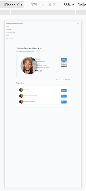
How it should look

HTML
@extends('layouts.app', ["current" => "clientes"])
<style>
.img-card-user{
width:220px;
border-radius:50%;
}
.img-mini-card{
width:50px;
}
.centered {
margin: 0 auto !important;
float: none !important;
}
</style>
@section('body')
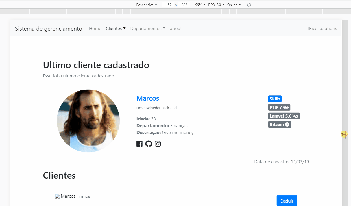
<h2>Ultimo cliente cadastrado</h2>
<p class="text-secondary">Esse foi o ultimo cliente cadastrado.</p>
<div class="bs-callout bs-callout-primary">
<div class="card-body">
<div class="row">
<div class="col-xs-12 col-md-3 centered">
<img alt="Responsive image" class="img-card-user mx-auto d-block" src="/img/clientes/jademS.jpg">
</div>
<div class="col-xs-12 col-md-6 centered" style="padding-top:15px;">
<h4 class="text-primary">{{ $lastCliente->Nome }}</h4>
<small class="text-dark">Desenvolvedor back-end</small>
<div class="text-secondary" style="margin-top:15px;">
<ul style="list-style-type: none; padding-left:0px;">
<li><b>Idade: </b>{{ $lastCliente->Idade }}</li>
<li><b>Departamento:</b>@php $departamento = $departamentos->find($lastCliente->departamento_id) @endphp {{ $departamento->nome }}</li>
<li><b>Descriação:</b> {{ $lastCliente->descricao }}</li>
</ul>
</div>
<div class="row" style="font-size:24px; padding-left:15px;">
<i style="margin-right:10px;" class="fab fa-facebook-square"></i>
<i style="margin-right:10px;" class="fab fa-github"></i>
<i style="margin-right:10px;" class="fab fa-instagram"></i>
</div>
</div>
<div class="col-xs-12 col-md-2" style="padding-top:15px; font-size:20px;">
<span class="badge badge-primary full">Skills</span>
<span class="badge badge-secondary full">PHP 7 <i class="fab fa-php"></i></span>
<span class="badge badge-secondary full">Laravel 5.6 <i class="fab fa-laravel"></i></span>
<span class="badge badge-secondary full">Bitcoin <i class="fab fa-bitcoin"></i></span>
</div>
</div>
</div>
</div>
<p class="text-right text-secondary"> Data de cadastro: {{ date('d/m/y', strtotime($lastCliente->created_at)) }} </p>
<h2>Clientes</h2>
<div class="card border">
<div class="card-body">
<ul class="list-group">
@foreach($clientes as $cliente)
<li class="list-group-item">
<img class="img-card-user img-mini-card" src="/img/clientes/mandela.jpg">
{{ $cliente->Nome }} <small class="text-secondary">@php $departamento = $departamentos->find($cliente->departamento_id) @endphp {{ $departamento->nome }}</small>
<a class="btn btn-primary float-right" href="/cliente/destroy/{{ $cliente->id }}" style="margin-top:10px;">Excluir</a>
</li>
@endforeach
</ul>
</div>
</div>
@endSection
All the places where you have col-Xs-12, you should only put col-12, apparently you are using BS4, but the classes of the BS3 grid, test and tell me what gave there, because with this code you can not test here, or put for us the direct HTML copied from the Browser, gives a Ctrlu in the window and copies the HTML from there already rendered!
– hugocsl
I changed but it stayed the same
– Evandro Ignacio
I put all html here https://notepad.pw/boostratpnotwork
– Evandro Ignacio
Here was perfect... must be something else you put there....... http://prntscr.com/mxy9a4 In fact it seems that the layout only breaks to a certain extent... I’ll see http://prntscr.com/mxya4k
– hugocsl
strange it may be some conf of my machine ?
– Evandro Ignacio
Young I answered you, I think it will solve your problem there, qq doubt comments there that I help you
– hugocsl