bootstrap line break does not occur

Asked

Viewed 631 times

2

Good evening, I’m learning how to use bootstrap 4. I made a menu using navbar and nav-brand, everything works normal but when it comes to the sizes sm and md for some reason the background size gets smaller than the menu links. That’s why I tried to make the links go below the logo but the links don’t go down to another line when I put the col-sm-12. When I use the col-sm-12 outside the Navbar it works normally.

If any of you have any tips, I’d appreciate it. Thank you

<link rel="stylesheet" href="https://maxcdn.bootstrapcdn.com/bootstrap/4.0.0/css/bootstrap.min.css" integrity="sha384-Gn5384xqQ1aoWXA+058RXPxPg6fy4IWvTNh0E263XmFcJlSAwiGgFAW/dAiS6JXm" crossorigin="anonymous">

<html>
<head>
    <title>Curso de Bootstrap</title>
    <meta http-equiv="X-UA-Compatible" content="IE-edge">
    <meta name="viewport" content="width=device-width, initial-scale=1">

    <link href="../bootstrap-4.3.1-dist/css/bootstrap.min.css" rel="stylesheet">
    <link href="_css/estilo.css" rel="stylesheet">
</head>
<body>
    <div class="container-fluid">
        <div class="row">
            <nav class="navbar navbar-expand-sm navbar-dark bg-dark col-md-12">
                <div class="navbar-header col-12 col-sm-4 col-md-2">
                <a href="#" class="navbar-brand"><img src="../img/icone_aftereffects_grande.png" width="50em">After Effects</a>
            </div>
                <ul class="navbar-nav col-12 col-sm-12 col-md-10">
                    <li class="nav-item"><a class="nav-link" href="home.html">Home</a></li>
                    <li class="nav-item"><a class="nav-link" href="info.html">Info</a></li>
                    <li class="nav-item"><a class="nav-link" href="special-events.html">Special Events</a></li>
                    <li class="nav-item"><a class="nav-link" href="dvd.html">DVD</a></li>
                    <li class="nav-item"><a class="nav-link" href="location.htm">Location</a></li>
                    <li class="nav-item"><a class="nav-link" href="menu.html">Menu</a></li>
                    <li class="nav-item"><a class="nav-link" href="review.html">Review</a></li>                
                </ul>  
                </nav>
        </div>    
    </div>

    <!-- Fim do seu codigo -->
    <script src="https://code.jquery.com/jquery-3.2.1.slim.min.js" integrity="sha384-KJ3o2DKtIkvYIK3UENzmM7KCkRr/rE9/Qpg6aAZGJwFDMVNA/GpGFF93hXpG5KkN" crossorigin="anonymous"></script>
<script src="https://cdnjs.cloudflare.com/ajax/libs/popper.js/1.12.9/umd/popper.min.js" integrity="sha384-ApNbgh9B+Y1QKtv3Rn7W3mgPxhU9K/ScQsAP7hUibX39j7fakFPskvXusvfa0b4Q" crossorigin="anonymous"></script>
<script src="https://maxcdn.bootstrapcdn.com/bootstrap/4.0.0/js/bootstrap.min.js" integrity="sha384-JZR6Spejh4U02d8jOt6vLEHfe/JQGiRRSQQxSfFWpi1MquVdAyjUar5+76PVCmYl" crossorigin="anonymous"></script>
    <script src="_js/script.js"></script>
</body>

1 answer

1


Your Navbar is quite different from what the documentation says... Also, your problem is actually whether the pq you are using the class navbar-expand-sm in Navbar, only that since you have many items in the menu the ideal would be to use navbar-expand-md for only expand Navbar after 768px width.

You can see the full documentation here: https://getbootstrap.com/docs/4.0/components/navbar/#how-it-Works

inserir a descrição da imagem aqui

Follow the image code above:

<link rel="stylesheet" type="text/css" media="screen" href="https://maxcdn.bootstrapcdn.com/bootstrap/4.3.0/css/bootstrap.min.css" />

<script src="https://code.jquery.com/jquery-3.2.1.min.js"></script>
<script src="https://cdnjs.cloudflare.com/ajax/libs/popper.js/1.12.9/umd/popper.min.js"></script>
<script src="https://maxcdn.bootstrapcdn.com/bootstrap/4.0.0/js/bootstrap.min.js"></script>


<div class="container-fluid">
    <div class="row">
        <nav class="navbar navbar-expand-md navbar-dark bg-dark col-12">
            <a href="#" class="navbar-brand"><img src="../img/icone_aftereffects_grande.png" width="50em">After Effects</a>
            <button class="navbar-toggler" type="button" data-toggle="collapse" data-target="#navbarNav" aria-controls="navbarNav"
                aria-expanded="false" aria-label="Toggle navigation">
                <span class="navbar-toggler-icon"></span>
            </button>
            <div class="collapse navbar-collapse" id="navbarNav">
                <ul class="navbar-nav">
                    <li class="nav-item"><a class="nav-link" href="home.html">Home</a></li>
                    <li class="nav-item"><a class="nav-link" href="info.html">Info</a></li>
                    <li class="nav-item"><a class="nav-link" href="special-events.html">Special Events</a></li>
                    <li class="nav-item"><a class="nav-link" href="dvd.html">DVD</a></li>
                    <li class="nav-item"><a class="nav-link" href="location.htm">Location</a></li>
                    <li class="nav-item"><a class="nav-link" href="menu.html">Menu</a></li>
                    <li class="nav-item"><a class="nav-link" href="review.html">Review</a></li>
                </ul>
            </div>
        </nav>
    </div>
</div>


Breaking the line

Now if your intention is to actually break the line ai the indication is to use the Flex classes of Bootstrap. Neither of CSS extra vc will need...

Navbar by default already has display:flex, so you just have to determine that between MD and SM screens Navbar will align the children in column with the class flex-sm-column and flex-lg-row you control it, and after SM the menu collapsa navbar-expand-sm . Here is the official documentation of the Flex Bootstrap classes https://getbootstrap.com/docs/4.0/utilities/flex/

inserir a descrição da imagem aqui

Follow the image code above:

<link rel="stylesheet" type="text/css" media="screen" href="https://maxcdn.bootstrapcdn.com/bootstrap/4.3.0/css/bootstrap.min.css" />

<script src="https://code.jquery.com/jquery-3.2.1.min.js"></script>
<script src="https://cdnjs.cloudflare.com/ajax/libs/popper.js/1.12.9/umd/popper.min.js"></script>
<script src="https://maxcdn.bootstrapcdn.com/bootstrap/4.0.0/js/bootstrap.min.js"></script>

<div class="container-fluid">
    <div class="row">
        <nav class="navbar navbar-expand-sm navbar-dark bg-dark col-12 flex-sm-column flex-lg-row align-items-start">
            <a href="#" class="navbar-brand"><img src="../img/icone_aftereffects_grande.png" width="50em">After Effects</a>
            <button class="navbar-toggler" type="button" data-toggle="collapse" data-target="#navbarNav" aria-controls="navbarNav"
                aria-expanded="false" aria-label="Toggle navigation">
                <span class="navbar-toggler-icon"></span>
            </button>
            <div class="collapse navbar-collapse" id="navbarNav">
                <ul class="navbar-nav">
                    <li class="nav-item"><a class="nav-link" href="home.html">Home</a></li>
                    <li class="nav-item"><a class="nav-link" href="info.html">Info</a></li>
                    <li class="nav-item"><a class="nav-link" href="special-events.html">Special Events</a></li>
                    <li class="nav-item"><a class="nav-link" href="dvd.html">DVD</a></li>
                    <li class="nav-item"><a class="nav-link" href="location.htm">Location</a></li>
                    <li class="nav-item"><a class="nav-link" href="menu.html">Menu</a></li>
                    <li class="nav-item"><a class="nav-link" href="review.html">Review</a></li>
                </ul>
            </div>
        </nav>
    </div>
</div>

  • 1

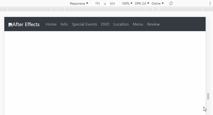
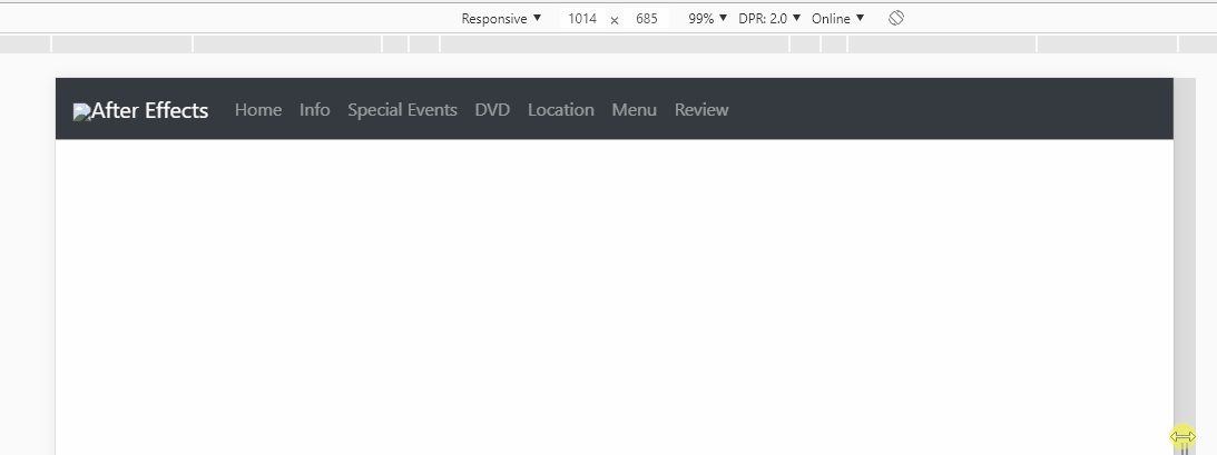
    Thank you, that’s exactly what I had in mind, that the menu just collapses after SM note, but I didn’t know yet that the flex class was for this. Really my navbar was different, had not put the class "navbar Collapse" nor the button with the class "navbar-Toggler". I’ll test here, thanks again.

  • @sarge88 without problems friend, always consult the documentation, help a lot and already have class ready for almost everything!

Browser other questions tagged

You are not signed in. Login or sign up in order to post.