How to increase modal popup width in mobile

Asked

Viewed 99 times

2

Good afternoon, I created a button that opens a modal in bostrap, inside it I inserted some tables. On the desktop works perfectly, but in mobile one of the tables "burst the modal". I wonder how to change the width of the modal in mobile.

inserir a descrição da imagem aqui

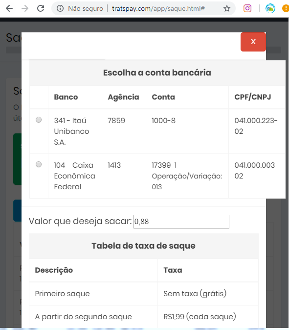
Page in question:http://tratspay.com/app/saque.html#

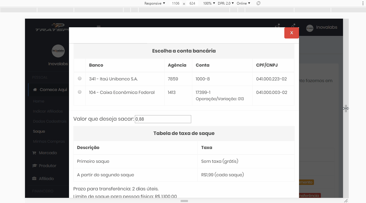
  • I think the problem is not the modal, but the table. I think you can hide some columns in mobile, or create another table format, or use the bootstrap . table-Responsive

  • Thanks, Zaffar! I was able to fix the bug by adding the table Responsive command. Thanks for the force!

1 answer

1


Look at the Bootstrap documentation itself indicates how to make the table responsive. I don’t know if it suits you, but that’s what the official documentation indicates, frameworks are like this... https://getbootstrap.com/docs/4.0/contenttables/#Responsive-Tables

What you should do is put the class .table-responsive in col- preceding the table, as below

<div class="col-sm-12 divContas table-responsive">

That way you will get the result of the image below

inserir a descrição da imagem aqui

  • 1

    I managed to do just that. Thank you for the strength!

  • @Igorrosa without problems my dear!

  • 1

    I’m managing to make my site beautiful with help from you forum. Tô felizão kk

Browser other questions tagged

You are not signed in. Login or sign up in order to post.