What CSS properties for specific background?

Asked

Viewed 94 times

1

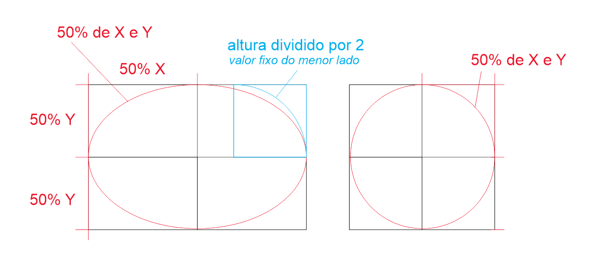
I’m trying to draw a button. I want a background similar to the image below. I started using the border-Radius property, but without success.

[css]

 .btn-criar{
                height: 50%;
                min-width: 60px;
                max-width: 100px;
                width: 80px;
                background-color: gray;
                position: relative;
                top: 50%;
                left: 50%;
                transform: translate(-50%, -50%);
                -webkit-transform: translate(-50%,-50%);
                -ms-transform: translate(-50%,-50%);
                border-style: solid;
                border-color: blue;
                border-width: 3px;
                border-radius: 50%; 

            }

[HTML]

<div class="row btn-criar">
                        <div class="col-md-6">
                            <div class="row">
                                <i class="btn-icon-criar fa fa-plus" aria-hidden="true"></i>
                            </div>
                        </div>
                        <div class="col-md-6">
                            <div class="row">
                                <span class="btn-texto-criar">Criar</span>
                            </div>
                        </div>
                    </div>

Can you help me?

ver exemplo

  • Edith your question and add the code you tried, so it will be easier for someone to help you.

  • @sant0will thanks for the tip. Done :)

  • I think you can add <span>’s inside the button to position them where you want and customize your layouts independently.

1 answer

4


What happens is that vc does not have an element that is a square, but a rectangle, it causes the axis of curvature to be ellipse-shaped and not circle-shaped, since half the width is not equal to half the height. Then put border-radius: 50%; will not look as expected.

inserir a descrição da imagem aqui

To fix this you will have to put a fixed height value to your button, and then yes use the border-radius at half the height.

Look at this idea in your code, I put the button height on 30px, soon the border-radius gets 15px, half the height. So you need the same value on the X and Y axis so you need a fixed value corresponding to the smallest side that in the case is the height.

As you can see in the image below the 50% de X é maior que 50% de Y so it was becoming one elipse...

inserir a descrição da imagem aquiinserir a descrição da imagem aqui

EDIT: to speed up creating a variable in the CSS to set the button height and in the border-radius I shared that one var() by 2 with a calc() guys like that: border-radius: calc(var(--altura) / 2);

:root {
   --altura: 30px;
  }
 .btn-criar{
    height: var(--altura);
    min-width: 60px;
    max-width: 100px;
    width: 80px;
    background-color: gray;
    position: relative;
    top: 50%;
    left: 50%;
    transform: translate(-50%, -50%);
    -webkit-transform: translate(-50%,-50%);
    -ms-transform: translate(-50%,-50%);
    border-style: solid;
    border-color: blue;
    border-width: 3px;
    border-radius: calc(var(--altura) / 2);
  } 
<br>
<br>
<br>

<div class="row btn-criar">
    <div class="col-md-6">
        <div class="row">
            <i class="btn-icon-criar fa fa-plus" aria-hidden="true"></i>
        </div>
    </div>
    <div class="col-md-6">
        <div class="row">
            <span class="btn-texto-criar">Criar</span>
        </div>
    </div>
</div>

You can read more about this property here: https://developer.mozilla.org/en-US/docs/Web/CSS/border-radius

OBS: By the classes you are using saw that you are using Bootstrap, but by the organization of your grid very likely you will have problem with this in the future, stay tuned in the documentation of Bootstrap....

  • Thank you for the answer. It really works, I wonder if there is no alternative to dynamic height.

  • @Maybe you have, but not with berder-Radius, you can even do something more automated using CSS variables, like I did in the edit of my reply. Or else you can do other tricks like using pseudo elements or radial-gradient, but these two techniques are more advanced... Read the EDIT I left in reply

Browser other questions tagged

You are not signed in. Login or sign up in order to post.