Align button on the left side of a div

Asked

Viewed 1,103 times

1

The problem is that I have a button that sits above a field input it should be on the left side. So, instead of showing like this:

Correto

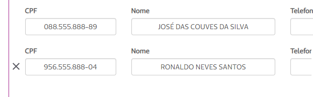
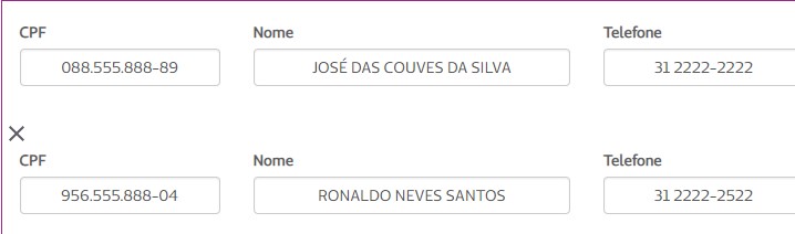
He shows himself so:

Problema

Code

The code of the button in question is:

<a href="#" class="icone-excluir"></a>

The code section you belong to is:

                    </div>
                        <div class="row">
                            <a href="#" class="icone-excluir"></a>
                        </div>
                    <div class="form-group row">
                        <div class="col-xs-2">
                            <label class="small" for="CPFSocio">CPF</label>
                            <input type="text" class="form-control text-center" id="CPFSocio" value="956.555.888-04"/>
                        </div>
                        <div class="col-xs-3">
                            <label class="small" for="NomeSocio">Nome</label>
                            <input type="text" class="form-control text-center" id="NomeSocio" value="RONALDO NEVES SANTOS"/>
                        </div>
                        <div class="col-xs-2">
                            <label class="small" for="TelefoneSocio">Telefone</label>
                            <input type="text" class="form-control text-center" id="TelefoneSocio" value="31 2222-2522"/>
                        </div>
                        <div class="col-xs-2">
                            <label class="small" for="CelularSocio">Celular</label>
                            <input type="text" class="form-control text-center" id="CelularSocio" value="31 99999-8999"/>
                        </div>
                        <div class="col-xs-3">
                            <label class="small" for="EmailSocio">E-mail</label>
                            <input type="text" class="form-control text-center" id="EmailSocio" value="[email protected]"/>
                        </div>
                        <div class="form-group row">
                        </div>
                    </div>

I’m starting now, so I don’t know how to play CSS and Bootstrap. If you can explain the solution within the HTML, I thank you.

EDIT: I was able to solve it this way:

                        <div class="col-xs-1" style="width: 2%; !important ">
                            <a href="#" class="icone-excluir"></a>
                        </div>

Since I didn’t know how to change the CSS, I changed the html and declared the style as Important to overwrite css in this case. :)

  • The same would be true if you follow the Official documentation of the BS3 Form, https://getbootstrap.com/docs/3.4/css/#Forms-inline only that as you have many fields in the same line will end up breaking the line, the ideal would be maybe you split these inputs into two form-groups or something like that... Or you can do it on the basis of the way suggested in the answers (not that they are wrong, but this is a problem of using frameworks, we almost always need these ways to make it work)

  • Are you using Bootstrap 3? How wide is this icon?

3 answers

0


The correct thing would be for you to provide the tag <a> next to <input>:

                <div class="form-group row">
                    <div class="col-xs-2">
                        <label class="small" for="CPFSocio">CPF</label>
                        <a href="#" class="icone-excluir"></a><input type="text" class="form-control text-center" id="CPFSocio" value="956.555.888-04"/>
                    </div>
                    <div class="col-xs-3">
                        <label class="small" for="NomeSocio">Nome</label>
                        <input type="text" class="form-control text-center" id="NomeSocio" value="RONALDO NEVES SANTOS"/>
                    </div>
                    <div class="col-xs-2">
                        <label class="small" for="TelefoneSocio">Telefone</label>
                        <input type="text" class="form-control text-center" id="TelefoneSocio" value="31 2222-2522"/>
                    </div>
                    <div class="col-xs-2">
                        <label class="small" for="CelularSocio">Celular</label>
                        <input type="text" class="form-control text-center" id="CelularSocio" value="31 99999-8999"/>
                    </div>
                    <div class="col-xs-3">
                        <label class="small" for="EmailSocio">E-mail</label>
                        <input type="text" class="form-control text-center" id="EmailSocio" value="[email protected]"/>
                    </div>
                    <div class="form-group row">
                    </div>
                </div>
  • @hugocsl how I put this visual effect as I did on the tag a and input?

  • `` I saw here, obg

  • 1

    That’s right puts the text between , or you select the text and click on that btn http://prntscr.com/mmmmto

  • I even tried to do it your way, but the X is in front of the input title, and it has to come to the left side of the input and not next to the title. :(

  • you need to apply CSS styling as the form is adapting to the Bootstrap classes.

  • I appreciate the help, I put an Edit in the question stating how I managed to solve. :)

Show 1 more comment

0

You are using a div class="row" and thus creating a line and leaving the "X" above the field. To solve is simple:

                <div class="form-group row">
                    <div class="col-xs-1 div-icone-excluir">
                       <a href="#" class="icone-excluir"></a>
                    </div>
                    <div class="col-xs-1">
                        <label class="small" for="CPFSocio">CPF</label>
                        <input type="text" class="form-control text-center" id="CPFSocio" value="956.555.888-04"/>
                    </div>
                    <div class="col-xs-3">
                        <label class="small" for="NomeSocio">Nome</label>
                        <input type="text" class="form-control text-center" id="NomeSocio" value="RONALDO NEVES SANTOS"/>
                    </div>
                    <div class="col-xs-2">
                        <label class="small" for="TelefoneSocio">Telefone</label>
                        <input type="text" class="form-control text-center" id="TelefoneSocio" value="31 2222-2522"/>
                    </div>
                    <div class="col-xs-2">
                        <label class="small" for="CelularSocio">Celular</label>
                        <input type="text" class="form-control text-center" id="CelularSocio" value="31 99999-8999"/>
                    </div>
                    <div class="col-xs-3">
                        <label class="small" for="EmailSocio">E-mail</label>
                        <input type="text" class="form-control text-center" id="EmailSocio" value="[email protected]"/>
                    </div>
                    <div class="form-group row">
                    </div>
                </div>

This way you just create a column in the same row as the fields. Leaving as wanted!

Edit 1

As the doubt "I had even tried this way, but the icon still remains at the top, this time aligned with the titles of the inputs and there is a huge space between the X and the first input":

You can manage with css:

div.div-icone-excluir{
    height: 10em;
    position: relative
}

div.div-icone-excluir a {
    margin: 0;
    position: absolute;
    top: 50%;
    left: 50%;
    margin-right: -50%;
    transform: translate(-50%, -50%)
}

Working with padding and margin you can fix that too.

  • I had even tried this way, but the icon still remains at the top, this time aligned with the titles of the inputs and there is a huge space between the X and the first input. I need the X to be aligned in the middle of the input and not have all that space at the beginning. :(

  • I appreciate the help, I put an Edit in the question stating how I managed to solve. :)

  • you can choose to use display: inline-block instead of position, so there is no need for much maneuvering for the expected result.

0

You can position the icon absolutely inside the form-group Row by simply adding a padding-left with a value slightly larger than the width of the icon and position with left and bottom. Important to add a z-index also so that the icon does not get underneath the Row.

You also need Row to have position: relative to accommodate the icon with position: absolute:

.container{
   background: #f5f5f5;
}

.row{
   position: relative;
}

.icone-excluir{
   position: absolute;
   left: 22px;
   bottom: 25px;
   width: 15px;
   height: 15px;
   display: inline-block;
   background-image: url(http://cdn.onlinewebfonts.com/svg/img_377892.png);
   background-size: contain;
   z-index: 1;
}

.p-left{
   padding-left: 32px;
}
<link href="https://maxcdn.bootstrapcdn.com/bootstrap/3.3.6/css/bootstrap.min.css" rel="stylesheet" />

<div class="container">
   <div class="row">
        <div class="form-group row p-left">
            <a href="#" class="icone-excluir"></a>
            <div class="col-xs-2">
                <label class="small" for="CPFSocio">CPF</label>
                <input type="text" class="form-control text-center" id="CPFSocio" value="956.555.888-04"/>
            </div>
            <div class="col-xs-3">
                <label class="small" for="NomeSocio">Nome</label>
                <input type="text" class="form-control text-center" id="NomeSocio" value="RONALDO NEVES SANTOS"/>
            </div>
            <div class="col-xs-2">
                <label class="small" for="TelefoneSocio">Telefone</label>
                <input type="text" class="form-control text-center" id="TelefoneSocio" value="31 2222-2522"/>
            </div>
            <div class="col-xs-2">
                <label class="small" for="CelularSocio">Celular</label>
                <input type="text" class="form-control text-center" id="CelularSocio" value="31 99999-8999"/>
            </div>
            <div class="col-xs-3">
                <label class="small" for="EmailSocio">E-mail</label>
                <input type="text" class="form-control text-center" id="EmailSocio" value="[email protected]"/>
            </div>
            <div class="form-group row">
            </div>
        </div>
    </div>
</div>

  • I appreciate the help, I put an Edit in the question stating how I managed to solve. :)

Browser other questions tagged

You are not signed in. Login or sign up in order to post.