Help with css animation!

Asked

Viewed 91 times

1

Does anyone know how I can animar the passage of dashboard for the menu? Menu are the 3 dashes of the app and Dashboard is what appears when the code runs! Just a little animation !

CSS | HTML

body{
  margin-left: 0px;
  margin-right: 0px;
  margin-top: 0px;
  margin-bottom: 0px;
  background: #252C35;
  color: white;
}

#UpperBar{
  height: 45px;
}

.MASlime{
  position: absolute;
  font-size: 30px;
  top: 1px;
  left: 40px;
}

#Totals{
  position: absolute;
  font-size: 30px;
}

.Total{
  position: absolute;
  top: 70px;
  left: 130px;
}

.TotalEarnings{
  position: absolute;
  top: 70px;
  left: 200px;
}

.TotalO{
  position: absolute;
  top: 140px;
  left: 130px;
}

.TotalOrders{
  position: absolute;
  top: 140px;
  left: 200px;
}

#Earnings{
  position: absolute;
  top: 70px;
  left: 350px;
}

#Orders{
  position: absolute;
  top: 140px;
  left: 350px;
}

.NewOrder{
  position: absolute;
  top: 250px;
  left: 200px;
  font-size: 30px;
}

.OrderName{
  position: absolute;
  top: 350px;
  left: 140px;
  width: 250px;
  height: 25px;
  background-color: #252C35;
  color: white;
  border: 1px;
  border-style: solid;
  border-radius: 5px;
  border-color: white;
  padding: 5px;
}

.OrderDate{
  position: absolute;
  top: 400px;
  left: 140px;
  width: 250px;
  height: 25px;
  background-color: #252C35;
  color: white;
  border: 1px;
  border-style: solid;
  border-radius: 5px;
  border-color: white;
  padding: 5px;
}

.SKU{
  position: absolute;
  top: 450px;
  left: 140px;
  width: 250px;
  height: 25px;
  background-color: #252C35;
  color: white;
  border: 1px;
  border-style: solid;
  border-radius: 5px;
  border-color: white;
  padding: 5px;
}

.SUBMIT{
  position: absolute;
  top: 500px;
  left: 220px;
  width: 100px;
  height: 40px;
  background-color: #252C35;
  color: white;
  border: 1px;
  border-style: solid;
  border-radius: 5px;
  border-color: white;
  padding: 5px;
}

.Menu{
  position: absolute;
  top: 25px;
  left: 480px;
  font-size: 30px;
  cursor: pointer;
}

.menu{
  text-align: center;
  width: 100%;
  display: none;
}

.menu a{
  display: block;
  border-bottom: 1px solid #EAEAED;
  text-decoration: none;
  color: white;
  margin-top: 100px;
  padding-bottom: 10px;
  font-size: 30px;
  background: #252C35;
}

.All{
  display: block;
}

#toggle{
  display: none;
}

#toggle:checked + .menu{
  display: block;
}
<!DOCTYPE html>
<html lang="en" dir="ltr">
  <head>
    <meta charset="utf-8">
    <title>EComerce App Slime</title>
    <link rel="stylesheet" href="css/index.css">
  </head>
  <body>
    <div id="menu">
      <label for="toggle" class="Menu">&#9776;</label>
      <input type="checkbox" id="toggle" onclick="meuMenuToggle()"/>
      <div class="menu">
          <a href="#">Slime Recipe</a>
      </div>
    </div>
    <div id="UpperBar">
      <p class="MASlime">MASlime</p>
    </div>
      <div id="HomePage">
        <div id="Totals">
          <p class="Total">Total</p>
          <p class="TotalEarnings">Earnings</p>
          <p class="TotalO">Total</p>
          <p class="TotalOrders">Orders</p>
          <p id="Earnings">100€</p>
          <p id="Orders">1</p>
        </div>
        <div id="NewOrder">
          <p class="NewOrder">New Order</p>
          <form id="OrderForm">
            <input class="OrderName" type="text" name="OrderName" placeholder="Buyer Name" required>
            <input class="OrderDate" type="text" name="OrderDate" placeholder="Date of Order" required>
            <input class="SKU" type="text" name="ProductSKU" placeholder="Product SKU" required>
            <input class="SUBMIT" type="button" name="Submit" value="SUBMIT">
          </form>
        </div>
    </div>
    <script>
    function meuMenuToggle() {
      var x = document.getElementById("HomePage");
      if (x.style.display === "none") {
        x.style.display = "block";
      } else {
        x.style.display = "none";
      }
    }
    </script>
    <script src="js/index.js"></script>
  </body>
</html>

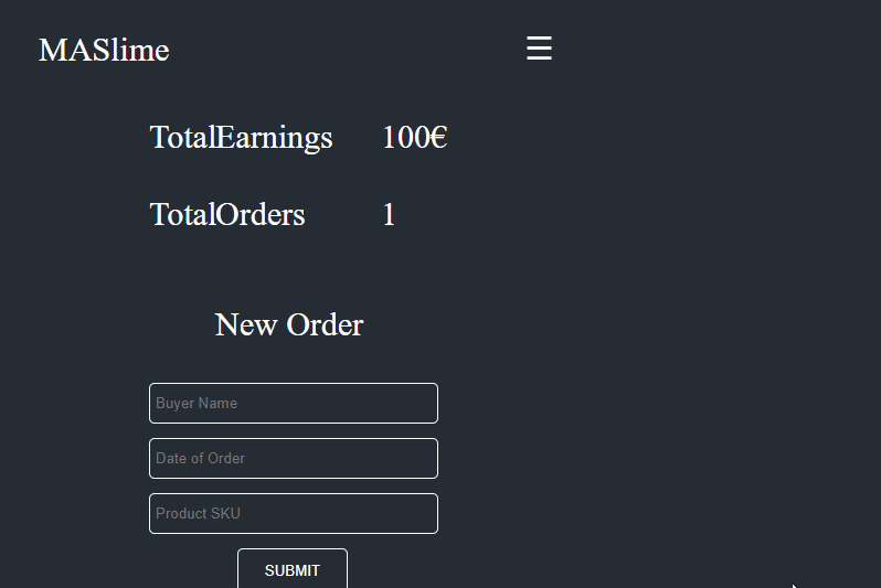
  • Use the Greensock library, it is normally used for such animations, here’s a tutorial - https://youtu.be/dzz8kigJqvs

  • @Pona I’ll try it! However if you want to give up I’d appreciate it very much!

  • Animate type what? Make a transparency transition? Appear coming from the left, take a loop on the screen? You need to give more details...

  • You use Jquery in your code?

  • @Eliseub. I don’t use much jquery!

  • But is there? Because it doesn’t need a lot of jquery, or complexity for what you need, maybe 3 lines.

Show 2 more comments

2 answers

4

Follow a CSS-only option

inserir a descrição da imagem aqui

I used two techniques, the div .backdrop that covers the content I used transition, already the menu list that appears at the top I used a @keyframes with an animation of opacity.

body {
  margin-left: 0px;
  margin-right: 0px;
  margin-top: 0px;
  margin-bottom: 0px;
  background: #252C35;
  color: white;
}

#UpperBar {
  height: 45px;
  top: 1px;
  left: 40px;
  position: absolute;
  z-index: 2;
}

.MASlime {
  position: absolute;
  font-size: 30px;
}

#Totals {
  position: absolute;
  font-size: 30px;
}

.Total {
  position: absolute;
  top: 80px;
  left: 140px;
}

.TotalEarnings {
  position: absolute;
  top: 80px;
  left: 200px;
}

.TotalO {
  position: absolute;
  top: 150px;
  left: 140px;
}

.TotalOrders {
  position: absolute;
  top: 150px;
  left: 200px;
}

#Earnings {
  position: absolute;
  top: 80px;
  left: 350px;
}

#Orders {
  position: absolute;
  top: 150px;
  left: 350px;
}

.NewOrder {
  position: absolute;
  top: 250px;
  left: 200px;
  font-size: 30px;
}

.OrderName {
  position: absolute;
  top: 350px;
  left: 140px;
  width: 250px;
  height: 25px;
  background-color: #252C35;
  color: white;
  border: 1px;
  border-style: solid;
  border-radius: 5px;
  border-color: white;
  padding: 5px;
}

.OrderDate {
  position: absolute;
  top: 400px;
  left: 140px;
  width: 250px;
  height: 25px;
  background-color: #252C35;
  color: white;
  border: 1px;
  border-style: solid;
  border-radius: 5px;
  border-color: white;
  padding: 5px;
}

.SKU {
  position: absolute;
  top: 450px;
  left: 140px;
  width: 250px;
  height: 25px;
  background-color: #252C35;
  color: white;
  border: 1px;
  border-style: solid;
  border-radius: 5px;
  border-color: white;
  padding: 5px;
}

.SUBMIT {
  position: absolute;
  top: 500px;
  left: 220px;
  width: 100px;
  height: 40px;
  background-color: #252C35;
  color: white;
  border: 1px;
  border-style: solid;
  border-radius: 5px;
  border-color: white;
  padding: 5px;
}

.Menu {
  position: absolute;
  top: 25px;
  left: 480px;
  font-size: 30px;
  cursor: pointer;
  z-index: 3;
}

.menu {
  text-align: center;
  width: 100%;
  z-index: 3;


  position: relative;
  /* transition: all 500ms; */
  /* transform-origin: top; */
  /* transform: scaleY(0); */

  display: none;

}

.menu a {
  display: block;
  border-bottom: 1px solid #EAEAED;
  text-decoration: none;
  color: white;
  margin-top: 70px;
  padding-bottom: 10px;
  font-size: 30px;
  background: #252C35;

  z-index: 3;
  position: relative;
}

.All {
  display: block;
}

#toggle {
  display: none;
}

#toggle:checked+.menu {
  /* transform: scaleY(1); */
  display: block;
  animation: teste 500ms linear;
}

@keyframes teste {
  0% {
    opacity: 0;
  }

  100% {
    opacity: 1;
  }
}

#toggle:checked~.backdrop {
  height: 100%;
}

#toggle:checked~.All {
  /* display: none; */
}

.backdrop {
  position: fixed;
  width: 100%;
  height: 0%;
  background-color: #252C35;
  top: 0;
  left: 0;
  z-index: 1;
  transform-origin: top;
  transition: all 250ms;
}

#menu {
  /* position: relative; */
  z-index: 3;
}
<div id="menu">
    <label for="toggle" class="Menu">&#9776;</label>
    <input type="checkbox" id="toggle" />
    <div class="menu">
        <a href="#">Slime Recipe</a>
    </div>
    <div class="backdrop"></div>
</div>
<div id="UpperBar">
    <p class="MASlime">MASlime</p>
</div>
<div class="All">
    <div id="HomePage">
        <div id="Totals">
            <p class="Total">Total</p>
            <p class="TotalEarnings">Earnings</p>
            <p class="TotalO">Total</p>
            <p class="TotalOrders">Orders</p>
            <p id="Earnings">100€</p>
            <p id="Orders">1</p>
        </div>
        <div id="NewOrder">
            <p class="NewOrder">New Order</p>
            <form id="OrderForm">
                <input class="OrderName" type="text" name="OrderName" placeholder="Buyer Name" required>
                <input class="OrderDate" type="text" name="OrderDate" placeholder="Date of Order" required>
                <input class="SKU" type="text" name="ProductSKU" placeholder="Product SKU" required>
                <input class="SUBMIT" type="button" name="Submit" value="SUBMIT">
            </form>
        </div>
    </div>
</div>

  • I could give +1 in the publication ! Apparently I was ban the stack until I get a better point in the publications! Very good your work!

  • @Deadsec Whenever you ask, or answer, try to give the details of everything you used, the error you had, and what you need, always include the correct tags, code, and if possible images. In time you will be able to participate again, the Moderators are usually very careful to maintain the quality of the questions and answer. Ma qq thing says there that I try to help you

  • Thanks to the people who gave up I could ask again and I’m trying as hard as I can to make my questions clear !

  • @Deadsec, it’s not just you. Always try to explain what you tried to do and where you had the problem, include the code I got and explain how you would like to solve the problem etc... Soon you’ll be back ;)

2


I made an example just to demonstrate how it can be done using Javascript:

var home = document.getElementById('HomePage');
var menu = document.getElementsByClassName('menu')[0];
menu.style.display = 'none';

document.getElementById('toggle').onclick = () => {

  if (menu.style.display == 'none') setTimeout(fadeMenu, 150);
  else if(menu.style.display == 'block') setTimeout(fadeHome, 150);
}

function fadeMenu() {
  home.style.display = 'none';
  menu.classList.add('fadeIn');
  menu.style.display =  'block';
}

function fadeHome() {
  home.style.display = 'block';
  home.classList.add('fadeIn');
  menu.style.display = 'none';
}
body {
  margin-left: 0px;
  margin-right: 0px;
  margin-top: 0px;
  margin-bottom: 0px;
  background: #252C35;
  color: white;
}

#UpperBar {
  height: 45px;
}

.MASlime {
  position: absolute;
  font-size: 30px;
  top: 1px;
  left: 40px;
}

#Totals {
  position: absolute;
  font-size: 30px;
}

.Total {
  position: absolute;
  top: 70px;
  left: 130px;
}

.TotalEarnings {
  position: absolute;
  top: 70px;
  left: 200px;
}

.TotalO {
  position: absolute;
  top: 140px;
  left: 130px;
}

.TotalOrders {
  position: absolute;
  top: 140px;
  left: 200px;
}

#Earnings {
  position: absolute;
  top: 70px;
  left: 350px;
}

#Orders {
  position: absolute;
  top: 140px;
  left: 350px;
}

.NewOrder {
  position: absolute;
  top: 250px;
  left: 200px;
  font-size: 30px;
}

.OrderName {
  position: absolute;
  top: 350px;
  left: 140px;
  width: 250px;
  height: 25px;
  background-color: #252C35;
  color: white;
  border: 1px;
  border-style: solid;
  border-radius: 5px;
  border-color: white;
  padding: 5px;
}

.OrderDate {
  position: absolute;
  top: 400px;
  left: 140px;
  width: 250px;
  height: 25px;
  background-color: #252C35;
  color: white;
  border: 1px;
  border-style: solid;
  border-radius: 5px;
  border-color: white;
  padding: 5px;
}

.SKU {
  position: absolute;
  top: 450px;
  left: 140px;
  width: 250px;
  height: 25px;
  background-color: #252C35;
  color: white;
  border: 1px;
  border-style: solid;
  border-radius: 5px;
  border-color: white;
  padding: 5px;
}

.SUBMIT {
  position: absolute;
  top: 500px;
  left: 220px;
  width: 100px;
  height: 40px;
  background-color: #252C35;
  color: white;
  border: 1px;
  border-style: solid;
  border-radius: 5px;
  border-color: white;
  padding: 5px;
}

.Menu {
  position: absolute;
  top: 25px;
  left: 480px;
  font-size: 30px;
  cursor: pointer;
}

.menu {
  text-align: center;
  width: 100%;
}

.menu a {
  display: block;
  border-bottom: 1px solid #EAEAED;
  text-decoration: none;
  color: white;
  margin-top: 100px;
  padding-bottom: 10px;
  font-size: 30px;
  background: #252C35;
}

.All {
  display: block;
}

#toggle {
  display: none;
}

.fadeIn {
  animation: fadein 1.3s ease-in;
}

@keyframes fadein {
  0% { opacity: 0; }
  25% { opacity: 0.3; }
  50% { opacity: 0.5; }
  75% { opacity: 0.8; }
  100% { opacity: 1; }
}
<div id="menu">
  <label for="toggle" class="Menu">&#9776;</label>
  <input type="checkbox" id="toggle" />
  <div class="menu">
    <a href="#">Slime Recipe</a>
  </div>
</div>
<div id="UpperBar">
  <p class="MASlime">MASlime</p>
</div>
<div id="HomePage">
  <div id="Totals">
    <p class="Total">Total</p>
    <p class="TotalEarnings">Earnings</p>
    <p class="TotalO">Total</p>
    <p class="TotalOrders">Orders</p>
    <p id="Earnings">100€</p>
    <p id="Orders">1</p>
  </div>
  <div id="NewOrder">
    <p class="NewOrder">New Order</p>
    <form id="OrderForm">
      <input class="OrderName" type="text" name="OrderName" placeholder="Buyer Name" required>
      <input class="OrderDate" type="text" name="OrderDate" placeholder="Date of Order" required>
      <input class="SKU" type="text" name="ProductSKU" placeholder="Product SKU" required>
      <input class="SUBMIT" type="button" name="Submit" value="SUBMIT">
    </form>
  </div>
</div>

  • 1

    Without needing jQuery very good

  • 1

    Oops, thank you Hugo!

  • I could give +1 in the publication ! Apparently I was ban the stack until I hit better points in the publications!

Browser other questions tagged

You are not signed in. Login or sign up in order to post.