-5
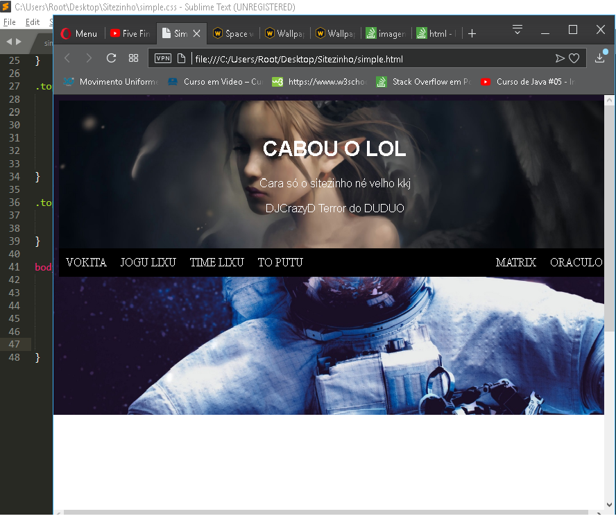
I’d like to take out that "leftover" white in window mode. I’m new at this, any help is welcome.
body {
    background-image: url(IMGS/img08.jpg);
    background-repeat: no-repeat;
    background-size: 100%;
    background-attachment: fixed;
}
-5
I’d like to take out that "leftover" white in window mode. I’m new at this, any help is welcome.
body {
background-image: url(IMGS/img08.jpg);
background-repeat: no-repeat;
background-size: 100%;
background-attachment: fixed;
}
1
When using the property background-size: 100% you are setting that the width of the background image will occupy the entire width of the body. This is because the property background-size may have two values:
background-size: largura altura
                    ↑      ↑
               1º valor   2º valor
In his case, only the width was set at 100% (1st value). Thus, if the height of the window is greater than the height of the image, the image will not take up the entire vertical space.
You could use a second value (height) at 100%, but that would break the image ratio (Aspect ratio): background-size: 100% 100%;
What you have to do is use the value cover:
background-size: cover;
The cover will cover the entire body area to full height, but you can cut a right side of the background image because it will increase the image to the height of the window, keeping the image aspect.
So, if you like, you can use another property to keep the image centered, because, if there is a cut on the sides, they are the same on the left and right side, and not just on the right side:
background-position: center;
Soon your style will be:
body {
    background-image: url(IMGS/img08.jpg);
    background-repeat: no-repeat;
    background-size: cover;
    background-position: center;
    background-attachment: fixed;
}
-1
html, body {
  height: 100%;
  margin: 0;
}

#elementoPrincipal {
  height: 100%;
}

#elementoSuperior {
  background-color: #505050;
  height: 30%;
  display: block;
}

#elementoInferior {
  background-color: #707070;
  height: 70%;
  display: block;
}
<html>
<body>
<div id="elementoPrincipal">
<div id="elementoSuperior"></div>
<div id="elementoInferior"></div>
</div>
</body>
</html>Apparently, the total height of the element with the background is failing to 'stretch' up to the height of the window: do the following:
If you gave some example of how your code is (HTML and CSS), it would facilitate.
-1
So friend,
You can follow and structure your background image using the header or div, as below:
body {
  height: 100vh;
  margin: 0;
  padding: 0;
}

.header {
  background: url(https://www.altoastral.com.br/wp-content/uploads/2016/05/paisagem.jpg) no-repeat center center/cover;
  height: 100vh;
}
<header class="header">
</header>Enter your code as soon as this space will disappear. Up until.
Thank you very much.
Did it work, bro? If so, mark as correct the answer to contribute to others who will have similar problems in the future :D
Browser other questions tagged css
You are not signed in. Login or sign up in order to post.
My dear friend, please quickly edit the question, for example, put the HTML structure that references that banner you want to set up. Okay? I already make a quick code to help you ^^
– Lougans de Matos
Hey, I know you’re new but don’t insert an image as a direct background into the body. Create a tag first
headeror adivnormal because then you can set the size you want. Then inside these tags Voce puts the background-image, ok?– Lougans de Matos