As you said you were using Bootstrap 3 I made this model based on Navbar original of framework.
Briefly there are some pseudo-elements with positions and transform. I recommend that you study the details in the CSS code to understand what was done.
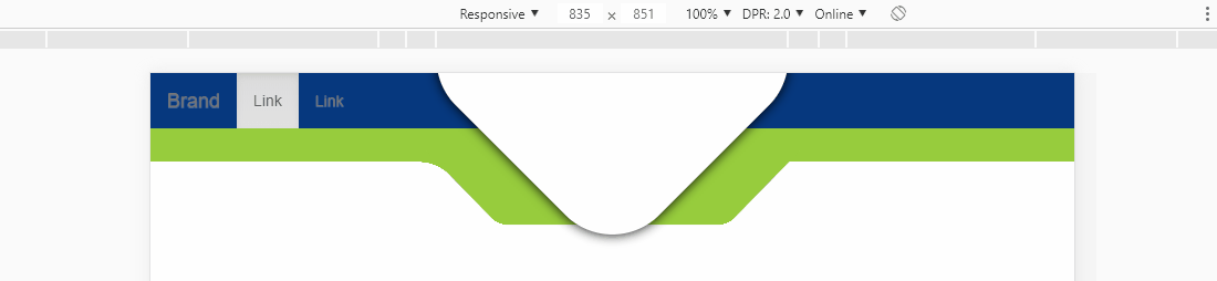
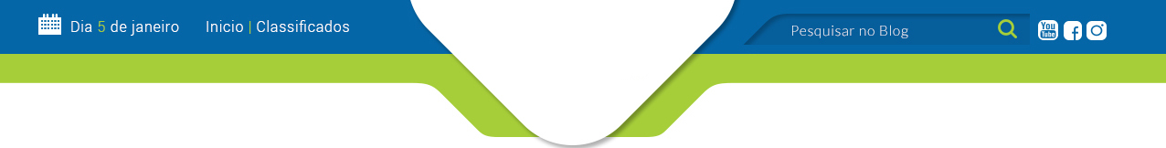
The white element is a square built into a pseudo-element in own nabvar, it was rotated 45deg, with a border-radius and aligned in the center of the navbar
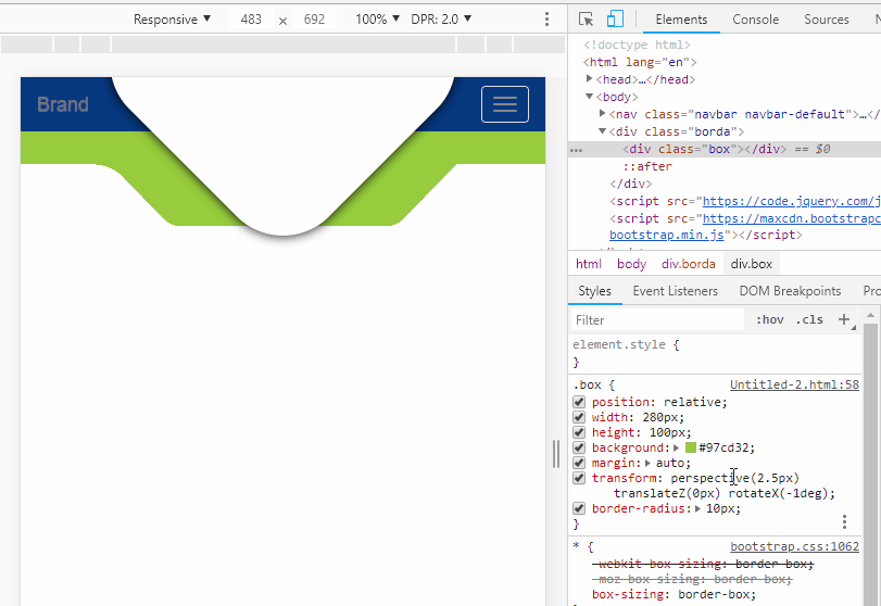
The green bar has a box inside, that box was lined up in the middle of the bar with margim and then I used property to transform the element transform: perspective(2.5px) rotateX(-1deg); Notice that adjusting the perspective you adjust the angle of the sides of the box
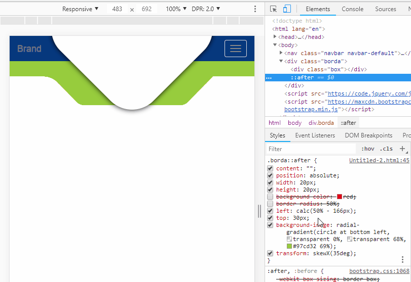
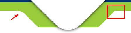
Already to make the curvature that at the junction of the box with the bar I used a pseudo-element ::after, esse::afterna verdade é um quadrado com um radial-gradiente que vai do transparente para a mesma cor de fundo da barra, o verde, nessa imagem eu coloquei vermelho para vc entender melhor como é o elemento. Depois eu coloquei umTransform: skewX(35deg);para ajustar esse elemento com o mesmo angulo da lateral dobox` and get everything right.
Follow the image code above.
OBS1: It may be that you need to do a responsive treatment for mobile screens, my recommendation is to give a display:none in all these "allegorical elements"
OBS2: Leave the curvature on the left side for you to do and see for yourself how it was all assembled
<!DOCTYPE html>
<html lang="en">
<head>
    <meta charset="utf-8" />
    <meta http-equiv="X-UA-Compatible" content="IE=edge">
    <title>Page Title</title>
    <meta name="viewport" content="width=device-width, initial-scale=1">
    <link rel="stylesheet" type="text/css" media="screen" href="https://maxcdn.bootstrapcdn.com/bootstrap/3.3.7/css/bootstrap.min.css" />
    <link rel="stylesheet" type="text/css" media="screen" href="https://maxcdn.bootstrapcdn.com/bootstrap/3.3.7/css/bootstrap-theme.min.css" />
    <link rel="stylesheet" type="text/css" media="screen" href="https://maxcdn.bootstrapcdn.com/font-awesome/4.7.0/css/font-awesome.min.css" />
<style>
.navbar-default {
    background-image: none;
    background-color: #003780;
    box-shadow: none;
    border: none;
    margin-bottom: 0;
    border-radius: 0;
    position: relative;
    z-index: 2
}
.navbar-default::after {
    content: "";
    width: 260px;
    height: 260px;
    border-radius: 60px;
    box-shadow: 0 0 16px black;
    transform: rotate(45deg) translate(-88%, -17%);
    transform-origin: center;
    background-color: #ffffff;
    position: absolute;
    left: 50%;
}

.borda {
    top: 50px;
    left: 0;
    width: 100%;
    height: 30px;
    background-color: #97cd32;
    position: absolute;
    z-index: 1;
}

.borda::after {
    content: "";
    position: absolute;
    width: 20px;
    height: 20px;
    /* background-color: red; */
    /* border-radius: 50%; */
    left: calc(50% - 166px);
    top: 30px;
    background-image: radial-gradient(circle at bottom left, transparent 0%, transparent 68%, #97cd32 69%);
    transform: skewX(35deg);
}

.box {
    position:relative;
    width: 280px;
    height: 100px;
    background: #97cd32;
    margin: auto;
    transform: perspective(2.5px) rotateX(-1deg);
    border-radius: 10px;
}

</style>
</head>
<body>

<nav class="navbar navbar-default">
    <div class="container-fluid">
        <!-- Brand and toggle get grouped for better mobile display -->
        <div class="navbar-header">
        <button type="button" class="navbar-toggle collapsed" data-toggle="collapse" data-target="#bs-example-navbar-collapse-1" aria-expanded="false">
            <span class="sr-only">Toggle navigation</span>
            <span class="icon-bar"></span>
            <span class="icon-bar"></span>
            <span class="icon-bar"></span>
        </button>
        <a class="navbar-brand" href="#">Brand</a>
        </div>

        <!-- Collect the nav links, forms, and other content for toggling -->
        <div class="collapse navbar-collapse" id="bs-example-navbar-collapse-1">
        <ul class="nav navbar-nav">
            <li class="active"><a href="#">Link <span class="sr-only">(current)</span></a></li>
            <li><a href="#">Link</a></li>
        </ul>
        </div><!-- /.navbar-collapse -->
    </div><!-- /.container-fluid -->
</nav>
<div class="borda">
    <div class="box"></div>
</div>

    <script src="https://code.jquery.com/jquery-3.2.1.min.js"></script>
    <script src="https://maxcdn.bootstrapcdn.com/bootstrap/3.3.7/js/bootstrap.min.js"></script>
</body>
</html>
And I just asked for tips. I had just discovered that the triangle is actually a square with rounded edges and a 45-degree turn. Now from the green bar, I will study your code to learn how to do. Thank you very much.
– Carlos Fagiani Jr
@Carlosfagianijr me a square same rss, in the green bar has a rectangle, only rotated with rss perspective. If you doubt any detail
– hugocsl
you can be sure that I am reading and learning from your code, even if I have to do it in the footer, only reversed.
– Carlos Fagiani Jr