Separate Tables in Columns using HTML

Asked

Viewed 1,050 times

2

I need to distribute 10 tables in 2 columns of 5 for display.

How can I do this distribution or separate the tables from the example below by a space or something similar?

<HTML>
<BODY>
<style type="text/css">
body {
  font: 75%/1.6 "Myriad Pro", Frutiger, "Lucida Grande", "Lucida Sans", "Lucida Sans Unicode", Verdana, sans-serif;
}
table {
  border-collapse: collapse;
  width: 35em;
  border: 1px solid #666;
}
thead {
  background: #ccc url(https://www.devfuria.com.br/html-css/tabelas/bar.gif) repeat-x left center;
  border-top: 1px solid #a5a5a5;
  border-bottom: 1px solid #a5a5a5;
}
tr:hover {
  background-color:#3d80df;
  color: #fff;
}
thead tr:hover {
  background-color: transparent;
  color: inherit;
}
tr:nth-child(even) {
    background-color: #edf5ff;
}
th {
  font-weight: normal;
  text-align: left;
}
th, td {
  padding: 0.1em 1em;
}
</style>
    <div style="float:left;">
        <table id="Programa1">
            <thead>
                <tr>    
                    <th></th> 
                    <th colspan="3">Programa</th>
                </tr>
            </thead>
            <tbody>
                <tr>
                    <td>1</td>
                    <td>Saude</td>
                    <td colspan="3"></td>
                </tr>
                <tr>
                    <td>2</td>
                    <td></td>
                    <td></td>
                </tr> 
            </tbody>
        </table>
</div>
<div style="float:left;">
        <table id="Programa2">
            <thead>
                <tr>    
                    <th></th> 
                    <th colspan="3">Programa</th>
                </tr>
            </thead>
            <tbody>
                <tr>
                    <td>1</td>
                    <td>Saude</td>
                    <td colspan="3"></td>
                </tr>
                <tr>
                    <td>2</td>
                    <td></td>
                    <td></td>
                </tr> 
            </tbody>
        </table>
</div>
</BODY>
</HTML>
  • 1

    I’m sorry, I didn’t understand your question, could you explain?

  • You just want to keep the tables separate from each other?

  • I need to display 10 tables, I want to display 5 on the left and 5 on the right. Basically that would be it.

  • The easiest method, what I have achieved so far is to let them side by side, but then they stick together, so if you can separate with a space already solves my problem.

3 answers

2

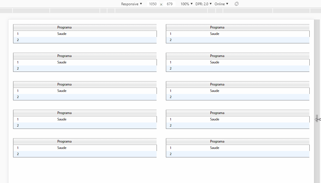
You can use display:flex in a container father of divs that will be with the table inside, so you leave the table with 100% of the width of this div, whereas the div which will have the table inside is 50% of the father’s width, so you will have 2 columns of 50% in the container father.

inserir a descrição da imagem aqui

OBS: I just adjusted the columns of the most CSS stuff I didn’t move, and apart from the container parent does not include anything in your HTML, but remember to change the name of IDs of each table when editing content

EDITE: Includes a table that occupies 100% of the width of container. For that I created a class w100 with width 100% and put in div .box box.

Follow the image code above:

html, body {
    width: 100%;
    height: 100%;
    margin: 0;
    padding: 0;
}
body {
    font: 75%/1.6 "Myriad Pro", Frutiger, "Lucida Grande", "Lucida Sans", "Lucida Sans Unicode", Verdana, sans-serif;
}

table {
    border-collapse: collapse;
    width: 100%;
    border: 1px solid #666;
}

thead {
    background: #ccc url(https://www.devfuria.com.br/html-css/tabelas/bar.gif) repeat-x left center;
    border-top: 1px solid #a5a5a5;
    border-bottom: 1px solid #a5a5a5;
}

tr:hover {
    background-color: #3d80df;
    color: #fff;
}

thead tr:hover {
    background-color: transparent;
    color: inherit;
}

tr:nth-child(even) {
    background-color: #edf5ff;
}

th {
    font-weight: normal;
    text-align: left;
}

th,
td {
    padding: 0.1em 1em;
}
.container {
    display: flex;
    flex-wrap: wrap;
}
.box {
    box-sizing: border-box;
    padding: 1rem;
    width: 50%;
}
.box.w100 {
    width: 100%;
}
<div class="container">
    <div class="box">
        <table id="Programa1">
            <thead>
                <tr>
                    <th></th>
                    <th colspan="3">Programa</th>
                </tr>
            </thead>
            <tbody>
                <tr>
                    <td>1</td>
                    <td>Saude</td>
                    <td colspan="3"></td>
                </tr>
                <tr>
                    <td>2</td>
                    <td></td>
                    <td></td>
                </tr>
            </tbody>
        </table>
    </div>
    <div class="box">
        <table id="Programa2">
            <thead>
                <tr>
                    <th></th>
                    <th colspan="3">Programa</th>
                </tr>
            </thead>
            <tbody>
                <tr>
                    <td>1</td>
                    <td>Saude</td>
                    <td colspan="3"></td>
                </tr>
                <tr>
                    <td>2</td>
                    <td></td>
                    <td></td>
                </tr>
            </tbody>
        </table>
    </div>

<div class="box w100">
        <table id="Programa2">
            <thead>
                <tr>
                    <th></th>
                    <th colspan="3">Programa</th>
                </tr>
            </thead>
            <tbody>
                <tr>
                    <td>1</td>
                    <td>Saude</td>
                    <td colspan="3"></td>
                </tr>
                <tr>
                    <td>2</td>
                    <td></td>
                    <td></td>
                </tr>
            </tbody>
        </table>
    </div>

</div>

  • Thank you very much, I believe that this should already solve my problem. Now I will fix the names and assign the features. Thank you very much for the help!

  • @Good luck with the project. Then if you think any question solved your problem Check it as accepted in this icon next to the arrows of the question you choose. []s

  • Good morning, I will use the example of the container, but I came up with a question, in case I insert out of this layout one more table, this consuming the whole screen, below these 10 already made, would it be possible? Maybe you need to change the CSS?

  • @Guilhermemontagnani is very quiet, just you create a class like this .w100 {width:100%} You put this class in the div box, it would look like this: <div class="box w100">. This way this table is 100% wide. Test there and thing tells me

  • I could not make it work, the table remains at 50%. I inserted it in the last line of the CSS: } . W100 { width:100% } </style> <div class="box W100"> <table id="Program1">.... (Remainder of table)

  • In case my box is referencing 50%, maybe what I should do is create two more classes? a 50% and a 100% and reference to each table which I want to use? I’ll do some tests here. Thanks for the help.

  • @Guilhermemontagnani made a EDITE in response, a read there, tb already updated the code with the example running and a box with 100% width

  • 1

    Thank you very much, I’m still not able to include this in the code I was using, but with the example you posted worked, I will base myself on it and make the other changes. Thanks again for the help!

Show 3 more comments

1

To separate the tables in a horizontal X space, you can put a DIV in the middle of the other two DIVs existing. See the example below where I took X by 2.5em:

<div style="float:left;">
    <table id="Programa1">
    ...
</div>

<div style="float: left; padding: 2.5em;"></div>

<div style="float:left;">
...

Stay like this:

inserir a descrição da imagem aqui

So you don’t have to worry about spacing DIVs that matter. It will not affect the later size and the final calculation is easy.

  • 1

    That I had tried but it had not worked. I must have made a mistake in the syntax, I will try again. Thanks a lot for the help.

  • 1

    It worked that way too. Thank you very much.

  • @Guilhermemontagnani has to wear padding since width is expandable with the content. And because it has zero content, the width effective stays 0. It may be that this is what you had trouble trying before the question.

  • 1

    Got it, Thank you so much again.

0


This code makes responsive tables, which fit the screen of mobile phones!

Understanding:

We created the class. divTab which has a size of 50% of the screen of any device, the table will stick to the wdt of 95% to pick up the margins and stay separate.

.divTab{
  float: left;
  width: 50%;
}
table {
  margin: 5px !important;
  width:95%;
  margin: 5px !important;
  border: 1px solid #666;
}

Here we set the resolution of the mobile phone or tablet, for tables to be responsive.

@media only screen and (max-width: 600px) {
  .divTab{
  float: none;
  width: 100%;
  }
  table {
  width:100%;
}
}

<HTML>
<BODY>
<style type="text/css">
body {
  font: 75%/1.6 "Myriad Pro", Frutiger, "Lucida Grande", "Lucida Sans", "Lucida Sans Unicode", Verdana, sans-serif;
}
.divTab{
  float: left;
  width: 50%;
}
table {
  margin: 5px !important;
  width:95%;
  margin: 5px !important;
  border: 1px solid #666;
}
thead {
  background: #ccc url(https://www.devfuria.com.br/html-css/tabelas/bar.gif) repeat-x left center;
  border-top: 1px solid #a5a5a5;
  border-bottom: 1px solid #a5a5a5;
}
tr:hover {
  background-color:#3d80df;
  color: #fff;
}
thead tr:hover {
  background-color: transparent;
  color: inherit;
}
tr:nth-child(even) {
    background-color: #edf5ff;
}
th {
  font-weight: normal;
  text-align: left;
}
th, td {
  padding: 0.1em 1em;
}

@media only screen and (max-width: 600px) {
  .divTab{
  float: none;
  width: 100%;
  }
  table {
  width:100%;
}
}
</style>
    <div class="divTab">
        <table id="Programa1">
            <thead>
                <tr>    
                    <th></th> 
                    <th colspan="3">Programa</th>
                </tr>
            </thead>
            <tbody>
                <tr>
                    <td>1</td>
                    <td>Saude</td>
                    <td colspan="3"></td>
                </tr>
                <tr>
                    <td>2</td>
                    <td></td>
                    <td></td>
                </tr> 
            </tbody>
        </table>
</div><div class="divTab" >
        <table id="Programa2">
            <thead>
                <tr>    
                    <th></th> 
                    <th colspan="3">Programa</th>
                </tr>
            </thead>
            <tbody>
                <tr>
                    <td>1</td>
                    <td>Saude</td>
                    <td colspan="3"></td>
                </tr>
                <tr>
                    <td>2</td>
                    <td></td>
                    <td></td>
                </tr> 
            </tbody>
        </table>
</div>
<div class="divTab" >
        <table id="Programa2">
            <thead>
                <tr>    
                    <th></th> 
                    <th colspan="3">Programa</th>
                </tr>
            </thead>
            <tbody>
                <tr>
                    <td>1</td>
                    <td>Saude</td>
                    <td colspan="3"></td>
                </tr>
                <tr>
                    <td>2</td>
                    <td></td>
                    <td></td>
                </tr> 
            </tbody>
        </table>
</div>

</BODY>
</HTML>

  • For the moment it is not necessary a responsive function, the first examples already supply my need. But thank you very much, I really liked the tip and I’m sure it will be very useful in other projects. Thanks for the help.

Browser other questions tagged

You are not signed in. Login or sign up in order to post.