0
So,
I’m dealing with bootstrap, html and css.
I need to align two columns and have the items align to each other this way:
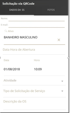
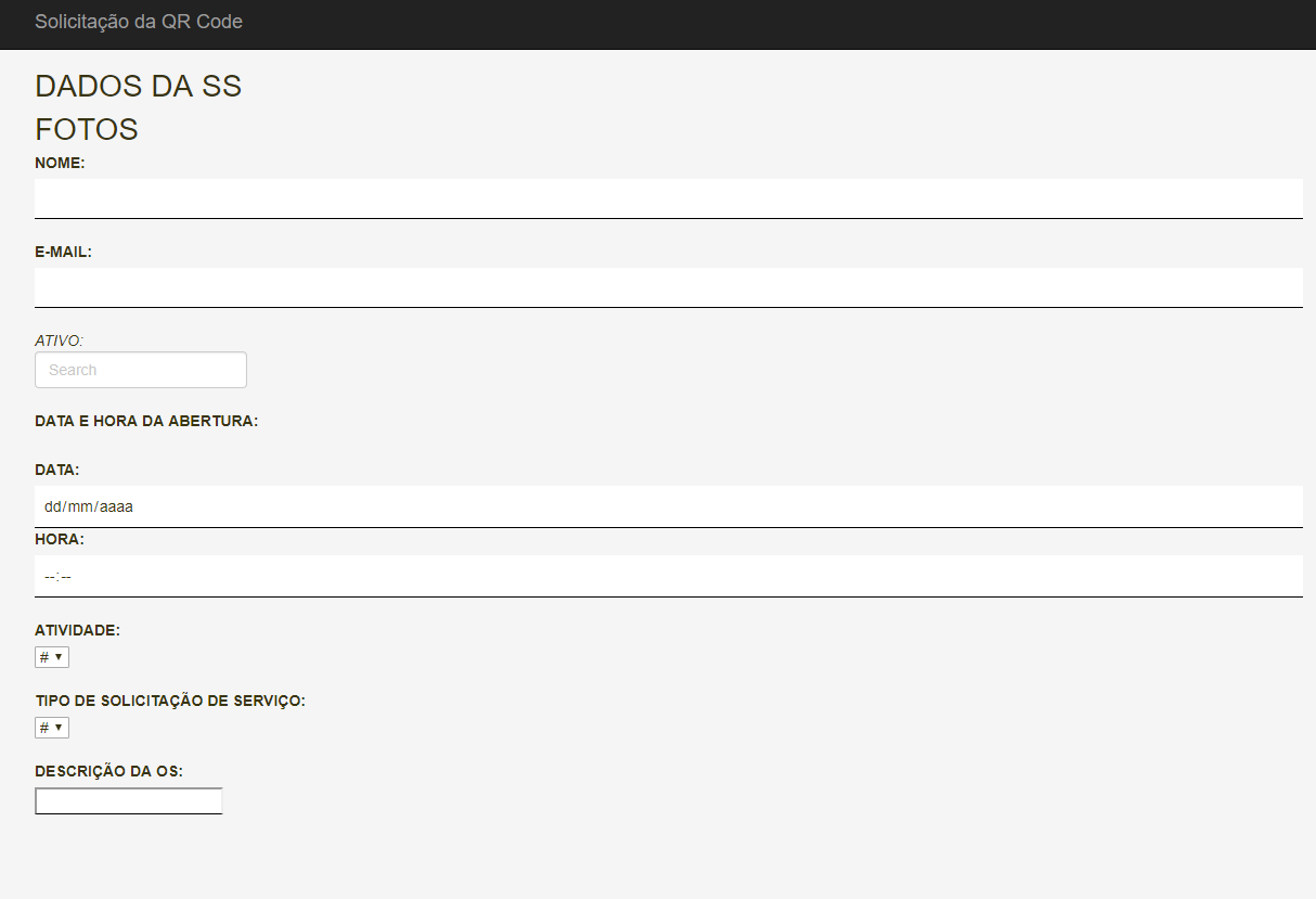
Mine at the moment is like this:
Someone can help me ?
body {
    padding-top: 50px;
    padding-bottom: 20px;
    background-color: whitesmoke;
    color: #383412;
}

/* Set padding to keep content from hitting the edges */
.body-content {
    padding-left: 15px;
    padding-right: 15px;
    padding-top:15px;
}

/* Set width on the form input elements since they're 100% wide by default */
textarea:focus, input:focus, select:focus {
    box-shadow: 0 0 0 0;
    border: 0 none;
    outline: 0;
}

..col-sm-6 {
    font-size: 15px;
    ;
    display: inline-block;
    float: left;
    width: 100%;
}

/*Fotos*/

/*Form-w3*/
.w3-input {
    border: none;
}

.container cabec {
    background-color: #39393a;
}

.form-control:focus {
    border-color: #cccccc;
    outline: 0;
    -webkit-box-shadow: none;
    box-shadow: none;
}

.col-sm {
    font-size: 2em;
}

col-sm-ft {
    font-size: 2em;
    border-bottom: 1px solid black;
    float: right;
}

/*SEARCH*/
.active-purple .fa, .active-purple-2 .fa {
    color: #ce93d8;
<div class="container">
<div class="row">
 <div class="col-sm">
                    DADOS DA SS
                </div>
<div class="col-sm">
FOTOS
</div>
<div class=".col-sm-6">
<label>NOME:</label><br />
<input type="text" class="w3-input" style="border-bottom:1px solid black;" /><br />
<label>E-MAIL:</label>
<input type="email" class="w3-input" style="border-bottom:1px solid black;" /><br />
<form class="form-inline active-purple-4">
<i class="fas fa-search" aria-hidden="true">ATIVO:</i><br/>
<input class="form-control form-control-sm mr-3 w-75" type="text" placeholder="Search" aria-label="Search"><br/><br/>
</form>
<label>DATA E HORA DA ABERTURA:</label><br /><br />
<label>DATA:</label>
<input type="date" class="w3-input" style="border-bottom:1px solid black;" />
<label>HORA:</label>
<input type="time" class="w3-input" style="border-bottom:1px solid black;" /><br />
<label>ATIVIDADE:</label><br />
<select>
<option>#</option>
<option>#</option>
<option>#</option>
<option>#</option>
</select><br /><br />
<label>TIPO DE SOLICITAÇÃO DE SERVIÇO:</label><br />
<select>
<option>#</option>
<option>#</option>
<option>#</option>
<option>#</option>
</select><br /><br />
<label>DESCRIÇÃO DA OS:</label><br />
<input type="text" style="border-bottom:1px solid black;" />
</div>
</div>
</div>
Put html because CSS isn’t enough to understand what you’re doing and help you with what you want to do.
– Augusto Vasques
Are you sure you’re using Bootstrap, which version of Bootstrap are you using? Because the css classes you posted there are from W3.CSS ... And not from Bootstrap
– hugocsl