The only way to control the scroll regardless of the standard behavior is using the property of perspective, and yet this property does not work if applied directly to the body of HTML, it should be applied in body, so you have to evaluate if you will be able to apply this technique in your project.
Roughly what we’re going to do here is put in the body perspective:1px and in the div which will have the effect of Parallax let’s put transform:translateZ(-1px); This will make the div with stay 100% "further back" on the axle Z
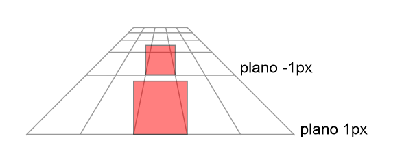
But since she was 100% "back" she’ll get smaller, and we’ll need to put one scale(2) to bring the image back to full size. Imagine that you have a picture of 1m x 1m that is 100m from you and another picture of 1m x 1m that is 200m from you, the picture that is 200m will seem smaller than the first picture that is closer to you.
With that in mind, everything moving in the foreground will seem faster of what is in the background, this will make the effect of Parallax happen!

This is the result of the code
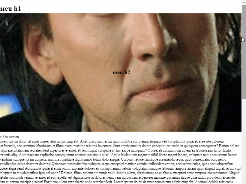
Follow the image code above:
* {
  box-sizing: border-box;
}
html, body {
  width: 100%;
  height: 100%;
  margin: 0;
  padding: 0;
  overflow: hidden;
}
body {
  overflow-x: hidden;
  overflow-y: auto;

  -webkit-perspective: 1px;
  perspective: 1px;
}

.parallax {
  -webkit-transform-style: preserve-3d;
  transform-style: preserve-3d;
  -webkit-perspective-origin-x: 100%;
  perspective-origin-x: 100%;

  position: relative;
  z-index: -20;
}
.parallax h2 {
  background: url('https://placecage.com/500/200');
  background-repeat: no-repeat;
  /* background-attachment: fixed; */
  background-position: center center;
  background-size: cover;
  height: 500px;
  width: 100%;
  display: flex;
  align-items: center;
  justify-content: center;
  position: relative;

  -webkit-transform: translateZ(-1px) scale(2.1);
  transform: translateZ(-1px) scale(2.1);

  /* 12rem é uma medida relativa ao H1 pode variar o valor dependendo da altura do elemento que estiver no lugar do H1 ou no tamanho da fonte dele*/
  /* 40vw é um tamanho relativo ao tamanho da imagem, como usei uma imagem que tem (500px X 200px) eu tenho que dividir 200 por 500 e multiplicar por 100, isso seria: 200/500 = 0,4 logo 0,4 * 100 = 40vw */
  top: calc(((100vh - (40vw + 12rem)) / 4) * -2);
}

h1 {
  background-color: #fff;
  padding: 1em;
}
.content {
  background-color: #fff;
}
<h1>meu h1</h1>
<div class="parallax">
  <h2>meu h2</h2>
</div>
<div class="content">
  <section>minha section</section>
  Lorem ipsum dolor sit amet consectetur adipisicing elit. Alias quisquam rerum quos mollitia porro enim aliquam sed voluptatibus quaerat, esse iste dolorem perferendis, accusantium laboriosam et illum quam maxime minima inventore. Sunt omnis amet in dolore excepturi est incidunt quisquam consequatur? Harum dolore culpa exercitationem reprehenderit asperiores eveniet, ab rem fugiat voluptate sit hic eaque numquam? Obcaecati accusantium autem ea laboriosam? Error facilis, veritatis aliquid sit magnam explicabo consequuntur aperiam possimus quasi. Atque laudantium magnam nihil libero magni labore, voluptate nobis accusamus harum blanditiis cumque ipsam adipisci, minima cupiditate dignissimos totam doloremque. Corporis labore similique assumenda sequi, quos consequatur odio nemo repudiandae culpa deserunt dolores! Quisquam necessitatibus voluptas saepe excepturi maxime eveniet quibusdam earum, accusamus culpa, quos eos voluptatibus facere atque rem! Accusamus quaerat enim omnis sapiente dolores ex corrupti animi debitis voluptatum cumque laborum tempora autem quos aliquid fugiat, rerum sunt voluptate in et voluptatibus ipsa vel optio? Dolores, illum aspernatur omnis velit, debitis ullam, dignissimos ea et alias a excepturi error tempora consequuntur. Aliquid debitis commodi veniam eveniet ad eos repellat est dignissimos in dolores nemo rem quibusdam asperiores maxime possimus itaque quae natus provident reiciendis eum at, rerum suscipit placeat! Fugit quo ullam vero facere unde reprehenderit.
  <span>
    Lorem ipsum dolor sit amet consectetur adipisicing elit. Aperiam debitis reiciendis molestiae dolorem nostrum excepturi dicta similique animi, necessitatibus facere assumenda mollitia alias odit architecto? Tenetur doloribus sapiente eligendi velit quas ex omnis excepturi in, id, recusandae officia iure dolorem a quod, officiis tempora voluptate molestiae natus accusantium quibusdam impedit animi. Amet harum impedit a beatae at dolor magnam pariatur dicta ut error voluptate vitae fuga, eos omnis totam saepe sed soluta minus nam, aspernatur excepturi voluptatibus. Inventore mollitia fuga a, dignissimos nesciunt quis? Accusantium officiis sed, doloribus sapiente ad provident porro deleniti! Dolores hic, sunt neque possimus nesciunt voluptas, velit illum enim similique illo ex in itaque eos pariatur, inventore aliquid optio officia voluptate quibusdam facilis! Voluptatem, cumque. Minima, soluta sunt aspernatur quia architecto incidunt. Blanditiis consequatur corporis aut dignissimos, culpa quidem. Reiciendis eveniet deleniti cupiditate sequi facere in, quae praesentium labore excepturi voluptatibus ipsa nobis maiores quos officia delectus repudiandae. Ratione aperiam minima labore, facilis eos porro, quasi magnam eligendi dolor ab doloribus molestias numquam. Odit quia eius ducimus ratione corrupti placeat eos libero consectetur aliquid dolore eveniet vitae, aperiam aliquam ad sunt tempore quo similique sit quibusdam eligendi blanditiis! Consequatur velit at odio perferendis doloremque. Obcaecati deserunt at architecto et! Nesciunt nostrum libero numquam voluptatibus saepe eius cumque corporis itaque debitis! Deserunt aperiam tempore corrupti rem fugiat. Veritatis enim nam sint unde placeat rerum, aliquid velit numquam deserunt voluptatem quam a sequi obcaecati consequuntur similique expedita incidunt odio, molestias repellat cum, deleniti consequatur nemo! Dolor culpa consequatur, fugit provident autem veniam delectus. Aspernatur nesciunt placeat, quae perspiciatis velit earum saepe asperiores? Hic, et? Repellat a atque modi praesentium odio, in sed expedita debitis fuga ut architecto, adipisci nobis nam voluptatem quae nulla. Possimus dicta provident laborum qui fugiat! Praesentium corporis assumenda aliquid voluptates est expedita beatae porro.
  </span>
</div>
OBS1: This article has more details https://learn-the-web.algonquindesign.ca/topics/css-animations-effects/#Parallax
OBS2: Here’s a legal article on the property perspective: https://css-tricks.com/tour-performant-responsive-css-site/
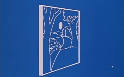
TIP
I recommend that those who have interest not fail to see this film that the Walt Disney explains how the animation in plans. It is a concept very close to what was done here. https://www.youtube.com/watch?v=YdHTlUGN1zw
Maybe it is possible yes! Please put what you already have of HTML and CSS so that we can at least simulate what you already have there. Only with this piece of CSS can not do much
– hugocsl
@hugocsl added
– Luan
give a look here https://css-tricks.com/snippets/jquery/smooth-scrolling/ I think this will help you!
– Lodi
@Lodi is not the issue. I need the background image to "move" slower than the mouse scroll. It has nothing to do with Smooth scrolling.
– Luan
Face has to be with the image as Background-image or it can be with the tag
<img>same? Using an image in HTML is possible, with an image inbackgroundI guess not from...– hugocsl
@hugocsl I only have access to CSS unfortunately
– Luan
Believe me, then I guess I won’t be able to help you. Maybe with JS you’ll find something...
– hugocsl