Help with Boostrap 4 side panel overlaying content

Asked

Viewed 704 times

1

Good afternoon. I am creating a project in Aspnet Core 2.1 with boostrap 4, I added a left side menu, but it is getting above the content of my project as the print below: menu esquerdo sobrescrevendo conteúdo do site 
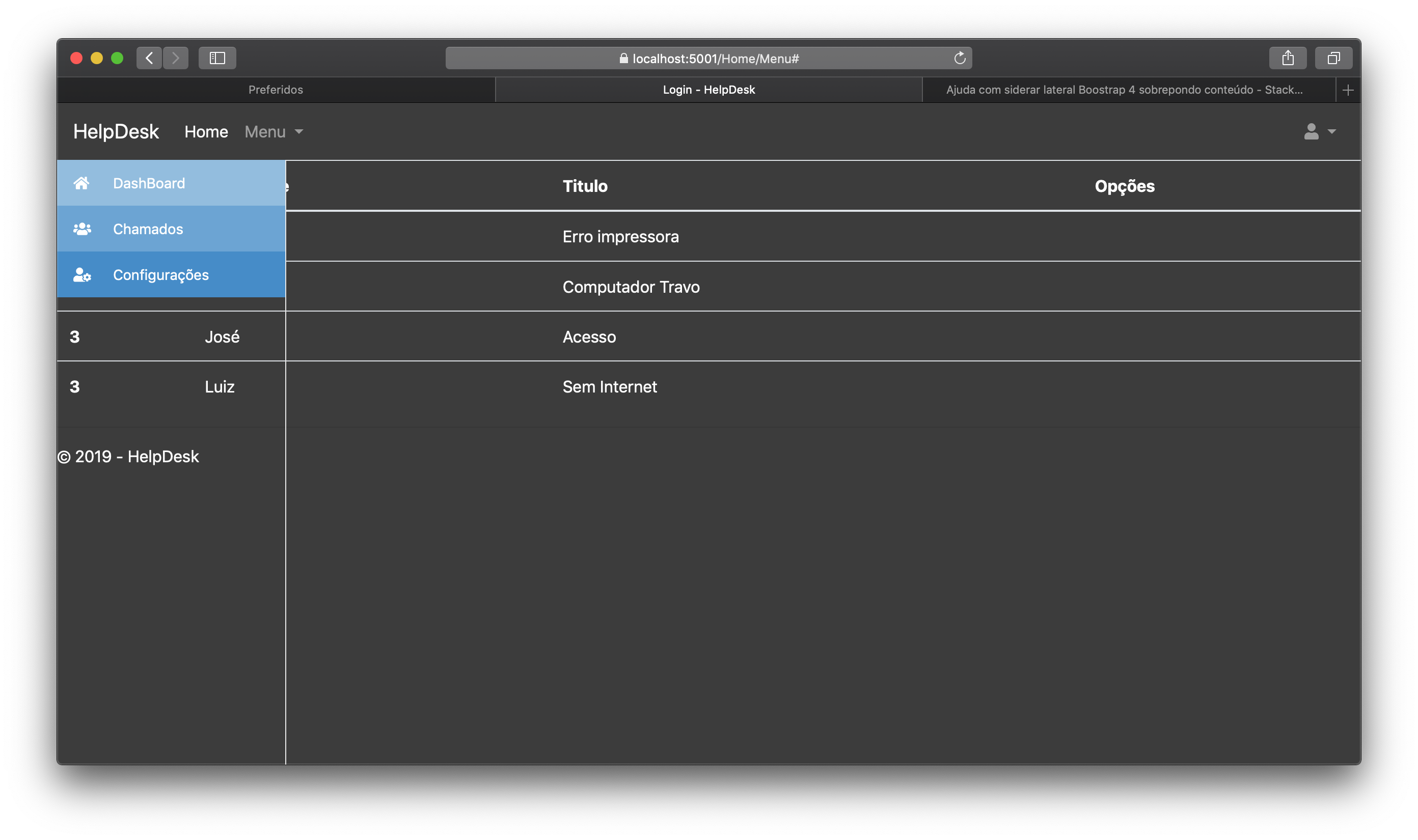
I would like help so that it occupies the left side only in a fixed way, thus staying next to the content. Follow the codes: _layout.csthml

 <!DOCTYPE html>
<html>
<head>
    <meta charset="utf-8" />
    <meta name="viewport" content="width=device-width, initial-scale=1.0" />
    <title>@ViewData["Title"] - HelpDesk</title>

    <!--Boostrap CSS-->
    <link rel="stylesheet" href="~/lib/bootstrap/css/bootstrap.min.css" />

    <!--CSS Site-->
    <link rel="stylesheet" href="~/css/site.css" />

    <!--Fonts-->
    <link rel="stylesheet" href="https://fonts.googleapis.com/css?family=Roboto|Varela+Round">
    <!--Icones-->
    <link rel="stylesheet" href="https://use.fontawesome.com/releases/v5.6.3/css/all.css" integrity="sha384-UHRtZLI+pbxtHCWp1t77Bi1L4ZtiqrqD80Kn4Z8NTSRyMA2Fd33n5dQ8lWUE00s/" crossorigin="anonymous">
</head>
<body>

   <!--Navbar -->
<nav class="navbar navbar-expand-lg navbar-dark">
  <a class="navbar-brand" href="~/Home/Menu">HelpDesk</a>
  <button class="navbar-toggler" type="button" data-toggle="collapse" data-target="#navbarSupportedContent-555"
    aria-controls="navbarSupportedContent-555" aria-expanded="false" aria-label="Toggle navigation">
    <span class="navbar-toggler-icon"></span>
  </button>
  <div class="collapse navbar-collapse" id="navbarSupportedContent-555">
    <ul class="navbar-nav mr-auto">
      <li class="nav-item active">
        <a class="nav-link" href="~/Home/Menu">Home
          <span class="sr-only">(current)</span>
        </a>
      </li>
      <li class="nav-item dropdown">
        <a class="nav-link dropdown-toggle" id="navbarDropdownMenuLink-555" data-toggle="dropdown" aria-haspopup="true"
          aria-expanded="false">Menu
        </a>
        <div class="dropdown-menu dropdown-secondary" aria-labelledby="navbarDropdownMenuLink-555">
          <a class="dropdown-item" href="#">Chamados</a>
          <a class="dropdown-item" href="#">Relatorios</a>
          <a class="dropdown-item" href="#">Reservas</a>
        </div>
      </li>
    </ul>
    <ul class="navbar-nav ml-auto nav-flex-icons">
      <li class="nav-item avatar dropdown">
        <a class="nav-link dropdown-toggle" id="navbarDropdownMenuLink-55" data-toggle="dropdown" aria-haspopup="true"
          aria-expanded="false">
          <i class="fas fa-user"></i>
        </a>
        <div class="dropdown-menu dropdown-menu-right dropdown-secondary" aria-labelledby="navbarDropdownMenuLink-55">
          <a class="dropdown-item" href="#">Perfil</a>
          <a class="dropdown-item" href="#">Configurações</a>
          <a class="dropdown-item" href="~/Home/Login">Sair</a>
        </div>
      </li>
    </ul>
  </div>
</nav>
<!-- Navbar -->

<!-- Sidebar Esquerda -->
<div id="wrapper">
        <div id="sidebar-wrapper">
            <aside id="sidebar">
                <ul id="sidemenu" class="sidebar-nav">
                    <li>
                        <a href="#">
                            <span class="sidebar-icon"><i class="fa fa-home"></i></span>
                            <span class="sidebar-title">DashBoard</span>
                        </a>
                    </li>
                    <li>
                        <a class="accordion-toggle collapsed toggle-switch" data-toggle="collapse" href="#submenu-2">
                            <span class="sidebar-icon"><i class="fa fa-users"></i></span>
                            <span class="sidebar-title">Chamados</span>
                            <b class="caret"></b>
                        </a>
                        <ul id="submenu-2" class="panel-collapse collapse panel-switch" role="menu">
                            <li><a href="#"><i class="fa fa-caret-right"></i>Abertos</a></li>
                            <li><a href="#"><i class="fa fa-caret-right"></i>Fechados</a></li>
                        </ul>
                    </li>

                    <li>
                        <a href="#">
                            <span class="sidebar-icon"><i class="fa fa-user-cog"></i></span>
                            <span class="sidebar-title">Configurações</span>
                        </a>
                    </li>

                </ul>
            </aside>            
        </div>

    </div> 

        @RenderBody()

        <hr />
        <footer>
            <p>&copy; 2019 - HelpDesk</p>
        </footer>
    </div>

    <!--Jquery-->
    <script src="https://cdnjs.cloudflare.com/ajax/libs/jquery/3.3.1/jquery.min.js"></script>

    <!--Ajax-->
    <script src="https://cdnjs.cloudflare.com/ajax/libs/popper.js/1.14.3/umd/popper.min.js" integrity="sha384-ZMP7rVo3mIykV+2+9J3UJ46jBk0WLaUAdn689aCwoqbBJiSnjAK/l8WvCWPIPm49" crossorigin="anonymous"></script>

    <!--Site CS-->
    <script src="~/js/site.js"></script>

    <!--Bootstrap JS-->
    <script src="~/lib/bootstrap/js/bootstrap.min.js"></script>
</body>
</html>

CSS:

@media (min-width: 992px) {
    #wrapper {
        padding-left: 225px;
    }
}

@media (min-width: 992px) {
    #wrapper #sidebar-wrapper {
        width: 225px;
    }
}

#sidebar-wrapper {
    border-right: 1px solid #e7e7e7;
}

#sidebar-wrapper {
    z-index: 1000;
    position: fixed;
    left: 225px;
    width: 0;
    height: 100%;
    margin-left: -225px;
    overflow-y: auto;
    -webkit-transition: all .5s ease;
    -moz-transition: all .5s ease;
    -o-transition: all .5s ease;
    transition: all .5s ease;
}

#sidebar-wrapper .sidebar-nav {
    position: absolute;
    top: 0;
    width: 225px;
    font-size: 14px;
    margin: 0;
    padding: 0;
    list-style: none;
}

#sidebar-wrapper .sidebar-nav li {
    text-indent: 0;
    line-height: 45px;
}

#sidebar-wrapper .sidebar-nav li a {
    display: block;
    text-decoration: none;
    color: #428bca;
}

.sidebar-nav li:first-child a {
    background: #92bce0 !important;
    color: #fff !important;
}

#sidebar-wrapper .sidebar-nav li a .sidebar-icon {
    width: 45px;
    height: 45px;
    font-size: 14px;
    padding: 0 2px;
    display: inline-block;
    text-indent: 7px;
    margin-right: 10px;
    color: #fff;
    float: left;
}

#sidebar-wrapper .sidebar-nav li a .caret {
  position: absolute;
  right: 23px;
  top: auto;
  margin-top: 20px;
}

#sidebar-wrapper .sidebar-nav li ul.panel-collapse {
    list-style: none;
    -moz-padding-start: 0;
    -webkit-padding-start: 0;
    -khtml-padding-start: 0;
    -o-padding-start: 0;
    padding: 0;
}

#sidebar-wrapper .sidebar-nav li ul.panel-collapse li i {
    margin-right: 10px;
}

#sidebar-wrapper .sidebar-nav li ul.panel-collapse li {
    text-indent: 15px;
}

@media (max-width: 992px) {
    #wrapper #sidebar-wrapper {
        width: 45px;
    }
    #wrapper #sidebar-wrapper #sidebar #sidemenu li ul {
        position: fixed;
        left: 45px;
        margin-top: -45px;
        z-index: 1000;
        width: 200px;
        height: 0;
    }
}

.sidebar-nav li:first-child a {
    background: #92bce0 !important;
    color: #fff !important;
}

.sidebar-nav li:nth-child(2) a {
    background: #6aa3d5 !important;
    color: #fff !important;
}

.sidebar-nav li:nth-child(3) a {
    background: #428bca !important;
    color: #fff !important;
}

.sidebar-nav li:nth-child(4) a {
    background: #3071a9 !important;
    color: #fff !important;
}

.sidebar-nav li:nth-child(5) a {
    background: #245682 !important;
    color: #fff !important;
}

Contents:

@{
    ViewData["Title"] = "Login";
}
<table class="table">
  <thead>
    <tr>
      <th scope="col">ID</th>
      <th scope="col">Solicitante</th>
      <th scope="col">Titulo</th>
      <th scope="col">Opções</th>
    </tr>
  </thead>
  <tbody>
    <tr>
      <th scope="row">1</th>
      <td>João</td>
      <td>Erro impressora</td>
      <td></td>
    </tr>
    <tr>
      <th scope="row">2</th>
      <td>Maria</td>
      <td>Computador Travo</td>
      <td></td>
    </tr>
    <tr>
      <th scope="row">3</th>
      <td>José</td>
      <td>Acesso</td>
      <td></td>
    </tr>
    <tr>
      <th scope="row">3</th>
      <td>Luiz</td>
      <td>Sem Internet</td>
      <td></td>
    </tr>
  </tbody>
</table>
  • 1

    When you use position fixed, the item is related to body and does not take up space in the layout, and the space it occupied is free, and the element that comes later will take up the free space left.

  • What would be a way to correct, I tried to put as Absolute or relative and keep trying mistakes.

  • 1

    You have to position the table to the right on the same width of the sidebar not to be below.

  • 1

    Is it for that sidebar with the menu being visible all the time? If the content of the table is too large and the page has a scroll bar and this sidebar remains in place even when the user rotates the screen?

  • @hugocsl yes, the goal is that it always fixed on the left side, leaving the left and the content on the side (in the case of this page the table).

1 answer

1


From what I’ve seen your side bar has two widths 225px for screens larger than 992px, and 45px for screens smaller than 992px

That way you just make in CSS a calc() to discount these widths from the total width of the table, and this discounted value of 225px or 45px you put in the margin-left of table

It would be something like this:

max-width: calc(100% - 225px);
margin-left: 225px;

inserir a descrição da imagem aqui

OBS: I saw that you will still need to deal with other things in this layout, as the Footer and fix the navbar tb. If you have another problem just open another question like the particular case.

Follow the code of the image above, I left at the end of the CSS the code I made:

<!DOCTYPE html>
<html>
<head>
    <meta charset="utf-8" />
    <meta name="viewport" content="width=device-width, initial-scale=1.0" />
    <title>@ViewData["Title"] - HelpDesk</title>

    <!--Boostrap CSS-->
    <link rel="stylesheet" href="~/lib/bootstrap/css/bootstrap.min.css" />
    <link rel="stylesheet" type="text/css" media="screen" href="https://maxcdn.bootstrapcdn.com/bootstrap/4.0.0/css/bootstrap.min.css" />

    <!--CSS Site-->
    <link rel="stylesheet" href="~/css/site.css" />

    <!--Fonts-->
    <link rel="stylesheet" href="https://fonts.googleapis.com/css?family=Roboto|Varela+Round">
    <!--Icones-->
    <link rel="stylesheet" href="https://use.fontawesome.com/releases/v5.6.3/css/all.css" integrity="sha384-UHRtZLI+pbxtHCWp1t77Bi1L4ZtiqrqD80Kn4Z8NTSRyMA2Fd33n5dQ8lWUE00s/" crossorigin="anonymous">

    <style>
    @media (min-width: 992px) {
    #wrapper {
        padding-left: 225px;
    }
}

@media (min-width: 992px) {
    #wrapper #sidebar-wrapper {
        width: 225px;
    }
}

#sidebar-wrapper {
    border-right: 1px solid #e7e7e7;
}

#sidebar-wrapper {
    z-index: 1000;
    position: fixed;
    left: 225px;
    width: 0;
    height: 100%;
    margin-left: -225px;
    overflow-y: auto;
    -webkit-transition: all .5s ease;
    -moz-transition: all .5s ease;
    -o-transition: all .5s ease;
    transition: all .5s ease;
}

#sidebar-wrapper .sidebar-nav {
    position: absolute;
    top: 0;
    width: 225px;
    font-size: 14px;
    margin: 0;
    padding: 0;
    list-style: none;
}

#sidebar-wrapper .sidebar-nav li {
    text-indent: 0;
    line-height: 45px;
}

#sidebar-wrapper .sidebar-nav li a {
    display: block;
    text-decoration: none;
    color: #428bca;
}

.sidebar-nav li:first-child a {
    background: #92bce0 !important;
    color: #fff !important;
}

#sidebar-wrapper .sidebar-nav li a .sidebar-icon {
    width: 45px;
    height: 45px;
    font-size: 14px;
    padding: 0 2px;
    display: inline-block;
    text-indent: 7px;
    margin-right: 10px;
    color: #fff;
    float: left;
}

#sidebar-wrapper .sidebar-nav li a .caret {
  position: absolute;
  right: 23px;
  top: auto;
  margin-top: 20px;
}

#sidebar-wrapper .sidebar-nav li ul.panel-collapse {
    list-style: none;
    -moz-padding-start: 0;
    -webkit-padding-start: 0;
    -khtml-padding-start: 0;
    -o-padding-start: 0;
    padding: 0;
}

#sidebar-wrapper .sidebar-nav li ul.panel-collapse li i {
    margin-right: 10px;
}

#sidebar-wrapper .sidebar-nav li ul.panel-collapse li {
    text-indent: 15px;
}

@media (max-width: 992px) {
    #wrapper #sidebar-wrapper {
        width: 45px;
    }
    #wrapper #sidebar-wrapper #sidebar #sidemenu li ul {
        position: fixed;
        left: 45px;
        margin-top: -45px;
        z-index: 1000;
        width: 200px;
        height: 0;
    }
}

.sidebar-nav li:first-child a {
    background: #92bce0 !important;
    color: #fff !important;
}

.sidebar-nav li:nth-child(2) a {
    background: #6aa3d5 !important;
    color: #fff !important;
}

.sidebar-nav li:nth-child(3) a {
    background: #428bca !important;
    color: #fff !important;
}

.sidebar-nav li:nth-child(4) a {
    background: #3071a9 !important;
    color: #fff !important;
}

.sidebar-nav li:nth-child(5) a {
    background: #245682 !important;
    color: #fff !important;
}

/* esse é o custom CSS que eu fiz */
body {
  background-color: #333;
}
table,
footer {
  color:#ddd;
}
.table {
  width: calc(100% - 225px);
  max-width: calc(100% - 225px);
  margin-left: 225px;
  transition: all .5s ease;
}
@media (max-width: 992px) {
  .table {
    width: calc(100% - 45px);
    max-width: calc(100% - 45px);
    margin-left: 45px;
  }
}

    </style>
</head>
<body>

   <!--Navbar -->
<nav class="navbar navbar-expand-lg navbar-dark">
  <a class="navbar-brand" href="~/Home/Menu">HelpDesk</a>
  <button class="navbar-toggler" type="button" data-toggle="collapse" data-target="#navbarSupportedContent-555"
    aria-controls="navbarSupportedContent-555" aria-expanded="false" aria-label="Toggle navigation">
    <span class="navbar-toggler-icon"></span>
  </button>
  <div class="collapse navbar-collapse" id="navbarSupportedContent-555">
    <ul class="navbar-nav mr-auto">
      <li class="nav-item active">
        <a class="nav-link" href="~/Home/Menu">Home
          <span class="sr-only">(current)</span>
        </a>
      </li>
      <li class="nav-item dropdown">
        <a class="nav-link dropdown-toggle" id="navbarDropdownMenuLink-555" data-toggle="dropdown" aria-haspopup="true"
          aria-expanded="false">Menu
        </a>
        <div class="dropdown-menu dropdown-secondary" aria-labelledby="navbarDropdownMenuLink-555">
          <a class="dropdown-item" href="#">Chamados</a>
          <a class="dropdown-item" href="#">Relatorios</a>
          <a class="dropdown-item" href="#">Reservas</a>
        </div>
      </li>
    </ul>
    <ul class="navbar-nav ml-auto nav-flex-icons">
      <li class="nav-item avatar dropdown">
        <a class="nav-link dropdown-toggle" id="navbarDropdownMenuLink-55" data-toggle="dropdown" aria-haspopup="true"
          aria-expanded="false">
          <i class="fas fa-user"></i>
        </a>
        <div class="dropdown-menu dropdown-menu-right dropdown-secondary" aria-labelledby="navbarDropdownMenuLink-55">
          <a class="dropdown-item" href="#">Perfil</a>
          <a class="dropdown-item" href="#">Configurações</a>
          <a class="dropdown-item" href="~/Home/Login">Sair</a>
        </div>
      </li>
    </ul>
  </div>
</nav>
<!-- Navbar -->

<!-- Sidebar Esquerda -->
<div id="wrapper">
        <div id="sidebar-wrapper">
            <aside id="sidebar">
                <ul id="sidemenu" class="sidebar-nav">
                    <li>
                        <a href="#">
                            <span class="sidebar-icon"><i class="fa fa-home"></i></span>
                            <span class="sidebar-title">DashBoard</span>
                        </a>
                    </li>
                    <li>
                        <a class="accordion-toggle collapsed toggle-switch" data-toggle="collapse" href="#submenu-2">
                            <span class="sidebar-icon"><i class="fa fa-users"></i></span>
                            <span class="sidebar-title">Chamados</span>
                            <b class="caret"></b>
                        </a>
                        <ul id="submenu-2" class="panel-collapse collapse panel-switch" role="menu">
                            <li><a href="#"><i class="fa fa-caret-right"></i>Abertos</a></li>
                            <li><a href="#"><i class="fa fa-caret-right"></i>Fechados</a></li>
                        </ul>
                    </li>

                    <li>
                        <a href="#">
                            <span class="sidebar-icon"><i class="fa fa-user-cog"></i></span>
                            <span class="sidebar-title">Configurações</span>
                        </a>
                    </li>

                </ul>
            </aside>            
        </div>

    </div> 

        <!-- @RenderBody() -->

        <table class="table">
          <thead>
            <tr>
              <th scope="col">ID</th>
              <th scope="col">Solicitante</th>
              <th scope="col">Titulo</th>
              <th scope="col">Opções</th>
            </tr>
          </thead>
          <tbody>
            <tr>
              <th scope="row">1</th>
              <td>João</td>
              <td>Erro impressora</td>
              <td></td>
            </tr>
            <tr>
              <th scope="row">2</th>
              <td>Maria</td>
              <td>Computador Travo</td>
              <td></td>
            </tr>
            <tr>
              <th scope="row">3</th>
              <td>José</td>
              <td>Acesso</td>
              <td></td>
            </tr>
            <tr>
              <th scope="row">3</th>
              <td>Luiz</td>
              <td>Sem Internet</td>
              <td></td>
            </tr>
          </tbody>
        </table>

        <hr />
        <footer>
            <p>&copy; 2019 - HelpDesk</p>
        </footer>


    <!--Jquery-->
    <script src="https://cdnjs.cloudflare.com/ajax/libs/jquery/3.3.1/jquery.min.js"></script>

    <!--Ajax-->
    <script src="https://cdnjs.cloudflare.com/ajax/libs/popper.js/1.14.3/umd/popper.min.js" integrity="sha384-ZMP7rVo3mIykV+2+9J3UJ46jBk0WLaUAdn689aCwoqbBJiSnjAK/l8WvCWPIPm49" crossorigin="anonymous"></script>

    <!--Site CS-->
    <script src="~/js/site.js"></script>

    <!--Bootstrap JS-->
    <script src="~/lib/bootstrap/js/bootstrap.min.js"></script>

</body>
</html>

  • Excellent, thanks so much @hugocsl for the help.

  • No problem @João qq another problem eh just give the touch, good luck there

Browser other questions tagged

You are not signed in. Login or sign up in order to post.