1
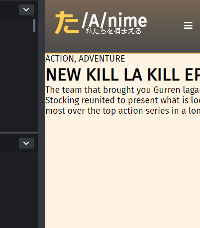
tl;dr When I put a width in the text container it doesn’t break the lines to optimize space.
Without setting anything the text becomes normal, and if I reset the screen size it will break naturally.
But I don’t want it to occupy the entire screen and I thought I’d set a size to occupy it.
But when defining a specific size, the text stops breaking naturally if necessary...
Code in the codepen: https://codepen.io/utamo/pen/ErQegM
I made some <br> and "solved" the problem, but I wanted it to occur in a container with specific size to distribute the text better.
* {
    margin: 0;
    padding: 0;
    box-sizing: border-box;
    font-family: 'Fira Sans', sans-serif;
    text-decoration: none;
    list-style-type: none;

}
.grid-container {
    display: grid;
    grid-template-columns: 1fr 1fr;
    grid-template-rows: 100px 50ch auto;
    grid-template-areas:
        "topo topo"    /* querie geral */
        "meio meio"
        "baixo baixo"
}

.header-container {
    grid-area: topo;
    display: grid;
    grid-template-columns: 300px 1fr;
    grid-template-areas:
        "left right"; /* sub grid do topo */

}
/* Header left side */
.leftz {
    grid-area: left;
    background: linear-gradient(
          rgba(89, 53, 15, 0.7),
          rgba(0, 0, 0, 0.7)
        ),url(imgs/matoi.png);
    background-size: cover;
    background-color: black;
    opacity: 0.7;
    display: flex;
    justify-content: space-between;
    padding: 1rem;
    align-items: center;
    border-bottom: 2px solid orange;
}
.logo-text {
    color: #f3f3f3;
    display: flex;
    line-height: 1.3rem;
    align-items: center;

}
.japword {
    align-self: center;
    font-size: 3rem;
    color: #ffb808;
}
.orange {
    color: orange;
}
.pointrem {
    font-size: .8rem;
    text-align: center
}
/* menu responsive */
.responsive-menu {
    display: none;
}
.hidden-search {
    padding: 1rem;
    position: relative;
    display: flex; /* vai usar isso no querie */
    align-items: center;
    flex-direction: row-reverse;
    justify-content: center;
}
.fas {
    color: white;
}

/* Header right side */

.rightx {
    display: flex;
    justify-content: space-between;
    align-items: center;
    grid-area: right;
    background: #f1f1f1;
    border-bottom: 2px solid #ffc04c;
}
.rightx ul {
    display: flex;

}
.rightx a {
    margin: .6rem;
    color: black;

}

/* Search bar */
.search-form {
    display: flex;
    border: none;
    padding: .5rem;
}
.search-form input[type="text"] {
    padding: .2rem;
    border: none;
}
.search-form button[type="submit"] {
    padding: .5rem;
    border: none;
    background: #e7c88f;

}
.mid-container {
    grid-area: meio;
    background: url(imgs/mako2.png);
    background-position: right;
    background-repeat: no-repeat;
    background-color: #fff4e3;

}
.text-container {
    display: flex;
    flex-direction: column;
    flex-wrap: wrap;
    width: 50ch;
}


/* Queries */
@media only screen and (max-width:860px) {
    .header-container {
        grid-template-areas:
            "left left";
    }
    .rightx {
        display: none;
    }
    .leftz {
        background-position: 50% 30%;
    }
}
<!DOCTYPE html>
<html lang="en">
<head>
<meta charset="UTF-8">
<link rel="stylesheet" href="styles.css">
<meta name="viewport" content="width=device-width, user-scalable=no, initial-scale=1.0, maximum-scale=1.0, minimum-scale=1.0">
<link href="https://fonts.googleapis.com/css?family=Anton|Fira+Sans|Oswald|Roboto+Condensed" rel="stylesheet">
<link rel="stylesheet" href="https://use.fontawesome.com/releases/v5.7.1/css/all.css" integrity="sha384-fnmOCqbTlWIlj8LyTjo7mOUStjsKC4pOpQbqyi7RrhN7udi9RwhKkMHpvLbHG9Sr" crossorigin="anonymous">
<title>Document</title>
</head>
<body>
<div class="grid-container">
<!-- Parte do topo -->
<div class="header-container">
<!-- Parte esq do header -->
<div class="leftz">
<div class="logo-text">
<h1><span class="japword">た</span></h1>
<div>
<h1>/A/nime</h1>
<p class="pointrem">私たちを捕まえる</p>
</div>
</div>
<!-- Menu falho que n tentei direito com CSS -->
<div class="hidden-search">
<i class="fas fa-bars"></i>
<div class="responsive-menu">
<ul>
<li><a href="#">News</a></li>
<li><a href="#">Animes</a></li>
<li><a href="#">Reviews</a></li>
</ul>
</div>
</div>
</div>
<!-- Parte dir do header -->
<div class="rightx">
<div> <!-- Menu -->
<ul>
<li><a href="#">News</a></li>
<li><a href="#">Animes</a></li>
<li><a href="#">Reviews</a></li>
</ul>
</div>
<div> <!-- Searh bar -->
<form class="search-form">
<input type="text" placeholder="Find something new...">
<button type="submit"><i class="fa fa-search"></i></button>
</form>
</div>
</div>
</div>
<!-- Começo do meio -->
<div class="mid-container">
<div class="mid-texts">
<div class="text-container">
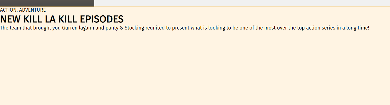
<p>ACTION, ADVENTURE</p>
<h1>NEW KILL LA KILL EPISODES</h1>
<p>The team that brought you Gurren lagann and panty & Stocking reunited to present what is looking to be one of the most over the top action series in a long time!</p>
</div>
</div>
</div>
</div>
</body>
</html>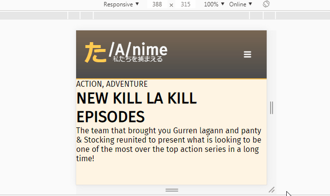
Your question has become a little confused, as to what you want to do and the difficulty you are having!
– LeAndrade
I think I tried to explain too much and left confused, but anyway, basically I want to define a "box" for text, but when I do this the text stops breaking the lines.
– utm
I still do not understand, it seems to me that it is normal. The text breaks in & and starts on the other line with Stocking, ends with the and starts another line with Most. Is breaking the text at the width you set the container.
– LeAndrade
@Leandrade he breaks there pq is the end of the container, but when you decrease the screen the container does not decrease in width and even when the screen is much smaller the line would stop breaking. After a look at the answer there you enter better. Summing up on large screen seems right, but on small cell screen the line stopped breaking
– hugocsl
Good Hugo, really had not understood that the problem was in smaller screens!
– LeAndrade
I will try to be more direct in the next questions, pardon
– utm