Pin tabs bar below navigation bar (navs x navbar)

Asked

Viewed 156 times

5

Goal

Create a tabs menu bar, below a menu bar, both fixed.


Test scenario

<script src="https://cdnjs.cloudflare.com/ajax/libs/jquery/3.2.1/jquery.min.js"></script>
<script src="https://maxcdn.bootstrapcdn.com/bootstrap/4.0.0/js/bootstrap.min.js"></script>
<link href="https://maxcdn.bootstrapcdn.com/bootstrap/4.0.0/css/bootstrap.min.css" rel="stylesheet"/>

<div class="container-fluid">

<nav class="navbar sticky-top navbar-light bg-light">
  <a class="navbar-brand" href="#">
    <img src="https://getbootstrap.com/docs/4.0/assets/brand/bootstrap-solid.svg" width="30" height="30" class="d-inline-block align-top" alt="">
    Bootstrap
  </a>
</nav>

<ul class="nav nav-tabs sticky-top">
  <li class="nav-item">
    <a class="nav-link active" href="#">Active</a>
  </li>
  <li class="nav-item">
    <a class="nav-link" href="#">Link</a>
  </li>
  <li class="nav-item">
    <a class="nav-link" href="#">Link</a>
  </li>
  <li class="nav-item">
    <a class="nav-link disabled" href="#">Disabled</a>
  </li>
</ul>

<br>
<p>1</p>
<br>
<p>2</p>
<br>
<p>3</p>
<br>
<p>4</p>
<br>
<p>5</p>
<br>
<p>6</p>
<br>
<p>7</p>
<br>
<p>8</p>
<br>
<p>9</p>

</div>


Problem

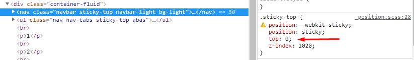
When I use fixed-top in the top bar, the content is already below it. If use sticky-top, is correct.

When fixing tabs menu, if used sticky-top, it does not fix, and stands on top of the top bar, and if use fixed-top, it is hidden behind the top bar.


Doubt

  • There is standard solution in BS4 to solve this problem?
  • If not, what are the options?

2 answers

5


It’s not just putting the two elements inside the same <div> and add the class .sticky-top in it?

<script src="https://cdnjs.cloudflare.com/ajax/libs/jquery/3.2.1/jquery.min.js"></script>
<script src="https://maxcdn.bootstrapcdn.com/bootstrap/4.0.0/js/bootstrap.min.js"></script>
<link href="https://maxcdn.bootstrapcdn.com/bootstrap/4.0.0/css/bootstrap.min.css" rel="stylesheet" />

<div class="container-fluid">

  <div class="sticky-top">
    <nav class="navbar navbar-light bg-light">
      <a class="navbar-brand" href="#">
        <img src="https://getbootstrap.com/docs/4.0/assets/brand/bootstrap-solid.svg" width="30" height="30" class="d-inline-block align-top" alt=""> Bootstrap
      </a>
    </nav>

    <ul class="nav nav-tabs">
      <li class="nav-item">
        <a class="nav-link active" href="#">Active</a>
      </li>
      <li class="nav-item">
        <a class="nav-link" href="#">Link</a>
      </li>
      <li class="nav-item">
        <a class="nav-link" href="#">Link</a>
      </li>
      <li class="nav-item">
        <a class="nav-link disabled" href="#">Disabled</a>
      </li>
    </ul>
  </div>

  <br>
  <p>1</p>
  <br>
  <p>2</p>
  <br>
  <p>3</p>
  <br>
  <p>4</p>
  <br>
  <p>5</p>
  <br>
  <p>6</p>
  <br>
  <p>7</p>
  <br>
  <p>8</p>
  <br>
  <p>9</p>

</div>

4

To the position:sticky he needs a top: set, even if it is 0. So in your case the top has to be the height of nav, 56px... Ai you create a class with the height of nav and puts in the aba as I did below.

inserir a descrição da imagem aqui

Note that in the default Bootstrap class you already have one top of 0. So you have to adjust it with a class

See how it looks with the adjustment

<!DOCTYPE html>
<html lang="en">
<head>
  <meta charset="utf-8" />
  <title>Page Title</title>
  <meta name="viewport" content="width=device-width, initial-scale=1">
  <link rel="stylesheet" type="text/css" media="screen" href="https://stackpath.bootstrapcdn.com/bootstrap/4.2.1/css/bootstrap.min.css" />
  <link rel="stylesheet" type="text/css" media="screen" href="https://maxcdn.bootstrapcdn.com/font-awesome/4.7.0/css/font-awesome.min.css" />
<style>
.abas {
  top: 56px !important;
}
</style>
</head>
<body>
  
  <div class="container-fluid">

    <nav class="navbar sticky-top navbar-light bg-light">
      <a class="navbar-brand" href="#">
        <img src="https://getbootstrap.com/docs/4.0/assets/brand/bootstrap-solid.svg" width="30" height="30" class="d-inline-block align-top" alt="">
        Bootstrap
      </a>
    </nav>
    
    <ul class="nav nav-tabs sticky-top abas">
      <li class="nav-item">
        <a class="nav-link active" href="#">Active</a>
      </li>
      <li class="nav-item">
        <a class="nav-link" href="#">Link</a>
      </li>
      <li class="nav-item">
        <a class="nav-link" href="#">Link</a>
      </li>
      <li class="nav-item">
        <a class="nav-link disabled" href="#">Disabled</a>
      </li>
    </ul>
    
    <br>
    <p>1</p>
    <br>
    <p>2</p>
    <br>
    <p>3</p>
    <br>
    <p>4</p>
    <br>
    <p>5</p>
    <br>
    <p>6</p>
    <br>
    <p>7</p>
    <br>
    <p>8</p>
    <br>
    <p>9</p>
    
    </div>
  
  <script src="https://code.jquery.com/jquery-3.2.1.min.js"></script>
  <script src="https://cdnjs.cloudflare.com/ajax/libs/popper.js/1.12.9/umd/popper.min.js"></script>
  <script src="https://stackpath.bootstrapcdn.com/bootstrap/4.2.1/js/bootstrap.min.js"></script>
</body>
</html>

Browser other questions tagged

You are not signed in. Login or sign up in order to post.