Scroll bar after using 100vh

Asked

Viewed 730 times

2

I set a height to leave the part of header covering the entire screen. I used 100vh at the time and 100vw width, however when I added content below the header appeared the axle scroll bar x (horizontal).

I fixed it with overflow-x : hidden;, but I’m a bit of a curious person and I’d like to know why the scrollbar appeared.

My code is this:

(function(window){
	'use strict';
	
	var menu = (function(){
							var $btnMenu = document.querySelector('[data-js=menuBtn]');

							function openAndCloseMenu(event){
								event.preventDefault();
								event.stopPropagation();
								$btnMenu.classList.toggle('openMenu');
							}

							function addNewEvent(event, element, callback){
								element.addEventListener(event, callback, false);
							}

							return{
								init: function(){
									addNewEvent('click', $btnMenu, openAndCloseMenu);
								}
							}
						}());

	menu.init();
}(window));
*{
    margin: 0;
    padding: 0;
    box-sizing: border-box;
    font-size: 100%;
    background: none;
    border: none;
}

:root{
    --green: #31FFC0;
    --bgcolor: #242B3E;
    --white: #FFFFFF;
    --svgBgColor: #4F4C61;
    --copostBG: #646178;
    --greeCompost: #72D5B7;
}

body{
    font-family: 'Fira Code', sans-serif;
    font-size: 400;
    background-color: var(--bgcolor);
    color: var(--white);
    position: relative;
}
h1, h2{
    font-family: 'Cabin', sans-serif;
    font-weight: 400;
}

h1{
    font-size: 2.7rem;
    font-weight: 400;
}

h2{
    font-size: 1.8rem;
}

a,li,ul{
    text-decoration: none;
    list-style: none;
}

ul{
    display: flex;
}

p{
    font-size: 1.2rem;
}

a{
    font-size: inherit;
}

.shadow-white{
    color: var(--white);
    text-shadow: 0 0 8px rgba(255,255,255, .4);
}

.shadow-black{
    color: var(--bgcolor);
    text-shadow: 0 0 8px rgba(36, 43, 62, .4);
}

.shadow-green{
    color: var(--green);
    text-shadow: 0 0 8px rgba(49, 255, 162, .4);
}

.sub-title{
    font-size: 1.2rem;
    font-weight: 400;
}

.container_flex{
    width: 100vw;
    padding: 0 13px;
    position: relative;
}

.container{
    width: 100%;
    padding: 13px;
}

.header_container{
    height: 100vh;
    min-height: 568px;
    display: flex;
    position: relative;
    z-index: 3;
}

.header_container::before{
    content: '';
    width: 100%;
    height: 100%;
    position: absolute;
    opacity: .5;
    background: url('../img/bg2.png') no-repeat center center;
    background-size: cover;
}

header .intro-container{
    padding: 0;
    align-self: center;
    text-align: center;
    z-index: 5;
}

.intro-container h1{
    margin-bottom: 12px;
    z-index: 5;
    text-align: left;
}

.intro-container p{
    margin-bottom: 10px;
    line-height: 1.45rem;
    text-align: left;
    z-index: 5;
}

.btnContat{
    margin-top: 10px;
    text-align: center;
    font-size: 1rem;
    color: var(--white);
    font-family: 'Fira Code';
    font-weight: 300;
    padding: 5px 20px;
    border: 1px solid var(--white);
    border-radius: 15px;
    cursor: pointer;
    z-index: 5;
    position: relative;
}

.btnContat::before{
    content: '';
   width: 100%;
   height: 0;
   position: absolute;
   border-radius: 15px;
   display: block;
   z-index: 0;
   background-color: var(--white);
   bottom: 0;
   left: 0;
   transition: height .3s ease;
   opacity: .1;
}

.btnContat:hover::before{
    top: 0;
    height: 100%;  
}

.nav{
    position: absolute;
    display: flex;
    padding: 10px 10px;
    align-items: center;
    justify-content: space-between;
    width: 100%;
}

.link{
    color: var(--white);
    position: relative;
}

.link-branch{
    color: var(--white);
    text-transform: uppercase;
    position: relative;
    z-index: 10;
}

.nav-menuBtn{
    height: 19px;
    width: 23px;
    position: relative;
    display: flex;
    align-items: flex-start;
    cursor: pointer;
    z-index: 100;
}

.nav-menuBtn i{
    position: absolute;
    width: 100%;
    height: 2px;
    background: var(--white);
}

.nav-menuBtn i:last-child{
    align-self: flex-end;
}

.nav-menuBtn i:nth-child(2){
    align-self: center;
}

.nav-menu{
    background-color:  rgba(36, 43, 62, .9);
    position: fixed;
    bottom: 0;
    top: 0;
    left: 0;
    right: 0;
    display: flex;
    flex-direction: column;
    justify-content: center;
    align-items: center;
    visibility: hidden;
    z-index: 50;
    transition: all .3s ease;
    opacity: 0;
}

li .link{
    font-size: 2rem;
    overflow: visible;
}
.nav-menu li{
    margin: 15px;
    overflow: visible;
}

li .link::after{
    content: '';
    position: absolute;
    display: block;
    width: 0;
    height: 2px;
    right: 0;
    background-color: var(--green);
    overflow: visible;
    bottom: -12px;
    transition: width .3s ease;
}

li .link:hover::after{
    left: 0;
    width: 100%;
}

.openMenu ~ .nav-menu{
    visibility: visible;
    opacity: 1;
}

@media screen and (min-width: 789px){
    .container{
        max-width: 900px;
        margin: 0 auto;
    }
}
<!DOCTYPE html>
<html lang="pt-br">
<head>
    <meta charset="UTF-8">
    <meta name="viewport" content="width=device-width, initial-scale=1.0">
    <meta http-equiv="X-UA-Compatible" content="ie=edge">
    <title>Antunes</title>

    <link href="https://fonts.googleapis.com/css?family=Cabin:400,500" rel="stylesheet"> 

    <link rel="stylesheet" href="./css/font/fira_code.css">
    <link rel="stylesheet" href="./css/config.css">
    <link rel="stylesheet" href="./css/menu.css">
    <link rel="stylesheet" href="./css/responsive.css">
    <link rel="stylesheet" href="./css/style.css">
</head>
<body>
   
    <nav class="nav">
        <button data-js="menuBtn" class="nav-menuBtn"><i></i><i></i><i></i></button>
        <ul class="nav-menu">
            <li class="menu-items">
                <a class="link" href="#" >Inicio</a>
            </li>
            <li class="menu-items">
                <a class="link" href="#" >Projetos</a>
            </li>
            <li class="menu-items">
                <a class="link" href="#" >Sobre</a>
            </li>
        </ul>
        <a class="link-branch" href="index.html" class="nav-logo">Antunes</a>
    </nav>
    <header class="container_flex header_container">

        <section class="container intro-container">
            <h1 class="shadow-green">Gabriel Antunes</h1>
            <p data-js="description" class="sub-title">
                é simpdgfdgesmente uma dfdmulação
                imgfdgfs, efgfgdo
                emgfgfgf pgfffgfdgra
            </p>
            <button class="btnContat" data-js="contatBtn">contato</button>
        </section>
    </header>

    <section class="container">
        <h2 class="shadow-white">
            Laboratório
        </h2>
        <div class="flex-row 2-3col">
            fdsfgdsgfsdfgfgafdgrfdgf
            <articl class="square_project" data-js="projects"></article>
            <articl class="square_project" data-js="projects"></article>
            <articl class="square_project" data-js="projects"></article>
            <articl class="square_project" data-js="projects"></article>
            <articl class="square_project" data-js="projects"></article>
            <articl class="square_project" data-js="projects"></article>
        </div>
    </section>

    <script src="./js/menu.js"></script>
</body>
</html>

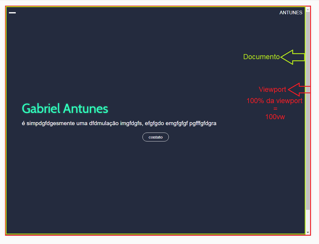
  • Tried to use the attribute overflow: hidden? The overflow attribute serves to tell you what will happen if the content exceeds the wrap size.

  • 1

    [OFF] Missing letter "e" in tag <articl .

  • "- [...] however when I added content below the header the scroll bar appeared" What is the expected effect? Logically, the scroll IS NECESSARY for the user to access the content. If you take out the scroll, it has the same effect as "you take out the content". If you want that content inside the header, you should mention it in the question. But anyway, if it exceeds the screen size, the scroll will appear. The difference is that the scroll will be the header, not the body. Can [Edit] the question and add more information to your goal?! ;D

  • i used the overflow-x Hidden, but would like to know why gave this scroll bar :/

  • @Lipespry-defolga- the scroll I speak is on the x-axis

  • Ahhhh yes! It is good to inform this in the question, bro! Kk

  • @Lipespry-defolga- I went by rsrs, I repaired with overflow-x Hidden, however I would like to know why it happens.

  • I got it! When my PC decides to call, I’ll give you an answer.

  • 1

    @Lipespry-defolga-vlw even by help <3

Show 4 more comments

2 answers

2

You defined the width of your header with 100% of the viewport: width: 100vw. Turns out the scroll bar (scrollbar) belongs to the viewport.

Print exemplo

Therefore, one should discount the size of it. MAAAS, A better way is to limit her size to 100%: max-width: 100%;. This solves the question of the different sizes of scrollbar browsers. Limiting the size to 100% of the document.

There’s a question about that in Soen: 100vw causing horizontal overflow, but only if more than one?.

Also, you need to adjust the position of your ::before. You defined the position: absolute;, but has yet to define from where it stands: top: 0; left: 0; resolves!

See how your code looks once it’s done:

(function(window){
	'use strict';
	
	var menu = (function(){
							var $btnMenu = document.querySelector('[data-js=menuBtn]');

							function openAndCloseMenu(event){
								event.preventDefault();
								event.stopPropagation();
								$btnMenu.classList.toggle('openMenu');
							}

							function addNewEvent(event, element, callback){
								element.addEventListener(event, callback, false);
							}

							return{
								init: function(){
									addNewEvent('click', $btnMenu, openAndCloseMenu);
								}
							}
						}());

	menu.init();
}(window));
*{
    margin: 0;
    padding: 0;
    box-sizing: border-box;
    font-size: 100%;
    background: none;
    border: none;
}

:root{
    --green: #31FFC0;
    --bgcolor: #242B3E;
    --white: #FFFFFF;
    --svgBgColor: #4F4C61;
    --copostBG: #646178;
    --greeCompost: #72D5B7;
}

body{
    font-family: 'Fira Code', sans-serif;
    font-size: 400;
    background-color: var(--bgcolor);
    color: var(--white);
    position: relative;
}
h1, h2{
    font-family: 'Cabin', sans-serif;
    font-weight: 400;
}

h1{
    font-size: 2.7rem;
    font-weight: 400;
}

h2{
    font-size: 1.8rem;
}

a,li,ul{
    text-decoration: none;
    list-style: none;
}

ul{
    display: flex;
}

p{
    font-size: 1.2rem;
}

a{
    font-size: inherit;
}

.shadow-white{
    color: var(--white);
    text-shadow: 0 0 8px rgba(255,255,255, .4);
}

.shadow-black{
    color: var(--bgcolor);
    text-shadow: 0 0 8px rgba(36, 43, 62, .4);
}

.shadow-green{
    color: var(--green);
    text-shadow: 0 0 8px rgba(49, 255, 162, .4);
}

.sub-title{
    font-size: 1.2rem;
    font-weight: 400;
}

.container_flex{
    width: 100vw;
    /* ADICIONEI ISSO: */
    max-width: 100%;
    /* --------------- */
    padding: 0 13px;
    position: relative;
}

.container{
    width: 100%;
    padding: 13px;
}

.header_container{
    height: 100vh;
    min-height: 568px;
    display: flex;
    position: relative;
    z-index: 3;
}

.header_container::before{
    content: '';
    width: 100%;
    height: 100%;
    position: absolute;
    /* ADICIONEI ISSO: */
    top: 0;
    left: 0;
    /* --------------- */
    opacity: .5;
    background: url('../img/bg2.png') no-repeat center center;
    background-size: cover;
}

header .intro-container{
    padding: 0;
    align-self: center;
    text-align: center;
    z-index: 5;
}

.intro-container h1{
    margin-bottom: 12px;
    z-index: 5;
    text-align: left;
}

.intro-container p{
    margin-bottom: 10px;
    line-height: 1.45rem;
    text-align: left;
    z-index: 5;
}

.btnContat{
    margin-top: 10px;
    text-align: center;
    font-size: 1rem;
    color: var(--white);
    font-family: 'Fira Code';
    font-weight: 300;
    padding: 5px 20px;
    border: 1px solid var(--white);
    border-radius: 15px;
    cursor: pointer;
    z-index: 5;
    position: relative;
}

.btnContat::before{
    content: '';
   width: 100%;
   height: 0;
   position: absolute;
   border-radius: 15px;
   display: block;
   z-index: 0;
   background-color: var(--white);
   bottom: 0;
   left: 0;
   transition: height .3s ease;
   opacity: .1;
}

.btnContat:hover::before{
    top: 0;
    height: 100%;  
}

.nav{
    position: absolute;
    display: flex;
    padding: 10px 10px;
    align-items: center;
    justify-content: space-between;
    width: 100%;
}

.link{
    color: var(--white);
    position: relative;
}

.link-branch{
    color: var(--white);
    text-transform: uppercase;
    position: relative;
    z-index: 10;
}

.nav-menuBtn{
    height: 19px;
    width: 23px;
    position: relative;
    display: flex;
    align-items: flex-start;
    cursor: pointer;
    z-index: 100;
}

.nav-menuBtn i{
    position: absolute;
    width: 100%;
    height: 2px;
    background: var(--white);
}

.nav-menuBtn i:last-child{
    align-self: flex-end;
}

.nav-menuBtn i:nth-child(2){
    align-self: center;
}

.nav-menu{
    background-color:  rgba(36, 43, 62, .9);
    position: fixed;
    bottom: 0;
    top: 0;
    left: 0;
    right: 0;
    display: flex;
    flex-direction: column;
    justify-content: center;
    align-items: center;
    visibility: hidden;
    z-index: 50;
    transition: all .3s ease;
    opacity: 0;
}

li .link{
    font-size: 2rem;
    overflow: visible;
}
.nav-menu li{
    margin: 15px;
    overflow: visible;
}

li .link::after{
    content: '';
    position: absolute;
    display: block;
    width: 0;
    height: 2px;
    right: 0;
    background-color: var(--green);
    overflow: visible;
    bottom: -12px;
    transition: width .3s ease;
}

li .link:hover::after{
    left: 0;
    width: 100%;
}

.openMenu ~ .nav-menu{
    visibility: visible;
    opacity: 1;
}

@media screen and (min-width: 789px){
    .container{
        max-width: 900px;
        margin: 0 auto;
    }
}
<!DOCTYPE html>
<html lang="pt-br">
<head>
    <meta charset="UTF-8">
    <meta name="viewport" content="width=device-width, initial-scale=1.0">
    <meta http-equiv="X-UA-Compatible" content="ie=edge">
    <title>Antunes</title>

    <link href="https://fonts.googleapis.com/css?family=Cabin:400,500" rel="stylesheet"> 

    <link rel="stylesheet" href="./css/font/fira_code.css">
    <link rel="stylesheet" href="./css/config.css">
    <link rel="stylesheet" href="./css/menu.css">
    <link rel="stylesheet" href="./css/responsive.css">
    <link rel="stylesheet" href="./css/style.css">
</head>
<body>
   
    <nav class="nav">
        <button data-js="menuBtn" class="nav-menuBtn"><i></i><i></i><i></i></button>
        <ul class="nav-menu">
            <li class="menu-items">
                <a class="link" href="#" >Inicio</a>
            </li>
            <li class="menu-items">
                <a class="link" href="#" >Projetos</a>
            </li>
            <li class="menu-items">
                <a class="link" href="#" >Sobre</a>
            </li>
        </ul>
        <a class="link-branch" href="index.html" class="nav-logo">Antunes</a>
    </nav>
    <header class="container_flex header_container">

        <section class="container intro-container">
            <h1 class="shadow-green">Gabriel Antunes</h1>
            <p data-js="description" class="sub-title">
                é simpdgfdgesmente uma dfdmulação
                imgfdgfs, efgfgdo
                emgfgfgf pgfffgfdgra
            </p>
            <button class="btnContat" data-js="contatBtn">contato</button>
        </section>
    </header>

    <section class="container">
        <h2 class="shadow-white">
            Laboratório
        </h2>
        <div class="flex-row 2-3col">
            fdsfgdsgfsdfgfgafdgrfdgf
            <!-- Corrigi as suas tags article que estavam sem o "e" -->
            <article class="square_project" data-js="projects"></article>
            <article class="square_project" data-js="projects"></article>
            <article class="square_project" data-js="projects"></article>
            <article class="square_project" data-js="projects"></article>
            <article class="square_project" data-js="projects"></article>
            <article class="square_project" data-js="projects"></article>
        </div>
    </section>

    <script src="./js/menu.js"></script>
</body>
</html>

-1

To prevent page content from continuing to be displayed after the height of the element in question reaches its maximum value, that is, 100%, prevent the scroll bar from being shown using the property overflow: hidden.

However, make no mistake: the content will still be there, you will only have prevented the user from getting to it.

  • 1

    I wasn’t the one who told you, but your solution was to "push the suggestion under the carpet". If you have the horizontal scroll eh Pq there is something wrong, and the overflow is not the answer to this error... Think about it

  • I made that clear in the reply...

Browser other questions tagged

You are not signed in. Login or sign up in order to post.