Well I’ll give you my tips, but maybe someone else has a different solution...
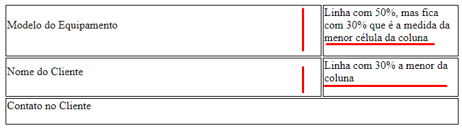
But about your problem notice that I a table vc can not make columns of different sizes, because all cells (TD) of the columns will follow the width of the smallest cell. Just as the height of cells of the same line will always be equal, even if one has little content and the other very, as you can see in this example.
table{
      width: 100%;
    }

    .linha-100{
      width: 100%;
    }

    .linha-70{
      width: 70%;
    }

    .linha-50 {
      width: 50%;
    }

    .linha-30 {
      width: 30%;
    }
td {
border: 1px solid #000;
}
<table>
  <tr>
    <td class="linha-70">
      <label>Modelo do Equipamento</label>
      <p></p>
    </td>

    <td class="linha-50">
      <label>Linha com 50%, mas fica com 30% que é a medida da menor célula da coluna</label>
      <p></p>
    </td>
  </tr>

  <tr>
      <td class="linha-70">
        <label>Nome do Cliente</label>
        <p></p>
      </td>

      <td class="linha-30">
        <label>Linha com 30% a menor da coluna</label>
        <p></p>
      </td>
    </tr>

    <tr>
        <td class="linha-100" colspan="2">
          <label>Contato no Cliente</label>
          <p></p>
        </td>
    </tr>

</table>
Now a layout option using elements from Form and FlexBox. Something else, like your form doesn’t have input I see no point in using label, but the fact is that without these elements he will be completely "not semantic"
My idea here is just to show you how to make a simple grid. I left the edges just for you to distribute the elements. If you want more responsive you can make one bracking point @madia and spend all the .col-x for 100% there they occupy a whole row each one
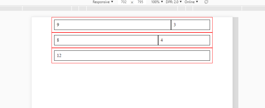
Follow the code of the image above, as you can see it is only you create in the class .col-x the size of the fields you want.
html, body {
  width: 100%;
  height: 100%;
  margin: 0;
  padding: 0;
}

.form {
  width: 80%;
  margin: auto;
}
.linha {
  padding: 0.5rem;
  box-sizing: border-box;
  display: flex;
  border: 1px solid red;
}
[class^="col-"] {
  box-sizing: border-box;
  border: 1px solid #000;
  padding: 0.5rem;
}
.col-12 {
  width: 100%;
}
.col-3 {
  width: 25%;
}
.col-4 {
  width: 33.33%;
}
.col-8 {
  width: 66.66%;
}
.col-9 {
  width: 75%;
}

@media (max-width: 480px) {
  .linha {
    flex-wrap: wrap;
  }
  .col-12,
  .col-9,
  .col-8,
  .col-4,
  .col-3 {
    width: 100%;
  }

}
<form class="form">
  <div class="linha">
    <div class="col-9">9</div>
    <div class="col-3">3</div>
  </div>
  <div class="linha">
    <div class="col-8">8</div>
    <div class="col-4">4</div>
  </div>
  <div class="linha">
    <div class="col-12">12</div>
  </div>
</form>
Man by what cause, reason or circumstance are you using table for this? Is it system requirement or can it be otherwise? Table is for tabular data, not for layout.... To do this you should use a Form with Labels, inputs and Divs
– hugocsl
this form will be pulled by Dynamics, so there can be no framework, in this specific case there can be no input, this was the best way I found ... if you have any better tips, I would be grateful.
– Roney Berti
Another thing, a column will always have the same width in all lines. From what I can see there, you want one line to be wide and another to be wide. This is not possible.
– Sam
The input (apart from the fact of accessibility) is the least... the biggest problem there is to use table to distribute the layout. If it will not be something sent by email, with style inline etc, the appropriate is to use elements of the form itself, p, div, span etc... And as Sam said, the Column will always have the value of the smallest cell, meaning all Tds in a column will be 30% which is the width of the smallest cell
– hugocsl
https://formulario-vyttra.netlify.com/
– Roney Berti
Yes, but this way was done with Framework, bootstrap... you do not need it to have this same result, da para fazer na mão sem maior problemas! How responsive you want to be??
– hugocsl
as far as I’ve been.
– Roney Berti