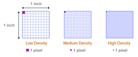
What happens is that the pixel density is not linked to the width of the screen. Look at this image, notice that I one inch you have amount of different pixels. On a high density screen you can have up to 3x more pixels in the same space.
The current units of resolution to make the media queries according to the documentation W3C sane:
- dpi: points per inch.
- dpcm: points per centimetre.
- dppx: points per pixel.
See that 1px is no longer 1px :/
Note that due to the 1:96 fixed ratio of CSS in to CSS px, 1dppx is equivalent to 96dpi. This Corresponds to the default Resolution of images displayed in CSS
What the above text means is that 1px CSS is equivalent to 96 points per inch.
The rule @media The following uses Media Queries to assign some special style rules to devices that use 2 or more device pixels for px unit of CSS:
@media (min-resolution: 2dppx) { ... } /* regra css para telas com 2x a densidade de pixel, 96 x 2 = 192dpi */
Source: https://www.w3.org/TR/css3-values/#Resolution
Summary: So what you need to keep in mind is that 400px CSS is different than 400px from the device screen. It’s a bit confusing at first, but if you want a different rule for high-density devices use the measurements above dpi dpcm dppx e não em PX.
And notice that in a monitor comum 1px = 96dpi, and on a modern monitor of the type Retina 1px = 192dpi (2 x 96) or more, but still 1px, therefore the rule @media to be in 2dppx for example or something like.
Tip: In this article is an example of how to group @media rules for ordinary or high-density screens: https://css-tricks.com/snippets/css/retina-display-media-query/
This is a simple table with some screen measurements, note the difference of Pixel Density vs. Display Resolution
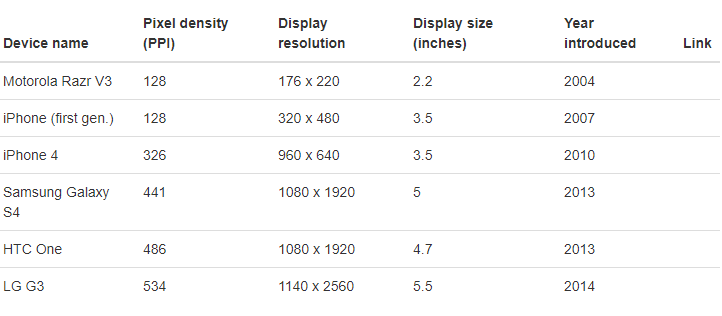
Image source where there is also a Pixel Density Calculator http://kingscalculator.com/en/other-calculators/pixel-density-calculator
Article that can help you better understand this concept: https://juiceboxinteractive.com/blog/a-pixel-is-not-a-pixel-designing-for-a-new-generation-of-mobile-devices/
OBS: It seems to me the property -webkit-min-device-pixel-ratio is not standard (non standard)! And its use is not recommended! Opt for the above mentioned units dpi dpcm dppx
While the standard uses min/max-resolution for this, some browsers support the Older non-standard device-pixel-ratio media query
Source: https://caniuse.com/#feat=css-media-Resolution
It’s really confusing, but I could understand basically how it works, thank you for sending the link of the site to calculate, I will give a better study, this will help me a lot in the responsive sites. Thanks for the help.
– John Covv
@Johncovv no problem, the boring thing is doing so many
@media, but vc can condense them into one, see here some examples https://css-tricks.com/snippets/css/retina-display-media-query/ and on the answer think you may have 1PX = 96dpi, and a 1PX that is = 144dpi, this will depend on the pixel density of the device’s screen.– hugocsl