Leave items next to the mobile with bootstrap 4

Asked

Viewed 76 times

2

Need to leave the following items next to each other as is the desktop.

As it is on the desktop
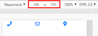
Desktop

Like this on mobile

Mobile

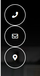
I need him to have the same behavior on mobile and desktop for these items.

<div class="col-md-6">
                <div class="contato-itens row">
                    <div class="col-md-4">

                            <div class="circulo-itens">
                                <i class="fas fa-phone"></i>
                            </div>
                            <p class="mt-2 text-left d-none d-md-block">xxx</p>
                        </a>
                    </div>
                    <div class="col-md-4">

                            <div class="circulo-itens">
                                <i class="far fa-envelope"></i>
                            </div>
                            <p class="mt-2 text-left d-none d-md-block">xxx</p>
                        </a>
                    </div>

                    <div class="col-md-4">
                        <a href="#">
                            <div class="circulo-itens">
                                <i class="fas fa-map-marker-alt"></i>
                            </div>
                            <p class="mt-2 text-left d-none d-md-block">xxx</p>
                        </a>
                    </div>
                </div>

1 answer

3


In that case just don’t declare the bracking point of grid in the class, for example, do not put in the div col-md-4, just put col-4, so it always occupied 1/3 of the width, even in small screens as of cell phones. BS4 Grid official documentation link that talks about this type of use

inserir a descrição da imagem aqui

  <link rel="stylesheet" type="text/css" media="screen" href="https://stackpath.bootstrapcdn.com/bootstrap/4.2.1/css/bootstrap.min.css" />
  <link rel="stylesheet" type="text/css" media="screen" href="https://use.fontawesome.com/releases/v5.7.1/css/all.css" />


  <div class="col-md-6">
    <div class="contato-itens row">

      <div class="col-4">
        <a href="#">
          <div class="circulo-itens">
            <i class="fas fa-phone"></i>
          </div>
          <p class="mt-2 text-left d-none d-md-block">xxx</p>
        </a>
      </div>

      <div class="col-4">
        <a href="#">
          <div class="circulo-itens">
            <i class="far fa-envelope"></i>
          </div>
          <p class="mt-2 text-left d-none d-md-block">xxx</p>
        </a>
      </div>

      <div class="col-4">
        <a href="#">
          <div class="circulo-itens">
            <i class="fas fa-map-marker-alt"></i>
          </div>
          <p class="mt-2 text-left d-none d-md-block">xxx</p>
        </a>
      </div>
      
    </div>
  </div>

Browser other questions tagged

You are not signed in. Login or sign up in order to post.