I’ll give you a solution that is the most current in css level, it uses display:grid. There are even other ways to get this layout, but not as simple and dynamic as you want.
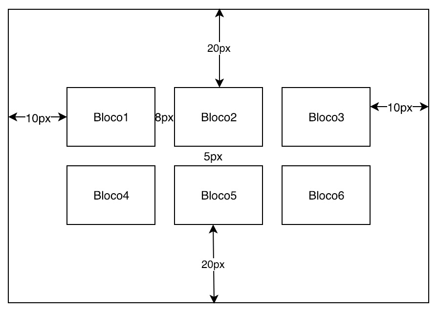
Note the image below, see that I used a padding in the container to give spacing acima/abaixo 20px and in the direita/esquerda 10px, among the .box i used the property of grid called grid-gap note that in the gap i put 8px de espaçamento horizontal and 5px de espaçamento vertical between one and the other. Notice the image with the display:grid spacing is only between .box, and do not add to other values of grid
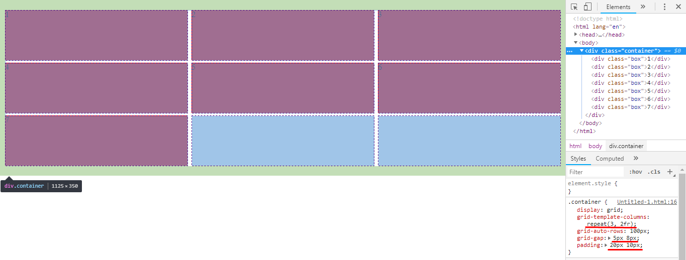
I set the number of columns here grid-template-columns: repeat(3, 1fr); this way each of the columns will always have 1fr. Here is a basic documentation from Mozilla about the Grid Layout, I think it’ll help you: https://developer.mozilla.org/en-US/docs/Web/CSS/CSS_Grid_Layout/Basic_Concepts_of_Grid_Layout
Dry the code referring to the image above, I left the comments in the code to help you better understand how the grid works
html, body {
  width: 100%;
  height: 100%;
  margin: 0;
  padding: 0;
}
.container {
  display: grid;
  /* aqui eu determino é são 3 colunas de tamanhos iguas, cada coluna tem uma fração */
  grid-template-columns: repeat(3, 1fr);
  /* esssa é a altura das linhas, se vc quiser pode apaga-la caso não queira uma altura definida */
  grid-auto-rows: 100px;
  /* espaço entre um elemento interno e outro */
  grid-gap: 5px 8px;
  /* margem interna que afasta os elementos da borda do grid */
  padding: 20px 10px;
}
.box {
  background-color: red;
}
<div class="container">
  <div class="box">1</div>
  <div class="box">2</div>
  <div class="box">3</div>
  <div class="box">4</div>
  <div class="box">5</div>
  <div class="box">6</div>
  <div class="box">7</div>
</div>
Dear your question is not very clear, if you want fixed branch 100px pro box and fixed size 300px pro container, how do you want it to grow horizontally? Will the container always have 300px or will it have at least 300px can increase? And the box, the minimum size of it should be 100px can increase if the container grows tbm?
– hugocsl
Collapse, what I meant was, grow vertically, the Container will always have 3 elements per horizontal Row (3 of 100px = 300px). The size of the box fits according to your children. Gave to clarify?
– Cláudio Hilário
So it won’t grow horizontally, it will grow vertically? The box will always be 100px wide, but.can be 200px high for example?
– hugocsl
Simply put, I don’t want to know the sizes I want is the children of the box every 3 pass to the bottom Row and have a margin between them 8/5px, and the margin of "out" is 10/20 px relative to the larger Row. All this in a dynamic way.
– Cláudio Hilário