div.layout {
    position: fixed;
    top: 0;
    right: 0;
    bottom: 0;
    left: 0;
}
div.layout > header {
    width: 100%;
    background-color: red;
    height: 15vh;
}
div.layout > nav {
    width: 100%;
    background-color: yellow;
    height: 15vh;
}
div.layout > main {
    width: 100%;
    height: 70vh;
}
div.layout > main > section > div.cabecalho {
    width: 100%;
    background-color: rgb(255, 175, 200);
    height: 30px;
    position: relative;
}
div.layout > main > section > div.cabecalho > h2 {
    margin: 0;
    padding: 3px;
}
div.layout > main > section > div.cabecalho > nav {
    position: absolute;
    right: 5px;
    top: 5px;
}
div.layout > main > section > div.registrosA {
    width: 100%;
    /*
     * REGRINHA DE 3...
     * 70 = 100
     * x = 40
     *
     * x = 28
     */
    height: calc(28vh - 30px);
    background-color: rgb(90, 130, 250);
    overflow: auto;
}
div.layout > main > section > div.registrosB {
    width: 100%;
    /*
     * REGRINHA DE 3 DE NOVO...
     * 70 = 100
     * x = 60
     *
     * x = 42
     */
    height: calc(42vh - 30px);
    background-color: rgb(0, 170, 0);
    overflow: auto;
}
<!DOCTYPE html>
<html>
    <head>
        <title>Layout</title>
    </head>
    <body>
        <div class="layout">
            <header>
                BARRA FIXA
            </header>
            <nav>
                MENU EM ABAS
            </nav>
            <main>
                <section>
                    <div class="cabecalho">
                        <h2>TITULO</h2>
                        <nav>
                            <a href="#">Adicionar</a>
                            <a href="#">Atualizar</a>
                        </nav>
                    </div>
                    <div class="registrosA">
                        <p>REGISTROS A</p>
                        <p>Lorem ipsum dolor sit amet, consectetur adipisicing elit. Autem velit recusandae cupiditate aut quas pariatur doloribus vero maiores nulla porro possimus accusamus expedita, quibusdam, aspernatur numquam perferendis a quod omnis?</p>
                        <p>Lorem ipsum dolor sit amet, consectetur adipisicing elit. Autem velit recusandae cupiditate aut quas pariatur doloribus vero maiores nulla porro possimus accusamus expedita, quibusdam, aspernatur numquam perferendis a quod omnis?</p>
                        <p>Lorem ipsum dolor sit amet, consectetur adipisicing elit. Autem velit recusandae cupiditate aut quas pariatur doloribus vero maiores nulla porro possimus accusamus expedita, quibusdam, aspernatur numquam perferendis a quod omnis?</p>
                        <p>Lorem ipsum dolor sit amet, consectetur adipisicing elit. Autem velit recusandae cupiditate aut quas pariatur doloribus vero maiores nulla porro possimus accusamus expedita, quibusdam, aspernatur numquam perferendis a quod omnis?</p>
                        <p>Lorem ipsum dolor sit amet, consectetur adipisicing elit. Autem velit recusandae cupiditate aut quas pariatur doloribus vero maiores nulla porro possimus accusamus expedita, quibusdam, aspernatur numquam perferendis a quod omnis?</p>
                        <p>Lorem ipsum dolor sit amet, consectetur adipisicing elit. Autem velit recusandae cupiditate aut quas pariatur doloribus vero maiores nulla porro possimus accusamus expedita, quibusdam, aspernatur numquam perferendis a quod omnis?</p>
                        <p>Lorem ipsum dolor sit amet, consectetur adipisicing elit. Autem velit recusandae cupiditate aut quas pariatur doloribus vero maiores nulla porro possimus accusamus expedita, quibusdam, aspernatur numquam perferendis a quod omnis?</p>
                        <p>Lorem ipsum dolor sit amet, consectetur adipisicing elit. Autem velit recusandae cupiditate aut quas pariatur doloribus vero maiores nulla porro possimus accusamus expedita, quibusdam, aspernatur numquam perferendis a quod omnis?</p>
                        <p>Lorem ipsum dolor sit amet, consectetur adipisicing elit. Autem velit recusandae cupiditate aut quas pariatur doloribus vero maiores nulla porro possimus accusamus expedita, quibusdam, aspernatur numquam perferendis a quod omnis?</p>
                    </div>
                </section>
                <section>
                    <div class="cabecalho">
                        <h2>TITULO</h2>
                        <nav>
                            <a href="#">Adicionar</a>
                            <a href="#">Atualizar</a>
                        </nav>
                    </div>
                    <div class="registrosB">
                        <p>REGISTROS B</p>
                        <p>Lorem ipsum dolor sit amet, consectetur adipisicing elit. Autem velit recusandae cupiditate aut quas pariatur doloribus vero maiores nulla porro possimus accusamus expedita, quibusdam, aspernatur numquam perferendis a quod omnis?</p>
                        <p>Lorem ipsum dolor sit amet, consectetur adipisicing elit. Autem velit recusandae cupiditate aut quas pariatur doloribus vero maiores nulla porro possimus accusamus expedita, quibusdam, aspernatur numquam perferendis a quod omnis?</p>
                        <p>Lorem ipsum dolor sit amet, consectetur adipisicing elit. Autem velit recusandae cupiditate aut quas pariatur doloribus vero maiores nulla porro possimus accusamus expedita, quibusdam, aspernatur numquam perferendis a quod omnis?</p>
                        <p>Lorem ipsum dolor sit amet, consectetur adipisicing elit. Autem velit recusandae cupiditate aut quas pariatur doloribus vero maiores nulla porro possimus accusamus expedita, quibusdam, aspernatur numquam perferendis a quod omnis?</p>
                        <p>Lorem ipsum dolor sit amet, consectetur adipisicing elit. Autem velit recusandae cupiditate aut quas pariatur doloribus vero maiores nulla porro possimus accusamus expedita, quibusdam, aspernatur numquam perferendis a quod omnis?</p>
                        <p>Lorem ipsum dolor sit amet, consectetur adipisicing elit. Autem velit recusandae cupiditate aut quas pariatur doloribus vero maiores nulla porro possimus accusamus expedita, quibusdam, aspernatur numquam perferendis a quod omnis?</p>
                        <p>Lorem ipsum dolor sit amet, consectetur adipisicing elit. Autem velit recusandae cupiditate aut quas pariatur doloribus vero maiores nulla porro possimus accusamus expedita, quibusdam, aspernatur numquam perferendis a quod omnis?</p>
                        <p>Lorem ipsum dolor sit amet, consectetur adipisicing elit. Autem velit recusandae cupiditate aut quas pariatur doloribus vero maiores nulla porro possimus accusamus expedita, quibusdam, aspernatur numquam perferendis a quod omnis?</p>
                        <p>Lorem ipsum dolor sit amet, consectetur adipisicing elit. Autem velit recusandae cupiditate aut quas pariatur doloribus vero maiores nulla porro possimus accusamus expedita, quibusdam, aspernatur numquam perferendis a quod omnis?</p>
                        <p>Lorem ipsum dolor sit amet, consectetur adipisicing elit. Autem velit recusandae cupiditate aut quas pariatur doloribus vero maiores nulla porro possimus accusamus expedita, quibusdam, aspernatur numquam perferendis a quod omnis?</p>
                        <p>Lorem ipsum dolor sit amet, consectetur adipisicing elit. Autem velit recusandae cupiditate aut quas pariatur doloribus vero maiores nulla porro possimus accusamus expedita, quibusdam, aspernatur numquam perferendis a quod omnis?</p>
                        <p>Lorem ipsum dolor sit amet, consectetur adipisicing elit. Autem velit recusandae cupiditate aut quas pariatur doloribus vero maiores nulla porro possimus accusamus expedita, quibusdam, aspernatur numquam perferendis a quod omnis?</p>
                        <p>Lorem ipsum dolor sit amet, consectetur adipisicing elit. Autem velit recusandae cupiditate aut quas pariatur doloribus vero maiores nulla porro possimus accusamus expedita, quibusdam, aspernatur numquam perferendis a quod omnis?</p>
                        <p>Lorem ipsum dolor sit amet, consectetur adipisicing elit. Autem velit recusandae cupiditate aut quas pariatur doloribus vero maiores nulla porro possimus accusamus expedita, quibusdam, aspernatur numquam perferendis a quod omnis?</p>
                        <p>Lorem ipsum dolor sit amet, consectetur adipisicing elit. Autem velit recusandae cupiditate aut quas pariatur doloribus vero maiores nulla porro possimus accusamus expedita, quibusdam, aspernatur numquam perferendis a quod omnis?</p>
                        <p>Lorem ipsum dolor sit amet, consectetur adipisicing elit. Autem velit recusandae cupiditate aut quas pariatur doloribus vero maiores nulla porro possimus accusamus expedita, quibusdam, aspernatur numquam perferendis a quod omnis?</p>
                        <p>Lorem ipsum dolor sit amet, consectetur adipisicing elit. Autem velit recusandae cupiditate aut quas pariatur doloribus vero maiores nulla porro possimus accusamus expedita, quibusdam, aspernatur numquam perferendis a quod omnis?</p>
                    </div>
                </section>
            </main>
        </div>
    </body>
</html>
"create a record table, "if tabular data,
<table>¯\(ツ)/¯– Woss
You say, simply create a table with fixed size? But then the bottom ones?
– rbz
HTML elements will depend on what information is displayed. There is no way to understand what exactly you want to display. Is the problem creating the div, aligning it to the layout or displaying the data? The question title also didn’t help much ^^
– Woss
With the available information I would say that you can do this very simply with
HTML,CSSandJavaScript– Leandro Angelo
@Leandroangelo But I wanted to know what to use for html... Use
div,frame, etc to create this table view, with the side scroll, keeping the size fixed on the screen– rbz
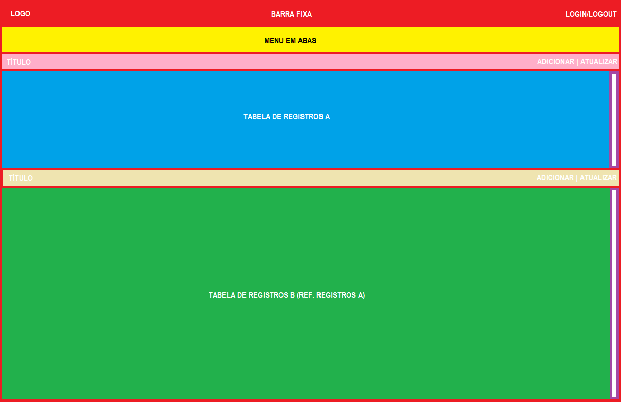
The layout seems to me very simple, you can use semantics, calling the header div, plus, Section and article, etc... but basically its layout are 6 div, and the blue div has a fixed height... I believe that the fixed bar and the tabs will also have a fixed height although you did not say... And also I believe that the record table should occupy 100% of the remaining space is this? If that’s what it is, consider including those hints in the question, it will help to answer you
– hugocsl
Frame, never scroll side you can apply in "any" element in css
overflow-x: auto;– Leandro Angelo
Amended question.
– rbz
@hugocsl Almost that. The question is about how to structure the 2 Tables. One on top of the other, maintaining proportion, and having the scroll bar on the side... I changed every question, see if improved
– rbz
But what exactly is the question? About the structure or want an html template/example? The structure would be basically (I will use class names to distinguish):
<header>><div class="header-barra-fixa"></div><nav class="header-menus"></nav></header><section class="tabela-a"><div class="tabela-a-titulo"></div><div class="tabela-a-conteudo"></div></section>
<section class="tabela-b"><div class="tabela-b-titulo"></div><div class="tabela-b-conteudo"></div></section>– Ricardo Pontual
@Ricardopunctual would be basically what I said. In that case I would use Section to display the contents of the tables. But that way if you have 200 records in "table a", will display entire... what you wanted is with scroll bar... I will change the image...
– rbz
this structure I suggested is a layout base. You can put
overflow-y: autoin classtabela-a-conteudoand achieve this. I just thought that I should first structure the layout and then think about the composition of each particular part– Ricardo Pontual
"- should have this fixed ratio 40%/60%" 40/60% of what? Viewport? What’s left? Because you have a SLASH and a TABBED MENU out of these two elements... Needs to be with bootstrap?
– LipESprY
@Lipespry-defolga- Yes, I am using bs4. the blue and green areas, ratio among themselves is 40%/60%. the 2 blue and green areas added, proportion to the rest, would be 70% and 30% the top menus.
– rbz
Is it acceptable without bootstrap? Fixed bar + menu = 30%, Records = 70% (40/60%). Right?!
– LipESprY
@Lipespry-defolga- in fact the doubt would be the end, but as it is very confused, I am at least trying to see without BS, and then turn to apply with BS... even because of the grids, I do not know if it will disturb, if I will have to create extra classes, or change something of BS...
– rbz
In a general context, you need a layout following the posted image. After several comments, I understood that you want to "improve" what you already have ready. Why didn’t you post the code you already have!? I was halfway through the code to help you. Now I’m going to post it anyway! ;X
– LipESprY