Problems in the Bootstrap Dropdown Menu on SM screens

Asked

Viewed 367 times

1

I’m having a problem with a menu dropdown that I made using Bootstrap.

The problem is this, the menu worked perfectly for size devices XS. However, it does not work on size devices SM (That’s what I wanted. I would like the menu to be used also in Tablets).

I’ve searched several forums and I still can’t find an answer. I’ll leave the code down here, see if you can help me. Thanks for your attention.

<!------------ MENU MÓVEL -------------->

                <nav class="navbar navbar-default hidden-md hidden-lg navbar-fixed-top " id="nav-movel">


                <!--------- DIV DAS REDES SOCIAIS ----------->

                    <div class="row visible-xs visible-sm" id="cabecalho-superior-movel">

                        <div class="col-xs-12 col-sm-12 col-md-12 col-lg-12" id="cabecalho-superior-acerto">
                            <a href="https://www.facebook.com/jcacontadores/" target="blank"><img src="_imagens/icones/footer_redesFace.png"></a>
                            <a href="https://www.instagram.com/jcacontadores/" target="blank"><img src="_imagens/icones/footer_redesInsta.png"></a>
                            <a href="https://www.linkedin.com/in/jca-contadores-406/" target="blank"><img src="_imagens/icones/footer_redesLink.png"></a>
                            <a href="https://www.youtube.com/channel/UCLb6KnKGdjKh-usDWdZ93yg?view_as=subscriber" target="blank"><img src="_imagens/icones/footer_redesYouTube.png"></a>
                            <a href="https://encurtador.com.br/gOPZ6" target="_blank"><img src="_imagens/icones/icone-zap.png"></a>
                            <a href="mailto:[email protected]"><img src="_imagens/icones/icone-email.png"></a>
                            <a href="#" data-toggle="modal" data-target="#modal-contato"><button class="btn btn-info btn-sm">Fale com um Especialista</button></a>
                        </div>

                    </div>

                    <section class="container">
                        <div class="navbar-header">

                            <button type="button" class="navbar-toggle collapsed" data-toggle="collapse" data-target="#movelmenu" arial-expanded="false">
                                <span class="sr-only">Toggle Navigation</span>
                                <span class="icon-bar"></span>
                                <span class="icon-bar"></span>
                                <span class="icon-bar"></span>
                            </button>


                                <a href="index.php" class="navbar-brand" target="_blank">
                                    <img src="_imagens/logo-216x93.png" class="logo-menu-movel">
                                </a>

                        </div>


                        <div class="collapse navbar-collapse" id="movelmenu">

                            <ul class="nav navbar-nav" id="ul-movel">
                                <li class="" id="li-menu-movel"><a href="index.php">HOME</a></li>
                                <li class="" role="presentation" class="dropdown" id="li-menu-movel">
                                    <a class="dropdown-toggle" data-toggle="dropdown" href="#" role="button" aria-haspopup="true" aria-expanded="false">
                                      SOBRE<span class="caret"></span>
                                    </a>
                                    <ul class="dropdown-menu">
                                      <li class="li-submenu-movel" id="li-submenu-movel"><a href="quemsomos.php" target="blank">QUEM SOMOS</a></li>
                                    </ul>

                                </li>
                                <li class="li-menu-movel" id="li-menu-movel"><a href="#">SERVIÇOS</a></li>
                                <li role="presentation" class="dropdown li-menu-movel" id="li-menu-movel">
                                    <a class="dropdown-toggle" data-toggle="dropdown" href="#" role="button" aria-haspopup="true" aria-expanded="false">
                                      CARREIRAS<span class="caret"></span>
                                    </a>
                                    <ul class="dropdown-menu">
                                      <li id="li-submenu-movel" ><a href="contato-despertando.php" target="blank">PROGRAMA DESPERTANDO TALENTOS</a></li>
                                      <li class="li-submenu-movel" id="li-submenu-movel" ><a href="contato-profissionais.php" target="blank">PROGRAMA PROFISSIONAIS EXPERIENTE</a></li>
                                    </ul>

                                </li>
                                <li id="li-menu-movel"><a href="https://jcasistemas.info/">BLOG</a></li>
                                <li id="li-menu-movel"><a href="#" data-toggle="modal" data-target="#modal-contato">CONTATO</a></li>
                                <li id="li-menu-movel"><a href="location.htm">ÁREA DO CLIENTE</a></li>

                            </ul>


                        </div>
                    </section>
                </nav>

1 answer

1


Friend your problem is that you are using the code of a navbar of Bootstrap 3 but with the CSS and JS Bootstrap 4. (If you took that navabar ready on some website make sure which version was used for it to work properly.)

inserir a descrição da imagem aqui

Note that when I used your code, you can index the Bootstrap version 3 it worked perfectly! But if you index the files of Bootstrap 4 she goes from dick even...


EDIT

First remove the classes hidden-md hidden-lg, because with them the navbar will disappear in bigger screens than 992px Then for Navbar "collapsar" in the toggle menu at 992px vc should include in your CSS the lines I used below, so it will activate the toggle menu at the resolution you want.

<!DOCTYPE html>
<html lang="en">
<head>
    <meta charset="utf-8" />
    <meta http-equiv="X-UA-Compatible" content="IE=edge">
    <title>Page Title</title>
    <meta name="viewport" content="width=device-width, initial-scale=1">
<link rel="stylesheet" type="text/css" media="screen" href="https://maxcdn.bootstrapcdn.com/bootstrap/3.3.7/css/bootstrap.min.css" />
<link rel="stylesheet" type="text/css" media="screen" href="https://maxcdn.bootstrapcdn.com/bootstrap/3.3.7/css/bootstrap-theme.min.css" />
<link rel="stylesheet" type="text/css" media="screen" href="https://maxcdn.bootstrapcdn.com/font-awesome/4.7.0/css/font-awesome.min.css" />
<style>
@media (min-width: 768px) and (max-width: 991px) {
	.navbar-nav .open .dropdown-menu {
		position: static;
		float: none;
		width: auto;
		margin-top: 0;
		background-color: transparent;
		border: 0;
		-webkit-box-shadow: none;
		box-shadow: none;
	}
	.navbar-nav .open .dropdown-menu > li > a {
		line-height: 20px;
	}
	.navbar-nav .open .dropdown-menu > li > a,
	.navbar-nav .open .dropdown-menu .dropdown-header {
		padding: 5px 15px 5px 25px;
	}
	.dropdown-menu > li > a {
		display: block;
		padding: 3px 20px;
		clear: both;
		font-weight: normal;
		line-height: 1.42857143;
		color: #333;
		white-space: nowrap;
	}
    .navbar-header {
        float: none;
    }
    .navbar-toggle {
        display: block;
    }
    .navbar-collapse {
        border-top: 1px solid transparent;
        box-shadow: inset 0 1px 0 rgba(255,255,255,0.1);
    }
    .navbar-collapse.collapse {
        display: none!important;
    }
    .navbar-nav {
        float: none!important;
        /*margin: 7.5px -15px;*/
		margin: 7.5px 50px 7.5px -15px
    }
    .navbar-nav>li {
        float: none;
    }
    .navbar-nav>li>a {
        padding-top: 10px;
        padding-bottom: 10px;
    }
    .navbar-text {
        float: none;
        margin: 15px 0;
    }
    /* since 3.1.0 */
    .navbar-collapse.collapse.in { 
        display: block!important;
    }
    .collapsing {
        overflow: hidden!important;
    }
}
</style>
</head>
<body>
    
<nav class="navbar navbar-default navbar-fixed-top hidden-md hidden-lg" id="nav-movel">


<!--------- DIV DAS REDES SOCIAIS ----------->

    <div class="row visible-xs visible-sm" id="cabecalho-superior-movel">

        <div class="col-xs-12 col-sm-12 col-md-12 col-lg-12" id="cabecalho-superior-acerto">
            <a href="https://www.facebook.com/jcacontadores/" target="blank"><img src="_imagens/icones/footer_redesFace.png"></a>
            <a href="https://www.instagram.com/jcacontadores/" target="blank"><img src="_imagens/icones/footer_redesInsta.png"></a>
            <a href="https://www.linkedin.com/in/jca-contadores-406/" target="blank"><img src="_imagens/icones/footer_redesLink.png"></a>
            <a href="https://www.youtube.com/channel/UCLb6KnKGdjKh-usDWdZ93yg?view_as=subscriber" target="blank"><img src="_imagens/icones/footer_redesYouTube.png"></a>
            <a href="https://encurtador.com.br/gOPZ6" target="_blank"><img src="_imagens/icones/icone-zap.png"></a>
            <a href="mailto:[email protected]"><img src="_imagens/icones/icone-email.png"></a>
            <a href="#" data-toggle="modal" data-target="#modal-contato"><button class="btn btn-info btn-sm">Fale com um Especialista</button></a>
        </div>

    </div>

    
        <div class="navbar-header">

            <button type="button" class="navbar-toggle collapsed" data-toggle="collapse" data-target="#movelmenu" arial-expanded="false">
                <span class="sr-only">Toggle Navigation</span>
                <span class="icon-bar"></span>
                <span class="icon-bar"></span>
                <span class="icon-bar"></span>
            </button>


                <a href="index.php" class="navbar-brand" target="_blank">
                    <img src="_imagens/logo-216x93.png" class="logo-menu-movel">
                </a>

        </div>


        <div class="collapse navbar-collapse" id="movelmenu" style="padding-left: 15px; padding-right: 15px;">

            <ul class="nav navbar-nav" id="ul-movel">
                <li class="" id="li-menu-movel"><a href="index.php">HOME</a></li>
                <li class="" role="presentation" class="dropdown" id="li-menu-movel">
                    <a class="dropdown-toggle" data-toggle="dropdown" href="#" role="button" aria-haspopup="true" aria-expanded="false">
                        SOBRE<span class="caret"></span>
                    </a>
                    <ul class="dropdown-menu">
                        <li class="li-submenu-movel" id="li-submenu-movel"><a href="quemsomos.php" target="blank">QUEM SOMOS</a></li>
                    </ul>

                </li>
                <li class="li-menu-movel" id="li-menu-movel"><a href="#">SERVIÇOS</a></li>
                <li role="presentation" class="dropdown li-menu-movel" id="li-menu-movel">
                    <a class="dropdown-toggle" data-toggle="dropdown" href="#" role="button" aria-haspopup="true" aria-expanded="false">
                        CARREIRAS<span class="caret"></span>
                    </a>
                    <ul class="dropdown-menu">
                        <li id="li-submenu-movel" ><a href="contato-despertando.php" target="blank">PROGRAMA DESPERTANDO TALENTOS</a></li>
                        <li class="li-submenu-movel" id="li-submenu-movel" ><a href="contato-profissionais.php" target="blank">PROGRAMA PROFISSIONAIS EXPERIENTE</a></li>
                    </ul>

                </li>
                <li id="li-menu-movel"><a href="https://jcasistemas.info/">BLOG</a></li>
                <li id="li-menu-movel"><a href="#" data-toggle="modal" data-target="#modal-contato">CONTATO</a></li>
                <li id="li-menu-movel"><a href="location.htm">ÁREA DO CLIENTE</a></li>

            </ul>


        </div>
    
</nav>
    
<script src="https://code.jquery.com/jquery-3.2.1.min.js"></script>
<script src="https://maxcdn.bootstrapcdn.com/bootstrap/3.3.7/js/bootstrap.min.js"></script>
</body>
</html>

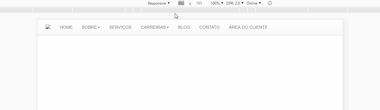
  • Hello, hugocsl friend. Thank you for the return. As I said, my menu is working perfectly in size "XS" (Mobile), the problem is that it is not working in size "SM" (Tablet), and it is this size that I would like it to work. In your example, it is working perfectly, however, you are using 722px width (XS size). In this size of XS mine also works. My problem is that it doesn’t work in the size "SM" (which is 768px up to 992px). If you can give me a solution on how to make the menu work in sizes other than "XS", I would be grateful.

  • 1

    @Thiagopetherson was that you had put the tag [Bootstrap-4] in your question, then got confused. But now I understood what you wanted. Read the EDIT which I did in response that you will see that now at 992px the collapsa menu in the toggle menu

  • At first glance, it all worked out on the menu. But when he looked better, he came kind of with the <li>, I mean the submenus, kind of buggers and side paddings.

  • I would like this Menu to be visible in XS and SM and be Hidden in MD and LG sizes. I’m cracking my head to do this in bootstrap.

  • 1

    @Thiagopetherson guy just did a general update, now it works as expected, one of the problems with the bug you talked about is pq vc had put a Section with class . container inside the navbar, this broke the layout. And now the LI expands correctly. In addition I put the Hidden class back in the navbar, but this way on screens larger than 992px the navbar disappears completely, so on screens larger than 992px no more visible menu.. Try it on and tell me

  • Speak there, my wizard. Now it’s all right. I just had to adjust some paddings and margins of your css. But it was minimal. Thank you so much for your help. Big hug !

  • One last question. Why am I only able to use this CSS code in the <style> area of the page and not in an external CSS file that I call on the page ? 'Cause then I’ll have to create this CSS code on every page of the site...

  • 1

    @Thiagopetherson is that Bootstrap has a very strong Class Hierarchy, you can even put in a file . Separate CSS, but you might need to use !important in the properties. Another detail is that this . CSS should come later, below the . CSS of Bootstrap ok! Do the test by putting it that way and talk to me. If you think the question has been answered remember to mark it as accepted in this icon next to the arrow, so your question is not pending on the site. And if you have any more problems just give me a tap

  • I really appreciate the tips. I am making a website for the company where I do internship. I’m using html,css,javascript, bootstrap, jquery and a minimum of php. I wonder if you could take a look at the site, even if superficially, and give me some improvement tips. It can be layout improvements, SEO... Goataria to leave the site light, beautiful and functional. The site is thiagopetherson.tech . Thank you very much for your patience. Hug-

  • @Thiagopetherson guy actually I’m just an rss designer, I don’t have all this knowledge to give you this "consulting", but I noticed that the site does not have ALT on all images, this is not good for SEO or Accessibility. You can Condense all . CSS into one in the version that will be published on the server this will help the site to load faster. I would leave the text of the Services centralized for mobile screens. And if you think that this question is solved mark as accepted in the icon beside the little arrows at the top the left of my answer. []s

Show 5 more comments

Browser other questions tagged

You are not signed in. Login or sign up in order to post.