Unwanted white space bringing the horizontal scroll bar to life by decreasing the screen

Asked

Viewed 602 times

0

When resizing the screen, there comes a time when a blank space is being generated in the corner of the screen, starting to do something with grid and trying to make it responsive, I must add media queries to solve this problem or is something I should change in the same code?

Obs: I added overflow-x: Hidden and the horizontal scroll is gone but it seemed more like a "hack"...

Replica of the code: https://codepen.io/utamo/pen/KJPNdL

* {
    margin: 0;
    padding: 0;
    font-family: 'Arimo', sans-serif;
}

/* Grid geral */
.grid-container {
    display: grid;
    grid-template-columns: 1fr 3fr 1fr;
    grid-template-rows: 100vh repeat(3,100vh) 10vh;
    grid-template-areas: 
        "header header header"
        ". midcontent ."
        ". aftermid . "
        ". finalcontent ."
        "footer footer footer"

}
/* Propriedades header */
.landing-header {
    grid-area: header;
    background: url(https://blog.sakugabooru.com/wp-content/uploads/2017/07/miabyss1.jpg);
  background-size: cover;
    display: flex;
    justify-content: center;
    align-items: center;
    flex-wrap: wrap;
    flex-shrink: 1;
   
}
.landing-text {
    font-size: 10em;
    color: white;
    
}
<!DOCTYPE html>
<html lang="en">
<head>
    <meta charset="UTF-8">
    <link rel="stylesheet" href="css/styles.css">
    <link href="https://fonts.googleapis.com/css?family=Arimo" rel="stylesheet">

    <title>Document</title>
</head>
<body>
    <section class="grid-container">
        <header class="landing-header">
            <h1 class="landing-text">WaifuLounge</h1>
        </header>
    </section>
</body>
</html>

1 answer

1


What happens is that you are using a fixed value in the text, and as this text is not responsive it ends up extrapolating the limits of the Grid.

See that putting a word-break: break-all; in the text would already prevent this, but I believe that you do not want the line to break in the middle of the word.

inserir a descrição da imagem aqui


So another very simple alternative is to put the measure of the text in VW, so it gets relative to the width of the viewport and will resize itself, without needing to media querys But if you want, you can make your own @media to treat the text, even though VW or EM

inserir a descrição da imagem aqui

Follow the code for the second image:

* {
    margin: 0;
    padding: 0;
    font-family: 'Arimo', sans-serif;
}

/* Grid geral */
.grid-container {
    display: grid;
    grid-template-columns: 1fr 3fr 1fr;m
    grid-template-rows: 100vh repeat(3,100vh) 10vh;
    grid-template-areas: 
        "header header header"
        ". midcontent ."
        ". aftermid . "
        ". finalcontent ."
        "footer footer footer"

}
/* Propriedades header */
.landing-header {
    grid-area: header;
    background: url('https://blog.sakugabooru.com/wp-content/uploads/2017/07/miabyss1.jpg');
    background-size: cover;
    display: flex;
    justify-content: center;
    align-items: center;
    flex-wrap: wrap;
    flex-shrink: 1;
   
}
.landing-text {
    /* aqui vc coloca o tamanho do texto relativo a largura da tela */
    font-size: 13vw;
    color: white;
}
<section class="grid-container">
    <header class="landing-header">
        <h1 class="landing-text">WaifuLounge</h1>
    </header>
</section>

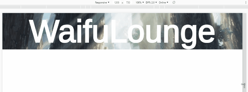
  • Valeu bro! I finished this small "responsive" site using vw with flexbox, if you want to take a look: https://utamo.github.io/waifuReboot/ The texts were smaller than expected but I was dealing with media queries

  • 1

    @utm mass! It was very responsive!

Browser other questions tagged

You are not signed in. Login or sign up in order to post.