2
.sidebar {
    -moz-transition: all 0.5s;
    -o-transition: all 0.5s;
    -webkit-transition: all 0.5s;
    transition: all 0.5s;
    font-family: "Roboto", sans-serif;
    background: rgba(0, 0, 0, 0.78);
    width: 250px;
    overflow: hidden;
    display: inline-block;
    height: calc(100vh - 70px);
    position: fixed;
    top: 70px;
    left: 0;
    -webkit-box-shadow: 2px 2px 5px rgba(0, 0, 0, 0.1);
    -moz-box-shadow: 2px 2px 5px rgba(0, 0, 0, 0.1);
    -ms-box-shadow: 2px 2px 5px rgba(0, 0, 0, 0.1);
    box-shadow: 2px 2px 5px rgba(0, 0, 0, 0.1);
    z-index: 11 !important;
}


.sidebar .user-info .info-container .user-helper-dropdown {
    position: absolute;
    right: -3px;
    bottom: -10px;
    -webkit-box-shadow: none;
    -moz-box-shadow: none;
    -ms-box-shadow: none;
    box-shadow: none;
    cursor: pointer;
    color: #fff;
}

.sidebar .menu {
    position: relative;
    overflow-y: scroll;
    height: 400px;
}

.sidebar .menu .list {
    list-style: none;
    padding-left: 0;
}

.sidebar .menu .list li.active > :first-child span {
    font-weight: bold;
}

.sidebar .menu .list .header {
    background: #eee;
    font-size: 12px;
    font-weight: 600;
    padding: 8px 16px;
}

.sidebar .menu .list i.material-icons {
    margin-top: 4px;
}

.sidebar .menu-toggle {
    color: white;
}

.sidebar .menu .list .menu-toggle:after, .sidebar .menu .list .menu-toggle:before {
    position: absolute;
    top: calc(50% - 14px);
    right: 17px;
    font-size: 19px;
    -moz-transform: scale(0);
    -ms-transform: scale(0);
    -o-transform: scale(0);
    -webkit-transform: scale(0);
    transform: scale(0);
    -moz-transition: all 0.3s;
    -o-transition: all 0.3s;
    -webkit-transition: all 0.3s;
    transition: all 0.3s;
}

.sidebar .menu .list .menu-toggle:before {
    content: '+';
    -moz-transform: scale(1);
    -ms-transform: scale(1);
    -o-transform: scale(1);
    -webkit-transform: scale(1);
    transform: scale(1);
}

.sidebar .menu .list .menu-toggle:after {
    content: '\2013';
    -moz-transform: scale(0);
    -ms-transform: scale(0);
    -o-transform: scale(0);
    -webkit-transform: scale(0);
    transform: scale(0);
}

.sidebar .menu .list .menu-toggle.toggled:before {
    -moz-transform: scale(0);
    -ms-transform: scale(0);
    -o-transform: scale(0);
    -webkit-transform: scale(0);
    transform: scale(0);
}

.sidebar .menu .list .menu-toggle.toggled:after {
    -moz-transform: scale(1);
    -ms-transform: scale(1);
    -o-transform: scale(1);
    -webkit-transform: scale(1);
    transform: scale(1);
}

.sidebar .menu .list a {
    color: white;
    position: relative;
    display: inline-flex;
    float: left;
    vertical-align: middle;
    width: 100%;
    padding: 10px 13px;
    text-decoration: none !important;
}

.sidebar .menu .list a:hover {
    background-color: #00b69d;
}

.sidebar .menu .list a small {
    position: absolute;
    top: calc(50% - 7.5px);
    right: 15px;
}

.sidebar .menu .list a span {
    margin: 7px 0 7px 12px;
    color: rgb(247, 247, 247);
    font-weight: bold;
    font-size: 14px;
    overflow: hidden;
}

.sidebar .menu .list .ml-menu {
    list-style: none;
    display: none;
    padding-left: 0;
}

.sidebar .menu .list .ml-menu span {
    font-weight: normal;
    font-size: 14px;
    margin: 3px 0 1px 6px;
}

.sidebar .menu .list .ml-menu li a {
    padding-left: 55px;
    padding-top: 7px;
    padding-bottom: 7px;
}

.sidebar .menu .list .ml-menu li.active a.toggled:not(.menu-toggle) {
    font-weight: 600;
    margin-left: 5px;
}

.sidebar .menu .list .ml-menu li.active a.toggled:not(.menu-toggle):before {
    content: '\E315';
    font-family: 'Material Icons';
    position: relative;
    font-size: 21px;
    height: 20px;
    top: -5px;
    right: 0px;
}

.sidebar .menu .list .ml-menu li .ml-menu li a {
    padding-left: 80px;
}

.sidebar .menu .list .ml-menu li .ml-menu .ml-menu li a {
    padding-left: 95px;
}
<link href="https://maxcdn.bootstrapcdn.com/bootstrap/3.3.7/css/bootstrap.min.css" rel="stylesheet"/>
<section>
<!-- Barra lateral -->
<div id="barralateral" class="sidebar">
<!-- User Info -->
<div class="user-info row" align="center">
<div class="image">
{% if user_foto_sidebar %}
<a href="{% url 'login:perfilview' %}"><img src="/media/{{user_foto_sidebar}}" alt="User"
class="centraliza-imagem"/></a>
{%else%}
<a href="{% url 'login:perfilview' %}"><img src="/media/imagens/user.png" alt="User"
class="centraliza-imagem"/></a>
{%endif%}
</div>
<div class="info-container">
<div class="name" data-toggle="dropdown" aria-haspopup="true" aria-expanded="false">
</div>
{% if user_empresa %}
<div class="email">{{user_empresa}}</div>
{% endif %}
<!--<div class="email">{{request.user.email}}</div>-->
<div class="user-helper-dropdown">
<i class="material-icons" data-toggle="dropdown" aria-haspopup="true"
aria-expanded="true"></i>
<ul class="dropdown-menu pull-right">
<li><a href="{% url 'login:perfilview' %}"><i class="material-icons"></i>Perfil</a></li>
<li role="seperator" class="divider"></li>
<li><a {% if user_empresa %} href="{% url 'cadastro:editarempresaview' user_empresa.id %}"
{%else%} class="popup" title="Selecionar Empresa"
href="{% url 'login:selecionarempresaview' %}" {%endif%}><i class="material-icons"></i>Minha
Empresa</a></li>
<li role="seperator" class="divider"></li>
<li><a href="{% url 'login:usuariosview' %}"><i class="material-icons"></i>Usuários</a>
</li>
<li role="seperator" class="divider"></li>
<li><a id="logout-btn" href="{% url 'login:logoutview' %}" title="Sair"><i
class="material-icons"></i>Sair</a></li>
</ul>
</div>
</div>
</div>
<!-- #User Info -->
<!-- Menu -->
<div class="menu">
<ul class="list">
<li class="active">
<a href="{% url 'base:index' %}">
<span>Página Inicial</span>
</a>
</li>
<li>
<a href="javascript:void(0);" class="menu-toggle"
<span>Cadastro</span>
</a>
</li>
<li>
<a href="javascript:void(0);" class="menu-toggle">
<span>Vendas</span>
</a>
</li>
<li>
<a href="javascript:void(0);" class="menu-toggle">
<span>Compras</span>
</a>
</li>
<li>
<a href="javascript:void(0);" class="menu-toggle">
<span>Boletos</span>
</a>
</li>
<li>
<a href="javascript:void(0);" class="menu-toggle">
<i class="material-icons"></i>
<span>Fiscal</span>
</a>
</li>
<li>
<a href="javascript:void(0);" class="menu-toggle">
<i class="material-icons"></i>
<span>Financeiro</span>
</a>
</li>
<li>
<a href="javascript:void(0);" class="menu-toggle">
<i class="material-icons"></i>
<span>Estoque</span>
</a>
</li>
<li>
<a href="{% url 'agenda:agendaview' %}">
<i class="material-icons"></i>
<span>Agenda</span>
</a>
</li>
</ul>
</div>
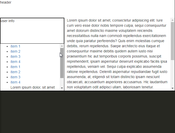
</section>I have a div for a side menu, in this menu there are several options, these options have sub-options. To scroll the options I edited as follows in css:
.sidebar .menu {
position: relative;
overflow-y: scroll;
height: 450px;
}
But you’re not responsive. On larger screens the menu has extra space, and on smaller screens the menu is cut, not showing all the options, even scrolling the bar.
I’ve tried to put height: 100%;, but the div gets larger than the screen, while scrolling some options do not appear.
How do I make this menu responsive?
The execution of the code here in the question was a bit of a joke because I use Python and Django and I can’t enter all the information here. But you get a sense of what’s going on.
Guy first puts the full code there so we can try to simulate his problem. Edit your question and put the HTML and CSS related to this menu there, yes this does not give you a precise answer....
– hugocsl