prevent image from crossing div

Asked

Viewed 2,387 times

2

Hello,

I’m starting my learning with dimensions and scales in Bootstrap. I started making a container occupy the entire screen, and distributes 3 divs to occupy the container independent of its contents. A div top occupies 10%, to div occupies middle 80%, and the div bottom occupies 10%; completing 100%.

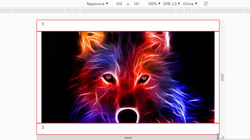
I decided to put a <img> in div of the middle, and I got the following problem: depending on the size of the image, it exceeds the limits of the div.

I tried to use max-width inherit and other properties to make it, if the image is larger than the div, it will not exceed that limit, but I did not succeed. I would like some help on that.

HEAD:

<!-- Bootstrap CSS -->
<link rel="stylesheet" href="https://stackpath.bootstrapcdn.com/bootstrap/4.1.2/css/bootstrap.min.css" integrity="sha384-Smlep5jCw/wG7hdkwQ/Z5nLIefveQRIY9nfy6xoR1uRYBtpZgI6339F5dgvm/e9B" crossorigin="anonymous">

<style type="text/css">

html {
  height: 100%;
}

body, .container-fluid {
  height: 100%;
}

</style>


<title>Dimensões e Escalas</title>


BODY:

<body>

<div class="container-fluid">
 <div class="row" style="border: 5px solid red; height: 10%;">
   <div class="col-12 h-50">Teste 10%</div>
 </div>

 <div class="row" style="border: 5px solid black; height: 80%">
  <div class="col-12">
    <img id="fotoExpandida" class="img-fluid rounded" src="http://ap.imagensbrasil.org/images/imagens-lobos.jpg" style="max-width: inherit; max-height: inherit;">
  </div>

 </div>

 <div class="row" style="border: 5px solid blue; height: 10%;">
   <div class="col-12">Teste 10%</div>
 </div>

</div>

<!-- Optional JavaScript -->
<!-- jQuery first, then Popper.js, then Bootstrap JS -->
<script src="https://code.jquery.com/jquery-3.3.1.slim.min.js" integrity="sha384-q8i/X+965DzO0rT7abK41JStQIAqVgRVzpbzo5smXKp4YfRvH+8abtTE1Pi6jizo" crossorigin="anonymous"></script>
<script src="https://cdnjs.cloudflare.com/ajax/libs/popper.js/1.14.3/umd/popper.min.js" integrity="sha384-ZMP7rVo3mIykV+2+9J3UJ46jBk0WLaUAdn689aCwoqbBJiSnjAK/l8WvCWPIPm49" crossorigin="anonymous"></script>
<script src="https://stackpath.bootstrapcdn.com/bootstrap/4.1.2/js/bootstrap.min.js" integrity="sha384-o+RDsa0aLu++PJvFqy8fFScvbHFLtbvScb8AjopnFD+iEQ7wo/CG0xlczd+2O/em" crossorigin="anonymous"></script>

  • Hello Tony, try using the max-width:100% instead of inherit. your code - jsfiddle

  • I have tried friend. The result is the same, the image is at its maximum size. However, if I set to 90%, 80%, etc., the image will decrease in size. But if I assign percentage, depending on the screen size, it will exceed the div limit. That’s why I have to somehow make the image responsive, but not allow it to exceed the limit of its relative (div).

1 answer

3


Face actually your "grid" is in a little trouble. As you want 3 lines the correct would be 1 row with 3 col-12, and the first and last with 10% height and the col middle with 80%. So I mounted the grid like this and made the classes in style.

After you need to adjust the image, it should be 100% wide and high. And the Object-fit: cover property will make the image always occupy all available space, centralized and without deforming (being flattened horizontally/vertically)...

inserir a descrição da imagem aqui

See the code for the image above:

html, body {
    width: 100%;
    height: 100%;
    margin: 0;
    padding: 0;
}

.n1 {
    height: 10%;
}
.n2 {
    height: 80%;
}
[class^="col-"] {
    border: 1px solid red;
}
img {
    height: 100%;
    width: 100%;
    object-fit: cover;
}
<link rel="stylesheet" type="text/css" media="screen" href="https://maxcdn.bootstrapcdn.com/bootstrap/4.1.0/css/bootstrap.min.css" />
 
<div class="container-fluid h-100">
    <div class="row h-100">
        <div class="col-12 n1">1</div>
        <div class="col-12 n2">
            <img id="fotoExpandida" class="" src="http://ap.imagensbrasil.org/images/imagens-lobos.jpg">
        </div>
        <div class="col-12 n1">3</div>
    </div>
</div>


TIP

If you want the image to always stay entirely inside element you can change object-fit: cover; for object-fit: contain;, this way the image always appears in its entirety, but will stay white space on the screen... Here is more details: Reduce image size and maintain CSS aspect ratio

  • That’s right. I really thought about using 3 col-12, but I thought it would be more "right" to use 3 Row. Thanks for this learning !!

  • @Tonystarkus wrong is not, but 3 col12 works best in this case, because it is a father with three children, and not 3 siblings with 1 child each . And inside the col you can through another Row ;)

  • Just one more question. With "Object-fit: cover;" a small image is expanded, losing quality. For my tests, the "Object-fit: contain;" works best for any image size, along with the code that is in the link you sent (set max-width and max height at 100%, and left width and height in auto). But with this configuration, the image is no longer centered vertically and horizontally. Any hints ? I used this image as a test: https://encrypted-tbn0.gstatic.com/images?q=tbn:And9gcr1b9v3blj3trgpxgsw3veqzisjuqibiwxilvfthu5-y2nNbLutA

  • @Tonystarkus sim na col que a imagem está dentro you can use the flex classes of Bootstrap 4 to align https://getbootstrap.com/docs/4.1/utilities/flex/ in this image col put the classes d-flex justify-content-center align-items-center test and tell me

  • 1

    I still have a lot to read in these Bootstrap documents. Thanks again !!

Browser other questions tagged

You are not signed in. Login or sign up in order to post.