6
I’m developing the one-page responsive and the documentation says to do the media queries as follows:
@media(max-width:767px){}
@media(min-width:768px){}
@media(max-width:992px){}
Uso Bootstrap 3.
So follow my CSS code:
@media (max-width:767px) {
/* de 0px até 767px */
}
@media (min-width:768px) and (max-width: 992px) {
/* de 768px até 992px*/
}
@media (min-width:992px) and (max-width: 1200px){
/* acima de 992px */
.infos-schedule{
font-size: 15px;
}
.title-infos{
font-size: 15px;
}
}
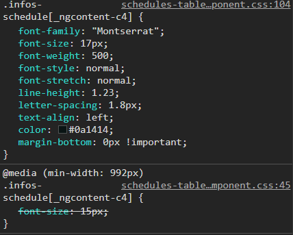
.infos-schedule{
font-family: "Montserrat";
font-size: 17px;
font-weight: 500;
font-style: normal;
font-stretch: normal;
line-height: 1.23;
letter-spacing: 1.8px;
text-align: left;
color: #0a1414;
margin-bottom: 0px !important;
}
.title-infos{
color: #037C74;
margin-right: 5px;
font-size: 20px;
}
.create-in-schedule{
font-family: Montserrat;
font-size: 14px;
font-weight: normal;
font-style: normal;
font-stretch: normal;
line-height: 1.22;
letter-spacing: 1.8px;
text-align: right;
color: #707070;
display: block;
}
.title-header{
margin-bottom: 10px;
padding: 0px;
display: flex;
align-items: center;
}
.title{
font-family: "Montserrat";
font-weight: 500;
font-style: normal;
font-stretch: normal;
line-height: 1.24;
letter-spacing: 2.1px;
color: #0a1414;
font-size: 21px;
margin-top: 20px;
margin-bottom: 20px;
}
.card-schedules {
margin: 10px 5px;
background-color: #ecf3f8;
height: 150px;
}
HTML:
<mat-card class="card-schedules"
                        *ngIf="pendente.status == 'Pendente'" >

                  <mat-card-content>
                    <div class="col-lg-12 col-md-12 col-sm-12 title-header">
                      <div class="col-lg-10 col-md-10 col-sm-12 infos-schedule padding0"><b class="title-infos">Anúncio: </b>{{ pendente.Anuncio }}</div>
                      <div class="col-lg-2 col-md-2 create-in-schedule padding0">{{ pendente.created_in | date:'MM/dd/yyyy'}}</div>
                    </div>
                  </mat-card-content>
</mat-card>
The problem is that the media query of 992px not being obeyed in the classes already produced and predominates the CSS of the media query greater.
Follow what the Browser is showing me:
What’s going on?
I’ve even done @media (min-width:992px) and (max-width: 1200px){ /* over 992px */ . Infos-Schedule{ font-size: 15px; } . title-Infos{ font-size: 15px; } } But it doesn’t change...always obeying the style already done in css
– Cichoki
Young man, put the complete CSS if possible, only with this piece of code can not understand what is happening, and put HTML ai tb. And as I told you, from a look at this link, I believe it will clarify some points that can help you ai https://answall.com/questions/351972/media-queries-n%C3%A3o-funciona-medidas-informadas/351977#351977 Avoid mixing min and max in @media
– hugocsl
Follows full code
– Cichoki
Beyond the things we already talked about, it seems to me that your CSS is inadequate. ALL @media rules should be the last things. Like first you write all your CSS, all the classes etc, then there at the end of everything you start to write the media querys and put the @ Day you need, they should come after all
– hugocsl
Edited response. But consider the ideas of @hugocsl... CSS is cascading style. What comes after overrides what comes before. So, the
@mediashould also follow this hierarchy (inheritance)...– LipESprY
Man, thank you!! I tweaked the CSS order by putting @media at the bottom of the code. It worked! I didn’t expect it to be this because I’ve worked other times starting at the top of the code had no problem. Adopting new practice haha Thank you!
– Cichoki
Sorry! Edited reply. Ahh, about that envelope in the properties, in the link I mentioned about
!importanthas an explanation about. It’s well explained there. Hugging! ;)– LipESprY