6
I’m trying to make a flag of Brazil that is responsive. But I came across a problem with the white banner of the flag.
OBS: I won’t put the text on the track!
What happens is that the track is actually a border, but I can’t use value in % as border-width. So when the flag decreases the edge becomes thick, and as per the flag grows the edge gets thin... How do I correct that?
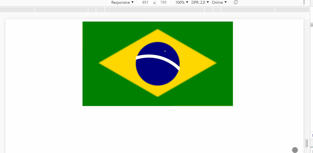
How can I fix this so my edge is also responsive along with the rest of the flag?
How can I make a responsive edge?
Or is there some other technique I can use besides the edge?
Follows the code.
.bandeira {
  max-width: 50%;
  margin: auto;
  border: 1px solid green;
  background-color: green;
  position: relative;
}
.box {
  padding-top: 56.25%;
  background-image:
    radial-gradient(circle at 55% 35%, rgba(255,255,255,.85) 0%, transparent 1%),
    radial-gradient(circle, navy 25%, transparent 26%),
    linear-gradient(-30deg, green 30%, transparent 31%, transparent 70%, green 71%),
    linear-gradient(30deg, green 30%, gold 31%, gold 70%, green 71%);
}

.faixa {
  position: absolute;
  width: 30%;
  height: 55%;
  border-radius: 50%;
  top: 0;
  bottom: 0;
  right: 0;
  left: 0;
  margin: auto;
  overflow: hidden;
}
.faixa::after {
  content: "";
  position: absolute;
  top: 30%;
  left: -70%;
  width: 200%;
  height: 200%;
  box-sizing: border-box;
  border: 10px solid #fff;
  border-radius: 50%;
}
<div class="bandeira">
<div class="box">
<div class="faixa"></div>
</div>
</div>
Changing the border size with media query is an option, if not, removing the border and using a div with height based on
vwor something like that– Costamilam
@Guilhermecostamilam with media query I’ll have "jumps" in the thickness, because it would be like a width between 320px and 768px, then another width between 768px and 992px... it would be "dry" changes and not something fluid like the rest of the flag. Note that as it is all in % you have no "heels" in sizes. With measurements in VH or VW the flag can deform depending on the Aspect-ratio of the device screen not? Like on an ultra-wide monitor, or a vertical cell phone...
– hugocsl
you can put several media query and not have these jumps, a lot of work but it works, if you use JS da to do in the screen resize event, there is a little simpler. "With measurements in VH or VW the flag may deform depending on the Aspect-ratio of the device screen not?" I can’t say anymore
– Costamilam
@Guilhermecostamilam to become fluid I think I would have to change the PX of the edge at least every 5 or 10px. So if your window decreases 10px wide you have to change the border to
Npx... I believe not to be a very viable option, although it may be that for certain yes... but I think only with CSS should have some more practical way– hugocsl
Makes the flag of Italy easier rs :D
– Sam
Tio @Sam http://weknowmemes.com/generator/uploads/generated/g1473323967676269521.jpg But tomorrow I’ll ask you how you do in Japan then :p
– hugocsl