How do I create circular image with css mask and Hover effect?

Asked

Viewed 744 times

0

Does anyone know any css template ready for me to use as a reference to recreate an effect on my site that I am switching from wordpress to html/css I saw by the code that is a layer mask Hover that creates the effect, but I still could not play the same using html/css.

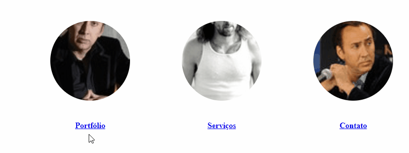
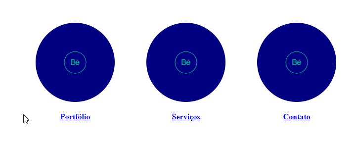
These are the icons I circled in blue I want to create a similar effect on this icons using html/css only (when the mouse moves over the circular image the mask decreases and increases the size of the image, since when the mouse is not on top of the image it appears with a larger mask that makes it appear to be smaller)

address of the websites are:

https://mdwebdesign.tk/
https://demo.presscustomizr.com/

the images are:

https://i.ibb.co/M6sxxqn/efeitohover.jpg
https://i.ibb.co/sJwfW3d/efeitohover2.jpg

a busy cat a busy cat

Code:

html:

<main>
    <div class="linkshome">
        <div class="czr-link-mask">
            <a href="portfolio.html">
                <img src="img/portfolio.jpg">
                <h4>Portfólio</h4>
            </a>
        </div>
        <div class="czr-link-mask">
            <a href="servicos.html">
                <img src="img/servicos.jpg">
                <h4>Serviços</h4>
            </a>
        </div>
        <div class="czr-link-mask">
            <a href="contato.html">
                <img src="img/contato.jpg">
                <h4>Contato</h4>
            </a>
        </div>
    </div>     
</main>

css:

main {
    margin-left: 90px;
    margin-right: 60px;
    padding: 20px;

}

.linkshome {
    display: flex;
    justify-content: center;
}

.linkshome h4{
    text-align: center;
}

/*Efeito Destaques (ainda testando efeitos para portfólio,serviços e contato.jpg)*/

.czr-link-mask-p.hover .czr-link-mask::before,.expanded .czr-link-mask::before, .czr-link-mask:hover {
    -webkit-transform:translate(-50%,-50%) scale(1.4);
    transform:translate(-50%,-50%) scale(1.4);
    -webkit-transform:translate3d(-50%,-50%,0) scale(1.4);
    transform:translate3d(-50%,-50%,0) scale(1.4);
}

/*Destaques*/
  • Put what you already have of code there, only the example link of the link does not help to solve your problem. You need to provide what you already have of model ready there so we can give you a solution to your case.

  • 1

    Buddy, I don’t think you noticed, but there’s a button written EDIT right below the text of your question. You should click on it and include these codes all directly within your question, and not in the comments here....

  • Cara gave a formatted code, but to vote to reopen it is necessary that you edit also describing this effect of Hover that you want. Whoever comes in now and reads the question will only see the code... and the description of the effect you want to do? Now you can leave the code plus the explanation and the link of the example and everything else. Don’t think of it as a tug of an ear, I’m just giving you tips so you can come up with your questions within the standards of the site. Abs

  • 1

    OK Thanks I already edited the question with the biggest kind of details I remembered

1 answer

0


This is just an example, you can have other answers with different solutions. Basically for this there is not a single answer...

The technique I used was to put the image inside a div, because it is not possible to use direct pseudo-element in the tag img. So I did the pseudo element in div that the image will be inside.

inserir a descrição da imagem aqui

So in this ::after of div container image I used a box-shadow to make the "mascara", in the :hover and pass this box-shadow to zero, with that need not touch the scale of the image, and work just like this pseudo element... The detail is that the color of box-shadow has to be the same color as the background.

html,
body {
  width: 100%;
  height: 100%;
  margin: 0;
  padding: 0;
}


main {
  margin-left: 90px;
  margin-right: 60px;
  padding: 20px;

}

.linkshome {
  display: flex;
  justify-content: center;
}

.linkshome h4 {
  text-align: center;
}

/*Efeito Destaques (ainda testando efeitos para portfolio,serviços e contato.jpg)*/

.czr-link-mask {
  margin: 2rem;
}
.czr-link-mask .box {
  width: 200px;
  height: 200px;
  border-radius: 50%;
  position: relative;
}
.czr-link-mask .box::after {
  content: "";
  position: absolute;
  top: 0;
  left: 0;
  width: 200px;
  height: 200px;
  overflow: hidden;
  border-radius: 50%;
  box-shadow: inset 0 0 0 20px #fff;
  z-index: 2;
  transition: box-shadow 300ms;
}
.czr-link-mask a:hover .box::after{
  box-shadow: inset 0 0 0 0px #fff;
}
.czr-link-mask .box img{
  width: 100%;
  height: 100%;
  object-fit: cover;
  border-radius: 50%;
  border: 2px solid white;
  box-sizing: border-box;

}

/*Destaques*/
<main>
  <div class="linkshome">
    <div class="czr-link-mask">
      <a href="portfolio.html">
        <div class="box">
          <img src="https://placecage.com/100/100">
        </div>
        <h4>Portfólio</h4>
      </a>
    </div>
    <div class="czr-link-mask">
      <a href="portfolio.html">
        <div class="box">
          <img src="https://placecage.com/101/100">
        </div>
        <h4>Serviços</h4>
      </a>
    </div>
    <div class="czr-link-mask">
      <a href="portfolio.html">
        <div class="box">
          <img src="https://placecage.com/100/101">
        </div>
        <h4>Contato</h4>
      </a>
    </div>
  </div>

</main>


Option for solid color

When the box color is solid it becomes even easier, because you can only work on the box :Hover, you don’t need class for image or pseudo elements

inserir a descrição da imagem aqui

main {
   margin-left: 90px;
   margin-right: 60px;
   padding: 20px;

}

.linkshome {
   display: flex;
   justify-content: center;
}

.linkshome h4 {
   text-align: center;
}

/*Efeito Destaques (ainda testando efeitos para portfolio,serviços e contato.jpg)*/

.czr-link-mask {
   margin: 2rem;
}
.czr-link-mask .box {
   display: flex;
   justify-content: center;
   align-items: center;
   width: 160px;
   height: 160px;
   border-radius: 50%;
   position: relative;
   background-color: navy;
   box-shadow: 0 0 0 0px navy;
   transition: box-shadow 300ms;
}
.czr-link-mask .box:hover {
   box-shadow: 0 0 0 10px navy;
}


/*Destaques*/
<main>
   <div class="linkshome">
      <div class="czr-link-mask">
      <a href="portfolio.html">
         <div class="box">
            <img src="https://cdn1.iconfinder.com/data/icons/icons-for-sharing-your-works/48/Behance_2.png">
         </div>
         <h4>Portfólio</h4>
      </a>
      </div>
      <div class="czr-link-mask">
      <a href="portfolio.html">
         <div class="box">
            <img src="https://cdn1.iconfinder.com/data/icons/icons-for-sharing-your-works/48/Behance_2.png">
         </div>
         <h4>Serviços</h4>
      </a>
      </div>
      <div class="czr-link-mask">
      <a href="portfolio.html">
         <div class="box">
            <img src="https://cdn1.iconfinder.com/data/icons/icons-for-sharing-your-works/48/Behance_2.png">
         </div>
         <h4>Contato</h4>
      </a>
      </div>
   </div>

</main>

  • I tested the two examples, they are run normal, but when I just replace the images to the ones I want the effect to work

  • @matheusdouradobr if it works here should work ai... Does your image work outside the example? It loads normally if it’s outside that code there?

  • Click yes, in the second example I changed the images to . png ai has worked a little, in the first example neither jpg nor png has worked, the images are these: https://i.ibb.co/zr9rznS/contact.png https://i.ibb.co/Drfshj7/servicos.png https://i.ibb.co/Dczcs5k/portfolio.png https://i.ibb.co/brh6M2C/contact.jpg https://i.ibb.co/Cjqddts/servicos.jpg https://i.ibb.co/fX5nySk/portfolio.jpg

  • @matheusdouradobr think it might be "crossbrowser" problem maybe... you can test in Chrome in the newest version and see if it improves...

  • @matheusdouradobr I think I already know what the problem is!! Is that your image does not go to the edges. Type look in JPG, notice that the circle with the icon is in the center then has a giant "edge" until the end.... You have to adjust your images, they have to be of the total size of the file and not be with these empty spaces... look here http://prntscr.com/m83fj5

  • OK Thank you, I will test here, I believe it will work now, as vote as best answer?

  • @matheusdouradobr test there and any problem tells me. To mark the answer as you accept just click on this icon below the arrows on the left side of my answer :) so the site does not get open questions pending even having already been solved.

  • Okay now I think I got to vote for the best answer

  • @matheusdouradobr worth young thank you!

Show 4 more comments

Browser other questions tagged

You are not signed in. Login or sign up in order to post.