0
My intention initially was to divide the header in 2 so that one part remained on the left and the other on the right. Then I put a flex-start and a flex-end, but it didn’t work out.
I’m trying to learn Flexbox and I think it’s something simple, but I’m not getting at the moment.

My code:
* {
    margin: 0;
    padding: 0;
}
html {
    font-size: 62.5%;

}
body {
    font-family: 'Dosis', sans-serif;
    background-color: #363636;
}
.head {
    font-family: 'Staatliches', cursive;
    padding-top: .5rem;
    font-size: 3rem;
    font-weight: 200;
    padding-right: 1rem;
    color: white;
}
.container {
    display: flex;
    flex-direction: row;
    font-size: 1.5rem;
}
/* as classes das 2 divs*/
.esquerda {
    justify-content: flex-start;
}
.direita {
    justify-content: flex-end;
}
ul {
    display: inline-flex;
    list-style-type: none;
}
li {
    color: white;
    cursor: pointer;
    padding: 1.5rem 3rem;
}
li:hover {
    transition: all .2s ease-out;
    background-color: #454545;
}
<!DOCTYPE html>
<html lang="en">
<head>
<meta charset="UTF-8">
<meta name="viewport" content="width=device-width, initial-scale=1.0">
<link rel="stylesheet" href="css/styles.css">
<meta http-equiv="X-UA-Compatible" content="ie=edge">
<link href="https://fonts.googleapis.com/css?family=Staatliches" rel="stylesheet">
<link href="https://fonts.googleapis.com/css?family=Dosis" rel="stylesheet">
<title>Manytestsbudda</title>
</head>
<body>
<header>
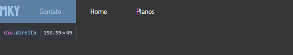
<div class="container">
<div class="esquerda">
<ul>
<h1 class="head">MKY</h1>
<li>Home</li>
<li>Planos</li>
</ul>
</div>
<div class="direita">
<ul>
<li>Contato</li>
</ul>
</div>
</div>
</header>
</body>
</html>Replica of the code available on Codepen.io.
It works for 2 items, if 3 are a fine centered in the middle... I’ll give you a tip on how to put one on each side without Justify
– hugocsl
@hugocsl I did based on the code posted. The questioner himself has already separated two to one side (within the same div) and one to the other (for div). But your answer is always welcome - welcome! I consider you the master of the front-end! Kkkk
– LipESprY
Rss, master I am far from it, even more speaking of front-end... But from CSS I understand a little :D. I talked about the case of 3 items because I’ve suffered trying to understand why justfy-self doesn’t work and align-self works... But the details I left in the reply.
– hugocsl
Thanks bros! They helped me :)
– utm