1
Well I have the following code I’m putting together:
.pg {
  width: 100%;
}

.pg>.produto {
  width: 250px;
  height: 300px;
  position: relative;
  float: left;
  margin: 10px;
  background: #ccc;
  border: 1px solid red;
}
<div class="pg">
<div class="produto">
x
</div>
<div class="produto">
x
</div>
<div class="produto">
x
</div>
<div class="produto">
x
</div>
<div class="produto">
x
</div>
<div class="produto">
x
</div>
<div class="produto">
x
</div>
<div class="produto">
x
</div>
<div class="produto">
x
</div>
<div class="produto">
x
</div>
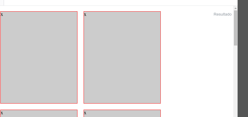
</div>Well the code is there, as you resize the page the div will fall to the bottom line. But I want to avoid a soft space on the right side, that is when I do not fit another div produto div should be centralized. Avoiding empty space.
Follow the picture of the empty space:
My answer is shorter!! Ra!
– fernandosavio
@fernandosavio is that I put some more rss perfumeries. Now the scheme is to leave the items of the last line left, without centralizing... ;)
– hugocsl
That’s exactly what I wanted. Thank you
– Hugo Borges
@Hugoborges quiet, my friend! If you are interested in signing here you have other answers with similar problems, where with display:grid the last item is on the left. https://answall.com/questions/327488/flexbox-css-grid/327518#327518 and here tb other grid options limiting 4 per line https://answall.com/questions/324963/como-coloca-um-limite-de-4-imagens-por-linha/324976#324976
– hugocsl