2
Good afternoon. I’ve been doing a lot of Google, American stackoverflow and here, but I couldn’t find what I needed. If I found something like this maybe I haven’t identified that it might suit me.
I’m a beginner/intern in this area and I’m building an html page. I have a side menu and this menu is hidden by decreasing the page to 750px and then a button is displayed in the header that should display this same menu when clicked and the bottom of the page is gray, as if disabled.
I started doing it with a hint I took in CSS, the side menu disappears when the page decreases, the menu icon appears, but the missing part is being able to display the menu after clicking on the icon. I don’t understand why it’s not showing after clicked (checked). I read a NAVBAR documentation on the getbootstrap site, but I couldn’t apply it to my code either.
If anyone knows a hint, I’d appreciate it. It could be in CSS or JS. A developer here at the company said he could use ajax, jquery, bootstrap. Just couldn’t use angular. Thank you.
<!DOCTYPE html>
<html xmlns="http:/www.w3.org/1999/xhtml" lang="pt-br">
<head>
<meta charset="UTF-8">
<meta name="viewport" content="width=device-width, initial-scale=1.0">
<meta http-equiv="X-UA-Compatible" content="IE=11 IE=10 IE=9 width=device-width initial-scale=1 maximum-scale=1" name="viewport"
/>
<title>Intranet</title>
<link rel="stylesheet" href="https://cdnjs.cloudflare.com/ajax/libs/font-awesome/4.7.0/css/font-awesome.min.css">
<link rel="shortcut icon" type="image/x-icon" href="media/img/favicon.ico">
<link rel="stylesheet" href="https://maxcdn.bootstrapcdn.com/font-awesome/4.5.0/css/font-awesome.min.css">
<link rel="stylesheet" type="text/css" href="media/css/bootstrap.min.css">
<link rel="stylesheet" type="text/css" href="media/css/css.css">
<link rel="stylesheet" type="text/css" href="media/css/slick.css">
<link rel="stylesheet" type="text/css" href="media/css/sidebar.css">
<script type="text/javascript" src="media/js/jquery-3.3.1.min.js"></script>
<script type="text/javascript" src="media/js/jquery-ui.min.js"></script>
<script type="text/javascript" src="media/js/bootstrap.min.js"></script>
<script type="text/javascript" src="media/js/jquery.mask.min.js"></script>
<script type="text/javascript" src="media/js/slick.min.js"></script>
<script type="text/javascript" src="media/js/init.js"></script>
<script>
// var msg = "${msg}";
// $(document).ready(function () {
// if (msg) {
// $('#modalMessage').modal().find('.modal-body p').text(msg);
// }
// });
</script>
</head>
<body>
<div id="wrapper" class="d-flex flex-column">
<header>
<div class="container-fluid">
<div class="row">
<div class="col">
<a href="#" title="Suporte Tecnológico"></a>
</div>
<input class=".btnMenu" type="checkbox" id="bt_menu">
<label for="bt_menu"> <i class="fa fa-bars" style="font-size: 30px;"></i></label>
</div>
</div>
</header>
<main class="flex-fill">
<!-- Sidebar -->
<div class="dashside">
<div class="sidebar-header">
<h3>Olá, Usuário</h3>
</div>
<!-- <button class="btn-menu">
<i class="fa fa-bars fa-lg"></i>
</button> -->
<div class="panel">
<ul class="sidebar-nav">
<li>
<a href="#">
<i class="fa fa-angle-right" style="font-size:20px"></i> Aplicações</a>
</li>
<li>
<a href="#">
<i class="fa fa-angle-right" style="font-size:20px"></i> Tokens</a>
</li>
<li>
<a href="#">
<i class="fa fa-angle-right" style="font-size:20px"></i> Serviços</a>
</li>
</ul>
</div>
</div>
<div class="backgroundImage"></div>
<div class="dashmain">
<div class="container-fluid">
<div class="container">
<div class="panel">
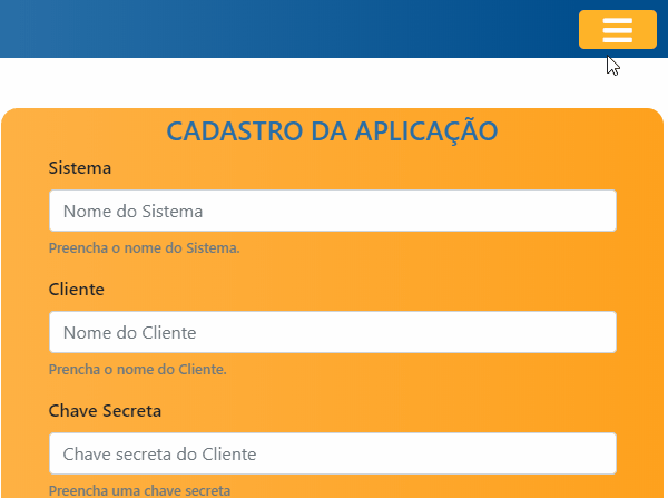
<h4>CADASTRO DA APLICAÇÃO</h4>
<form>
<div class="form-group">
<label for="clientId">Sistema</label>
<input type="text" class="form-control" id="systemId" aria-describedby="systemIdHelp" placeholder="Nome do Sistema" />
<small id="systemIdHelp" class="form-text text-muted">Preencha o nome do Sistema.</small>
</div>
<div class="form-group">
<label for="clientId">Cliente</label>
<input type="text" class="form-control" id="clientId" aria-describedby="clientIdHelp" placeholder="Nome do Cliente" />
<small id="clientIdHelp" class="form-text text-muted">Prencha o nome do Cliente.</small>
</div>
<div class="form-group">
<label for="clientSecret">Chave Secreta</label>
<input type="text" class="form-control" id="clientSecret" aria-describedby="clientSecretHelp" placeholder="Chave secreta do Cliente"
/>
<small id="clientIdHelp" class="form-text text-muted">Preencha uma chave secreta</small>
</div>
<button type="submit" class="btn btn-primary">Cadastrar</button>
</form>
</div>
</div>
</div>
</div>
</div>
</main>
<footer>
<div class="container-fluid">
<div class="row">
<div class="col-xs-1 col-sm-4 col-md-4 col-lg-4 support">
<strong>Suporte Tecnológico
<br>3004 0000 (Capital e regiões
<br>metropolitanas) ou 0800 000 0000
<br>(Demais regiões)</strong>
</div>
<div class="col-xs-1 col-sm-8 col-md-8 col-lg-8 links">
<a href="#" target="_blank" title="Segurança">Segurança</a> |
<a href="#" title="Rede de Atendimento">Rede de Atendimento</a> |
<a href="#" title="Ajuda">Ajuda</a> |
<a href="#" title="Termos e Contratos">Termos e Contratos</a>
</div>
</div>
</div>
</footer style="position: relative;">
</div>
<div id="modalMessage" class="modal" tabindex="-1" role="dialog">
<div class="modal-dialog" role="document">
<div class="modal-content">
<div class="modal-header">
<h5 class="modal-title">Mensagem</h5>
<button type="button" class="close" data-dismiss="modal" aria-label="Close">
<span aria-hidden="true">×</span>
</button>
</div>
<div class="modal-body">
<p></p>
</div>
<div class="modal-footer">
<button type="button" class="btn btn-secondary orange" data-dismiss="modal">Fechar</button>
</div>
</div>
</div>
</div>
<script>
</script>
</body>
</html>
And the CSS:
div .dashside .sidebar-header {
/* background-color: rgb(41, 111, 167); */
color: white;
font-weight: bolder;
padding: 14px;
}

div .dashside h3 {
    color: white;
}

div.dashside ul {
    padding: 0px !important;
}

div.dashside ul p {
    color: #fff;
    padding: 10px;
}

div.dashside ul li {
    list-style: none;
    left: -10px;
}

div.dashside ul li a {
    padding: 10px;
    font-size: 1.1em;
    display: block;
}

div.dashside ul li a:hover {
    /* color: #007ad9; */
    background: rgb(212, 158, 82);
    text-decoration: underline;
}

div.dashside ul li.active>a,
a[aria-expanded="true"] {
    color: #fff;
    background: #6d7fcc;
}

ul ul a {
    font-size: 0.9em !important;
    background: #6d7fcc;
}

.dashside .sidebar-nav a {
    background: #007ad9;
    color: white;
    width: 105%;
}

/* .btn-menu {
    background-color: rgb(240, 165, 60);
    color: white;
    border: none;
    size: 80px;
} */

div .dashmain h4 {
    text-align: center;
    color: rgb(41, 111, 167);
}

div .form-group label {
    font-weight: 600;
}

div .form-group small {
    font-weight: 500;
}

div.dashmain {
    margin-left: 35%;
    margin-right: 1%;
    margin-top: 100px;
    padding-bottom: 10px;
    min-height: 100%;
    position: relative;
    max-width: 700px;
}

div.dashside {
    position: absolute;
    width: 250px;
    min-height: 100%;
    /* background-color: rgb(41, 111, 167); */
    background-image: linear-gradient(rgb(41, 111, 167), rgb(0, 79, 144));
    box-shadow: 5px 5px 5px rgba(0, 0, 0, .3);
}

div .dashmain .container-fluid {
    background: linear-gradient(to right, rgb(255, 177, 68), rgb(255, 161, 29));
    border-radius: 15px;
    padding-bottom: 10px;
    padding-bottom: 10px;
    padding-top: 5px;
}

header .container-fluid {
    position: absolute;
}

header a {
    margin-left: 280px;
}

header .col {
    background: linear-gradient(to right, rgb(41, 111, 167), rgb(1, 78, 141));
    /* margin-bottom: 2px; */
}

div .btn-menu2 {
    background-color: rgb(240, 165, 60);
    color: white;
    display: none;
    float: right;
}

div .row {
    background: rgb(1, 78, 141);
}

label[for="bt_menu"] {
    background-color: rgb(255, 180, 40);
    color: white;
    text-align: center;
    font-size: 25px;
    width: 70px;
    height: 35px;
    padding-top: -10px;
    margin-top: 2%;
    margin-right: 2%;
    border-radius: 5px;
    cursor: pointer;
}

#bt_menu {
    display: none;
}

label[for="bt_menu"] {
    display: none;
}

@media (max-width: 750px) {
    label[for="bt_menu"] {
        display: block;
    }
    .dashside {
        margin-top: 5px;
        margin-left: -100%;
        transition: all 0.5s;
    }
    .dashside ul li {
        width: 100%;
        float: none;
    }
    div .dashmain {
        margin-left: 1%;
        margin-right: 1%;
        transition: 0.6s;
    }
    header a {
        margin-left: 10%;
    }
    #bt_menu:checked~.dashside {
        margin-left: 0%;
    }
}
Not the problem, but there’s an error here in the class of this line:
<input class=".btnMenu" type="checkbox" id="bt_menu">... the point is incorrect, would beclass="btnMenu"(without the point).– Sam
Which version of Bootstrap you are using?
– hugocsl