Alignment of the Dropdown Menu

Asked

Viewed 100 times

0

Guys, I’m making a menu and I’m having the following problem:

inserir a descrição da imagem aqui

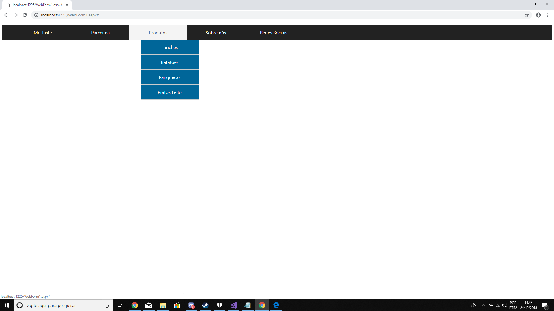
As you can see the items do not line up like the top****, I would have like to send this **list to the left? I tried some tags but could not (probably I am using the tag wrong aeuhaue)

HTML

<nav class="menu">
            <ul>
                <li><a href="#">Mr. Taste</a></li>
                <li><a href="#">Parceiros</a></li>
                <li><a href="#">Produtos</a>
                    <ul>
                        <li><a href="#">Lanches</a></li>
                        <li><a href="#">Batatões</a></li>
                        <li><a href="#">Panquecas</a></li>
                        <li><a href="#">Pratos Feito</a></li>
                    </ul>
                </li>
                <li><a href="#">Sobre nós</a></li>
                <li><a href="#">Redes Sociais</a>
                    <ul>
                        <li> <a href="#">Facebook</a></li>
                        <li> <a href="#">Instagram</a></li>
                        <li> <a href="#">Twitter</a></li>
                        <li> <a href="#">Whatssap</a></li>
                    </ul>
                </li>
            </ul>
        </nav>

CSS

{
    margin: 0;
    padding: 0;
}

.menu {
    width: 100%;
    height: 53px;
    background-color: #222;
    font-family: 'Segoe UI';
}

    .menu ul {
        list-style: none;
        position: relative;
        list-style-type: none
    }

        .menu ul li {
            width: 200px;
            float: left;
        }

    .menu a {
        display: block;
        text-decoration: none;
        text-align: center;
        background-color: #222;
        color: #fff;
        padding: 15px;
        left:0;
        list-style:none;
    }

    .menu ul ul {
        position: absolute;
        visibility: hidden;
        list-style-type: none
    }

    .menu ul li:hover ul {
        visibility: visible;
    }

    .menu a:hover {
        background-color: #f4f4f4;
        color: #555;
    }

    .menu ul ul li {
        float: none;
        border-bottom: solid 1px #ccc;
    }

        .menu ul ul li a {
            background-color: #069;
        }

label[for="bt_menu"] {
    padding: 5px;
    background-color: #222;
    color: #fff;
    font-family: "Segoe UI";
    text-align: center;
    font-size: 30px;
    cursor: pointer;
    width: 50px;
    height: 50px;
}

#bt_menu {
    display: none;
}

label[for="bt_menu"] {
    display: none;
}

@media(max-width: 800px) {
    label[for="bt_menu"] {
        display: block;
    }

    #bt_menu:checked ~ .menu {
        margin-left: 0;
    }

    .menu {
        margin-top: 5px;
        margin-left: -100%;
        transition: all .4s;
    }

        .menu ul li {
            width: 100%;
            float: none;
        }

        .menu ul ul {
            position: static;
            overflow: hidden;
            max-height: 0;
            transition: all .4s;
        }

        .menu ul li:hover ul {
            height: auto;
            max-height: 200px;
        }
}

From now on I thank you all!

  • No HTML/CSS code can’t help, because you can’t tell how you’re doing the menu.

2 answers

0

It would be helpful if you post a snippet of your code here. But looking at the picture, possibly what’s happening is that you forgot to reset the padding-left of the parent element.

Try the following:

ul.nome-da-class-sub-lista{ padding-left:0; }

  • 1

    @leandror In most cases the positioning of the submenu is done using position: absolute for an element ul within an element li. If this is your case, identify the element ul which marks the submenu and changes the coordinated CSS left. If not, display the HTML and CSS markup on the menu. Was the toolbar created with Bootstrap? If so, please specify only the BS version.

  • Okay, I’ve inserted html and css, I hope that helps!

0


You need to remove the padding and the margin of ul and of li in .menu ul and .menu ul li:

.menu ul {
   list-style: none;
   position: relative;
   list-style-type: none;
   padding: 0; /* aqui */
   margin: 0; /* aqui */
}

.menu ul li {
   width: 200px;
   float: left;
   padding: 0; /* aqui */
   margin: 0; /* aqui */
}

And also remove the margin of body:

body{
   margin: 0;
}

Behold (run in full screen):

body{
    margin: 0;
}

.menu {
    width: 100%;
    height: 53px;
    background-color: #222;
    font-family: 'Segoe UI';
}

.menu ul {
   list-style: none;
   position: relative;
   list-style-type: none;
   padding: 0;
   margin: 0;
}

.menu ul li {
   width: 200px;
   float: left;
   padding: 0;
   margin: 0;
}

    .menu a {
        display: block;
        text-decoration: none;
        text-align: center;
        background-color: #222;
        color: #fff;
        padding: 15px;
        left:0;
        list-style:none;
    }

    .menu ul ul {
        position: absolute;
        visibility: hidden;
        list-style-type: none
    }

    .menu ul li:hover ul {
        visibility: visible;
    }

    .menu a:hover {
        background-color: #f4f4f4;
        color: #555;
    }

    .menu ul ul li {
        float: none;
        border-bottom: solid 1px #ccc;
    }

        .menu ul ul li a {
            background-color: #069;
        }

label[for="bt_menu"] {
    padding: 5px;
    background-color: #222;
    color: #fff;
    font-family: "Segoe UI";
    text-align: center;
    font-size: 30px;
    cursor: pointer;
    width: 50px;
    height: 50px;
}

#bt_menu {
    display: none;
}

label[for="bt_menu"] {
    display: none;
}

@media(max-width: 800px) {
    label[for="bt_menu"] {
        display: block;
    }

    #bt_menu:checked ~ .menu {
        margin-left: 0;
    }

    .menu {
        margin-top: 5px;
        margin-left: -100%;
        transition: all .4s;
    }

        .menu ul li {
            width: 100%;
            float: none;
        }

        .menu ul ul {
            position: static;
            overflow: hidden;
            max-height: 0;
            transition: all .4s;
        }

        .menu ul li:hover ul {
            height: auto;
            max-height: 200px;
        }
}
<nav class="menu">
   <ul>
       <li><a href="#">Mr. Taste</a></li>
       <li><a href="#">Parceiros</a></li>
       <li><a href="#">Produtos</a>
           <ul>
               <li><a href="#">Lanches</a></li>
               <li><a href="#">Batatões</a></li>
               <li><a href="#">Panquecas</a></li>
               <li><a href="#">Pratos Feito</a></li>
           </ul>
       </li>
       <li><a href="#">Sobre nós</a></li>
       <li><a href="#">Redes Sociais</a>
           <ul>
               <li> <a href="#">Facebook</a></li>
               <li> <a href="#">Instagram</a></li>
               <li> <a href="#">Twitter</a></li>
               <li> <a href="#">Whatssap</a></li>
           </ul>
       </li>
   </ul>
</nav>

Browser other questions tagged

You are not signed in. Login or sign up in order to post.