Cards with smaller content breaking

Asked

Viewed 957 times

2

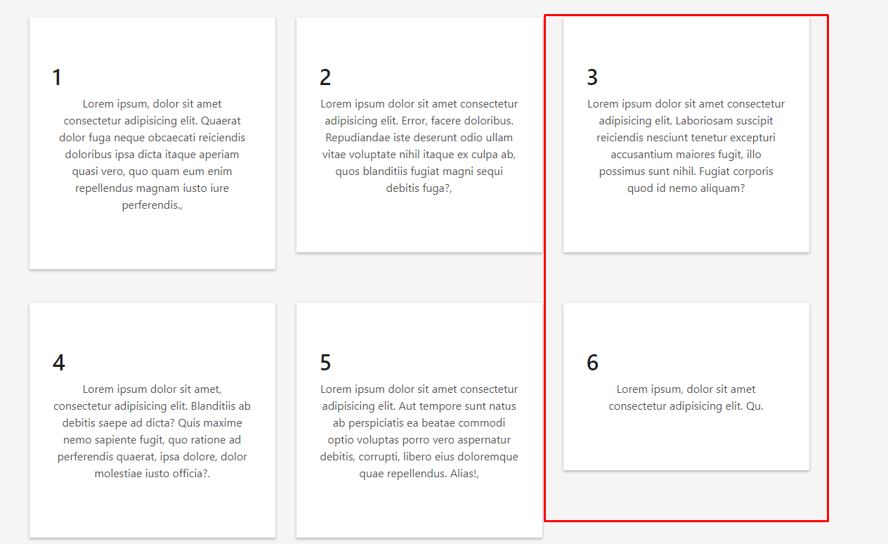
I’m using Bootstrap 4 to assemble a page, and at the time of making cards they are getting bigger or smaller than the others, even if they use the same class col-sm-4. It’s breaking because their contents are smaller. my doubt is how to leave these cards of the same size regardless of their content, and also how to put the h2 of them in the middle, for the class text-center only worked in the p

    <div class="container">
  <div class="row">
    <div class="col-sm-4">
      <div class="box-shadow-full">
        <div class="row">
          <!-- icone -->
          <h2>1</h2>
          <p>Lorem ipsum, dolor sit amet consectetur adipisicing elit. Quaerat dolor fuga neque obcaecati reiciendis doloribus ipsa dicta itaque aperiam quasi vero, quo quam eum enim repellendus magnam iusto iure perferendis.,</p>
        </div>
      </div>
    </div>
    <div class="col-sm-4">
      <div class="box-shadow-full">
        <div class="row">
          <!-- icone -->
          <h2>2</h2>
          <p>Lorem ipsum dolor sit amet consectetur adipisicing elit. Error, facere doloribus. Repudiandae iste deserunt odio ullam vitae voluptate nihil itaque ex culpa ab, quos blanditiis fugiat magni sequi debitis fuga?,</p>
        </div>
      </div>
    </div>
    <div class="col-sm-4">
      <div class="box-shadow-full">
        <div class="row">
          <!-- icone -->
          <h2>3</h2>
          <p>Lorem ipsum dolor sit amet consectetur adipisicing elit. Laboriosam suscipit reiciendis nesciunt tenetur excepturi accusantium maiores fugit, illo  possimus sunt nihil. Fugiat corporis quod id nemo aliquam?</p>
        </div>
      </div>
    </div>
    <div class="col-sm-4">
      <div class="box-shadow-full">
        <div class="row">
          <!-- icone -->
          <h2>4</h2>
          <p>Lorem ipsum dolor sit amet, consectetur adipisicing elit. Blanditiis ab debitis saepe ad dicta? Quis maxime nemo sapiente fugit, quo ratione ad perferendis quaerat, ipsa dolore, dolor molestiae iusto officia?.</p>
        </div>
      </div>
    </div>
    <div class="col-sm-4">
      <div class="box-shadow-full">
        <div class="row">
          <!-- icone -->
          <h2>5</h2>
          <p>Lorem ipsum dolor sit amet consectetur adipisicing elit. Aut tempore sunt natus ab perspiciatis ea beatae commodi optio voluptas porro vero aspernatur debitis, corrupti, libero eius doloremque quae repellendus. Alias!,</p>
        </div>
      </div>
    </div>
    <div class="col-sm-4">
      <div class="box-shadow-full">
        <div class="row">
          <!-- icone -->
          <h2>6</h2>
          <p>Lorem ipsum, dolor sit amet consectetur adipisicing elit. Qu.</p>
        </div>
      </div>
    </div>
  </div>

Cards quebrando

  • There are several techniques to create cards of the same height. Post the code you are using to analyze.

  • @Maujor opa, my failure to forget the code, I’ve edited

2 answers

4


Cara already exists natively in Bootstrap 4 a way to "align" the height of cards, and is with a Card Group as you can see here: https://getbootstrap.com/docs/4.0/components/card/#card-groups

inserir a descrição da imagem aqui

Then you can use other native classes like the border and the m-n° to adjust the spacing between them etc.

Another thing is that the text-center works perfectly on the tag Hn° as you can see in the example below. Another thing is that the BS also has a class of box-shadow from the version 4.1 as you can refer here https://getbootstrap.com/docs/4.1/utilities/shadows/

Note that there is no CSS in the example, it was all with the same BS classes...

<link rel="stylesheet" type="text/css" media="screen" href="https://stackpath.bootstrapcdn.com/bootstrap/4.1.3/css/bootstrap.min.css" />

<div class="container">
	<div class="row">
		<div class="card-group col-12">
			<div class="card m-3 border shadow-sm">
				<img class="card-img-top" src="..." alt="Card image cap">
				<h2 class="text-center">meu h2</h2>
				<div class="card-body">
					<h5 class="card-title">Card title</h5>
					<p class="card-text">This is a wider card with supporting text below as a natural lead-in to additional content.
						This content is a little bit longer.</p>
					<p class="card-text"><small class="text-muted">Last updated 3 mins ago</small></p>
				</div>
			</div>
			<div class="card m-3 border shadow-sm">
				<img class="card-img-top" src="..." alt="Card image cap">
				<h2 class="text-center">meu h2</h2>
				<div class="card-body">
					<h5 class="card-title">Card title</h5>
					<p class="card-text">This card has supporting text below as a natural lead-in to Lorem, ipsum dolor sit amet consectetur adipisicing elit. Ducimus similique quibusdam quasi repellendus consequatur tenetur molestias quo perferendis quam iure. additional content.</p>
					<p class="card-text"><small class="text-muted">Last updated 3 mins ago</small></p>
				</div>
			</div>
			<div class="card m-3 border shadow-sm">
				<img class="card-img-top" src="..." alt="Card image cap">
				<h2 class="text-center">meu h2</h2>
				<div class="card-body">
					<h5 class="card-title">Card title</h5>
					<p class="card-text">This is a wider card with supporting text below as a natution.</p>
					<p class="card-text"><small class="text-muted">Last updated 3 mins ago</small></p>
				</div>
			</div>
		</div>
	</div>
</div>

0

Dude, I advise you not to get stuck in bootstrap all the time, and learn to code your own CSS so when this kind of problem comes up and you don’t get plastered to do something.

In H2 you just do:

h2 {
    text-align: center;
}

In the cards part, you can put it like this:

.container > .row {
    display: flex;
    flex-wrap: wrap;
}

Browser other questions tagged

You are not signed in. Login or sign up in order to post.