How to Make Material Design Style Button Only with CSS

Asked

Viewed 844 times

5

On Android and on design system Material Design is common to see this button they call Ripple Buttom. https://material-components.github.io/material-components-web-catalog/#/Component/ripple

inserir a descrição da imagem aqui

But it is done with JS and my intention is to do it only with CSS. It would be possible to make an effect of this type only with CSS?

Notice that when btn is clicked this "ripple Effect"...

OBS: Don’t need the effect to happen where the click was made, it can always happen from the center of the button out. So I believe it is possible to do it only with CSS in this case.

That’s what I got so far:

.btn {
    width: 200px;
    height: 160px;
    margin: auto;
    background-color: #eee;
    box-shadow: 0 0 3px 0 rgba(0, 0, 0, .5);
    display: flex;
    justify-content: center;
    align-items: center;
    font-family: 'Segoe UI', Tahoma, Geneva, Verdana, sans-serif;
    cursor: pointer;
    transition: all 200ms linear;
}
.btn:hover {
    background-color: #ddd;
}
<div class="btn">Meu Ripple</div>

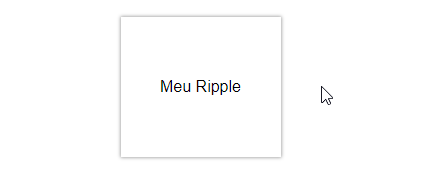
  • hugocsl Take a look at this codepen, I think it answers your question. It’s pretty simple. Anything we can get into more detail! https://codepen.io/finnhvman/pen/jLXKJw An Embrace!

4 answers

4

Tweaking CSS can make a template closer than I wanted.

It activates the animation in the click, not when I release the mouse button.

inserir a descrição da imagem aqui

The main point is the pseudo class :active, along with a pseudo-element on the button that will play the role of ripple. And in the button:active::after I activate the transition making the effect of animation.

I thought the result was quite satisfactory.

button {
    border: none;
    width: 160px;
    height: 140px;
    font-size: 16px;
    cursor: pointer;
    text-overflow: ellipsis;
    background-color: #fff;
    box-shadow: 0 0 4px #999;
    outline: none;
    overflow: hidden;
    transition: background-color 200ms linear;
    position: relative; 
}

button:hover {
    background-color: #eee;
}

button::after {
    content: "";
    position: absolute;
    top: 0;
    left: 0;
    right: 0;
    bottom: 0;
    margin: auto;
    width: 100%;
    height: 100%;
    background-image: radial-gradient(circle at center, transparent, transparent);
    background-size: 1%;
    background-position: center;
    background-repeat: no-repeat;
    opacity: 0;
    transition: background-size 900ms, opacity 150ms;
}

button:active::after {
    background-image: radial-gradient(circle at center, rgba(0,0,0,0.15) 50%, transparent 52%);
    background-size: 2000%;
    opacity: 1;
}

html, body {
  display: flex;
  height: 100%;
  justify-content: center;
  align-items: center;
}
<button class="ripple">Meu Ripple</button>

0

With transitions and some calculation in the background of radial-gradient in the hover.

Edit: which is basically the codepen that @Rodrigo Daoud put in the comment, had not seen before posting the answer

/* Ripple effect */
.ripple {
  background-position: center;
  transition: background 0.8s;
}
.ripple:hover {
  background: #47a7f5 radial-gradient(circle, transparent 1%, #47a7f5 1%) center/15000%;
}
.ripple:active {
  background-color: #6eb9f7;
  background-size: 100%;
  transition: background 0s;
}

/* Button style */
button {
  border: none;
  border-radius: 2px;
  padding: 12px 18px;
  font-size: 16px;
  cursor: pointer;
  color: white;
  background-color: #2196f3;
  box-shadow: 0 0 4px #999;
  outline: none;
}
<button class="ripple">Meu Ripple</div>

Removed from here

  • 2

    Friend when you copy the code from somewhere, especially if it’s in full as you did, they suit quote the source from where you copied the code you don’t think that would be right?

  • 2

    @hugocsl Of course, tb made it clear that it was from the same link on Edit.

  • Friend I want to be the most faithful to the example, so I want the "ripple" to happen when pressing the Button, in your example it happens when I release the button.... Notice the link I mentioned. There when you press the BTN the effect already happens and not when you release the mouse btn!

  • @hugocsl in this case is not feasible only with CSS, because CSS does not have a control of events like Javascript (in this case, the event is mousedown).

  • 1

    Gcp look there, with the effect on the click and not when you release the mouse btn https://codepen.io/hugocsl/pen/pqEGeO

  • 1

    @hugocsl is a good workaround, Congrats. A CSS penalty does not support events directly. PS: answer your own question and accept your answer for future reference :)

Show 1 more comment

0

Source: Material design ripples with CSS

button {
  position: relative;
  overflow: hidden;
  padding: 16px 32px;
}

button:after {
  content: '';
  display: block;
  position: absolute;
  left: 50%;
  top: 50%;
  width: 120px;
  height: 120px;
  margin-left: -60px;
  margin-top: -60px;
  background: #3f51b5;
  border-radius: 100%;
  opacity: .6;
  transform: scale(0);
}

@keyframes ripple {
  0% {
    transform: scale(0);
  }
  20% {
    transform: scale(1);
  }
  100% {
    opacity: 0;
    transform: scale(1.5);
  }
}

button:not(:active):after {
  animation: ripple 1s ease-out;
}

button:after {
  visibility: hidden;
}

button:focus:after {
  visibility: visible;
}
<button>
  Meu Ripple
</button>

  • 2

    Could you explain what the code does? As much as the code can answer what was requested, it would be interesting to explain how the code works for learning future searches.

  • Friend I want to be the most faithful to the example, so I want the "ripple" to happen when pressing the Button, in your example it happens when I release the button.... Notice the link I mentioned. There when you press the BTN the effect already happens and not when you release the mouse btn!

0

With a small modification in the css and html of the reply @Netinho Santos, I added a JS that causes the effect to occur from the clicked location, as well as in the material... Unfortunately this effect can not be done with pure css, but follows the modification for those who are interested:

$('button').click(function(e){

  var offset = $(this).offset();
  var relativeX = (e.clientX);
  var relativeY = (e.clientY);

  $(this).find('.ripple').offset({top: relativeY, left: relativeX})

})
button {
  position: relative;
  overflow: hidden;
  padding: 16px 32px;
}

button > .ripple {
  content: '';
  display: block;
  position: absolute;

  width: 120px;
  height: 120px;

  background: #3f51b5;
  border-radius: 100%;
  opacity: .6;
  transform: scale(0);
}

@keyframes ripple {
  0% {
    transform: scale(0);
  }
  20% {
    transform: scale(1);
  }
  100% {
    opacity: 0;
    transform: scale(1.5);
  }
}

button:not(:active)> .ripple {
  animation: ripple 1s ease-out;
}

button > .ripple {
  visibility: hidden;
}

button:focus > .ripple {
  visibility: visible;
}
<script src="https://cdnjs.cloudflare.com/ajax/libs/jquery/3.3.1/jquery.min.js"></script>
<br>
<button>
<i class="ripple"></i>
  Meu Ripple
</button>

  • Edson was worth the good will, but I was able to solve only with CSS the way I wanted, in the click, and not when releasing btn as the other codes posted.

Browser other questions tagged

You are not signed in. Login or sign up in order to post.