1
Good evening guys I’m having a problem in a matter of leaving my site Responsive. What happens is the following...
I have my menu, which contains 2 LI "ADD VALUE" , "ROUTINE". And I want to make them responsive, NAV in which they are, I managed to leave responsive by adding the Position: relative;, however when I reduce browser resolution only the NAV stay Responsive, my LI, do not redeem.
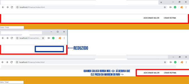
Red borders are to illustrate where CSS is affecting.
I’ve tried to put Position: relative; in the UL us LI, tried to put too Position: Absolute;, but nothing helped, my LI still not redeeming with browser resolution.
Man html code is as follows :
<nav id="menu">
    <ul>
        <li><a href="salario.html">Adicionar Valor</a></li>
        <li><a href="rotina.html">Criar Rotina</a></li>
    </ul>
</nav>
Man css code is this way:
body{
background-color: #e6a017;
margin:0;
padding:0;
}
nav{

background-color: white;
top: -16px;
position: relative;

}

nav a{
text-decoration: none;
color: black;
font-family: Arial;
font-size: 12px;
font-weight: bolder;
}
nav a:hover{
color: white;
}
nav ul{
border: 8px solid red;
list-style: none;
text-transform: uppercase;
right: -980px;
position: relative;
display: block;


}
nav li{

display: inline-block;
padding: 10px;
margin-right: 10px;

}
nav li:hover{
background-color: #e6a017;
transition: 1s;

}
RESOLVED
I swapped the css code line "right: -980px;" of Nav ul{} for "text-align: right;"
Sensational !! It worked here, I’m learning CSS3 still, so there are certain things I don’t master!! Thanks Sam
– Pedro Terencio - Gamer Artist
Good luck, young man!
– Sam