I need to make a shape with css and I can’t. And rotation doesn’t work on IE11

Asked

Viewed 63 times

0

Talk guys, is it okay with you? (I hope and wish you)

I’m starting a new personal project, and I’m getting my ass kicked with two questions:

1 - The set of menus is rotated, while the central logo is stopped and only runs on the function Hover, only unfortunately the menu buttons do not want to run on IE11, tried on Windows 7 and 10. In other browsers is normal.

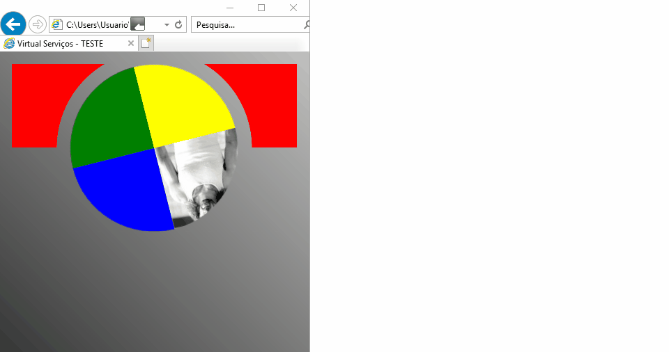
2 - I wanted to make a track at the top without using image, just changing the form of div’s, as usually the staff makes rectangles, in the last case I use png, but I’m preferring only to use div with background. Follow a picture of what I want: Boneca Topo do Site HB1 Virtual

Follows my codes:

@charset "utf-8";

body {
	margin: 0 auto;
	width: 92%;
	max-width: 960px;
	background: url('../images/bg.png');
	background-attachment: fixed;
}
.menutopo {
	width: 100%;
	height: 200px;
	margin: 0 auto;
}
.menu {
	position: relative;
	left: 50%;
	top: 50%;
	width: 240px;
	height: 240px;
	margin-left:-120px;
	margin-top:-120px;
}
.faixas {
	position: relative;
	width: 100%;
	height: 240px;
	background: #BB0F12;
}
.marquee{
	display: block;
	position: fixed;
	overflow: hidden;
	width: 240px;
	height: 240px;
	animation: scroll 10s linear infinite;
	-webkit-animation:spin 20s linear infinite;
    -moz-animation:spin 20s linear infinite;
    animation:spin 20s linear infinite;
	-webkit-animation-direction: reverse; /* Chrome, Safari, Opera */
    animation-direction: reverse;
}
@-moz-keyframes spin { 100% { -moz-transform: rotate(-360deg); } }
@-webkit-keyframes spin { 100% { -webkit-transform: rotate(-360deg); } }
@keyframes spin { 100% { -webkit-transform: rotate(-360deg); transform:rotate(-360deg); } }
.marquee:hover {
    animation-play-state: paused;
}
.menuse {
	position: fixed;
	background: url('../images/botaoprincipal01120.png') no-repeat;
	width: 120px;
	height: 120px;
}
.menuse:hover {
	background: url('../images/botaoprincipal01hover120.png') no-repeat;
}
.menusd {
	position: fixed;
	margin-left: 120px;
	background: url('../images/botaoprincipal02120.png') no-repeat;
	width: 120px;
	height: 120px;
}
.menusd:hover {
	background: url('../images/botaoprincipal02hover120.png') no-repeat;
}
.menuie {
	margin-top: 120px;
	position: fixed;
	background: url('../images/botaoprincipal03120.png') no-repeat;
	width: 120px;
	height: 120px;
}
.menuie:hover {
	background: url('../images/botaoprincipal03hover120.png') no-repeat;
}
.menuid {
	position: fixed;
	margin-top: 120px;
	margin-left: 120px;
	background: url('../images/botaoprincipal04120.png') no-repeat;
	width: 120px;
	height: 120px;
}
.menuid:hover {
	background: url('../images/botaoprincipal04hover120.png') no-repeat;
}
.menulogo {
	float: none;
	position: fixed;
	width: 160px;
	height: 160px;
	margin-top: 40px;
	margin-left: 40px;
	border-radius: 50%;
	background: url('../images/logoprincipal160.png') no-repeat;
	transition: 0.70s;
  -webkit-transition: 0.70s;
  -moz-transition: 0.70s;
  -ms-transition: 0.70s;
  -o-transition: 0.70s;
}
.menulogo:hover {
	transition: 0.70s;
  -webkit-transition: 0.70s;
  -moz-transition: 0.70s;
  -ms-transition: 0.70s;
  -o-transition: 0.70s;
  -webkit-transform: rotate(360deg);
  -moz-transform: rotate(360deg);
  -o-transform: rotate(360deg);
  -ms-transform: rotate(360deg);
  transform: rotate(360deg);
}
.clear { clear: both; }
.lateralesquerda {
	position: absolute;
	float: left;
	color: white;
	background-color: black;
	width: 150px;
	margin-top: 150px;
	border: solid;
}
.lateraldireita {
	position: relative;
	float: right;
	color: white;
	background-color: black;
	width: 150px;
	margin-top: 150px;
	border: solid;
}

.banner {
	width: 600px;
	color: white;
	float:right;
	position:fixed;
	text-align: center;
}
<!doctype html>
<html lang="pt-BR">
<head>
<meta charset="utf-8">
<meta name="viewport" content="width=device-width, initial-scale=1">
<title>Virtual Serviços - TESTE</title>
<link rel="apple-touch-icon" href="images/favicon.png" />
<link rel="SHORTCUT ICON" href="images/favicon.ico"/>
<link href="css/graf.css" rel="stylesheet" type="text/css">
</head>
<body>
<br>
<div class="menutopo">
	<div class="faixas">
		<div class="menu">
			<div class="marquee">
				<a href="../index.html"><div class="menuse"></div></a>
				<a href="../index.html"><div class="menusd"></div></a>
				<a href="../index.html"><div class="menuie"></div></a>
				<a href="../index.html"><div class="menuid"></div></a>
			</div> <!--marquee-->
			<a href="../index.html"><div class="menulogo"></div></a>
		</div>
	</div> <!--menu-->
</div> <!--menutopo-->
</body>
</html>

If you want, I left a RAR file to download, if necessary, in my domain: Files to download

  • Cara gave a completely edited answer, I think now solves all the points. Any doubt says there that I give you a help in what you need.

1 answer

0

EDIT: I preferred to reformulate the answer completely after analyzing the direct code in the link quoted in the question

Looking at the code, I noticed some errors. First your @keyframes was a problem of seeing prefix you put -webkt- inside a @keyfremes that should not have it

@keyframes spin { 100% { -webkit-transform: rotate(-360deg); transform:rotate(-360deg); } }

Then it looks like IE couldn’t rotate the element that has position: fixed; then altered by position: absolute; and was perfect without problems with animation or positioning.

After that it was the turn to do the track at the top. To make used a radial-gradient with the color of the transparent medium, and fixed value of "radius" to not have problems in smaller screens.

See the image running on IE11 :D

inserir a descrição da imagem aqui

Follow the result for the image above:

OBS: I didn’t touch anything in HTML

@charset "utf-8";

body {
	margin: 0 auto;
	width: 92%;
	max-width: 960px;
	/* background: url('../images/bg.png'); */
    background: linear-gradient(45deg, black, silver);
	background-attachment: fixed;
}
.menutopo {
	width: 100%;
	height: 200px;
	margin: 0 auto;
}
.menu {
	position: relative;
	left: 50%;
	top: 50%;
	width: 240px;
	height: 240px;
	margin-left:-120px;
	margin-top:-120px;
}
.faixas {
	position: relative;
	width: 100%;
	height: 240px;
	/* background: #BB0F12; */
  overflow: hidden;
}
.faixas::after {
  content: "";
  position: absolute;
  top: 0;
  left: 0;
  width: 100%;
  height: 120px;
  background-image: radial-gradient(circle at center 100%, transparent 140px, red 140px);
}
.marquee{
	display: block;
	/* position: fixed; */
  border-radius: 50%;
	overflow: hidden;
	width: 240px;
	height: 240px;
	animation: scroll 10s linear infinite;
	-webkit-animation:spin 20s linear infinite;
    -moz-animation:spin 20s linear infinite;
    animation:spin 20s linear infinite;
	-webkit-animation-direction: reverse; /* Chrome, Safari, Opera */
    animation-direction: reverse;
}
@-moz-keyframes spin { 100% { -moz-transform: rotate(-360deg); } }
@-webkit-keyframes spin { 100% { -webkit-transform: rotate(-360deg); } }
@keyframes spin { 100% { transform:rotate(-360deg); } }
.marquee:hover {
    animation-play-state: paused;
}
.menuse {
	position: absolute;
	background: url(https://placecage.com/120/120) no-repeat;
	width: 120px;
	height: 120px;
}
.menuse:hover {
	background: url('../images/botaoprincipal01hover120.png') no-repeat;
}
.menusd {
	position: absolute;
	margin-left: 120px;
	background: blue;
	width: 120px;
	height: 120px;
}
.menusd:hover {
	background: url('../images/botaoprincipal02hover120.png') no-repeat;
}
.menuie {
	margin-top: 120px;
	position: absolute;
	background: yellow;
	width: 120px;
	height: 120px;
}
.menuie:hover {
	background: url('../images/botaoprincipal03hover120.png') no-repeat;
}
.menuid {
	position: absolute;
	margin-top: 120px;
	margin-left: 120px;
	background: green;
	width: 120px;
	height: 120px;
}
.menuid:hover {
	background: url('../images/botaoprincipal04hover120.png') no-repeat;
}
.menulogo {
	float: none;
	position: fixed;
	width: 160px;
	height: 160px;
	margin-top: 40px;
	margin-left: 40px;
	border-radius: 50%;
	background: url('../images/logoprincipal160.png') no-repeat;
	transition: 0.70s;
  -webkit-transition: 0.70s;
  -moz-transition: 0.70s;
  -ms-transition: 0.70s;
  -o-transition: 0.70s;
}
.menulogo:hover {
	transition: 0.70s;
  -webkit-transition: 0.70s;
  -moz-transition: 0.70s;
  -ms-transition: 0.70s;
  -o-transition: 0.70s;
  -webkit-transform: rotate(360deg);
  -moz-transform: rotate(360deg);
  -o-transform: rotate(360deg);
  -ms-transform: rotate(360deg);
  transform: rotate(360deg);
}
.clear { clear: both; }
.lateralesquerda {
	position: absolute;
	float: left;
	color: white;
	background-color: black;
	width: 150px;
	margin-top: 150px;
	border: solid;
}
.lateraldireita {
	position: relative;
	float: right;
	color: white;
	background-color: black;
	width: 150px;
	margin-top: 150px;
	border: solid;
}

.banner {
	width: 600px;
	color: white;
	float:right;
	position:fixed;
	text-align: center;
}
<div class="menutopo">
	<div class="faixas">
		<div class="menu">
			<div class="marquee">
				<a href="../index.html"><div class="menuse"></div></a>
				<a href="../index.html"><div class="menusd"></div></a>
				<a href="../index.html"><div class="menuie"></div></a>
				<a href="../index.html"><div class="menuid"></div></a>
			</div> <!--marquee-->
			<a href="../index.html"><div class="menulogo"></div></a>
		</div>
	</div> <!--menu-->
</div> <!--menutopo-->

Browser other questions tagged

You are not signed in. Login or sign up in order to post.