1
How to make the sliding fixed menu with scrolling as the site:
https://bootstrapmade.com/demo/BizPage/
Note that when you scroll down the menu background changes to black.
1
How to make the sliding fixed menu with scrolling as the site:
https://bootstrapmade.com/demo/BizPage/
Note that when you scroll down the menu background changes to black.
2
With a simple jQuery you do it. In this example when the person scrolls the 40px screen I will put a class .ativo in Navbar with id menu. When he rolls back I withdraw the class .ativo.
Take the example to understand better. I used Bootstrap 4 since you put the Bootstrap tag, but it works in any code as long as you have jQuery like Bootstrap
The only CSS it includes was to style the nav to look like the example.
OBS: I left comments in the code to facilitate understanding
$(window).scroll(function() {
var scroll = $(window).scrollTop();
  if (scroll >= 40) {               // se rolar 40px ativa o evento
    $("#menu").addClass("ativo");    //coloca a classe "ativo" no id=menu
  } else {
    $("#menu").removeClass("ativo"); //se for menor que 40px retira a classe "ativo" do id=menu
  }
});
body {
min-height: 75rem;
padding-top: 7.5rem;
background-image: url(https://unsplash.it/400/200?image=6);
background-size: cover;
background-position: center;
margin: 0;
}
#menu {
background-color: rgba(0,0,0,0.2) !important;
padding: 1.5rem 1rem;
transition: all 500ms linear;
}
#menu.ativo {
background-color: rgba(0,0,0,0.8) !important;
padding: .5rem 1rem;
}<link rel="stylesheet" type="text/css" media="screen" href="https://maxcdn.bootstrapcdn.com/bootstrap/4.0.0/css/bootstrap.min.css" />
<script src="https://code.jquery.com/jquery-3.2.1.min.js"></script>
<script src="https://cdnjs.cloudflare.com/ajax/libs/popper.js/1.12.9/umd/popper.min.js"></script>
<script src="https://maxcdn.bootstrapcdn.com/bootstrap/4.0.0/js/bootstrap.min.js"></script>
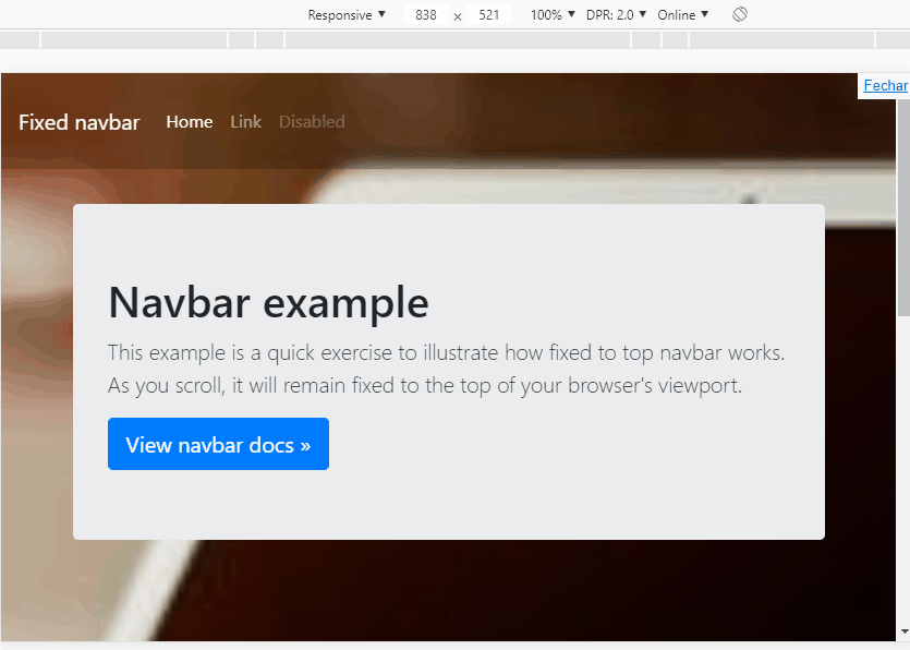
<nav id="menu" class="navbar navbar-expand-md navbar-dark fixed-top bg-dark">
<a class="navbar-brand" href="#">Fixed navbar</a>
<button class="navbar-toggler collapsed" type="button" data-toggle="collapse" data-target="#navbarCollapse"
aria-controls="navbarCollapse" aria-expanded="false" aria-label="Toggle navigation">
<span class="navbar-toggler-icon"></span>
</button>
<div class="navbar-collapse collapse" id="navbarCollapse">
<ul class="navbar-nav mr-auto">
<li class="nav-item active">
<a class="nav-link" href="#">Home <span class="sr-only">(current)</span></a>
</li>
<li class="nav-item">
<a class="nav-link" href="#">Link</a>
</li>
<li class="nav-item">
<a class="nav-link disabled" href="#">Disabled</a>
</li>
</ul>
</div>
</nav>
<main role="main" class="container">
<div class="jumbotron">
<h1>Navbar example</h1>
<p class="lead">This example is a quick exercise to illustrate how fixed to top navbar works. As you
scroll, it will remain fixed to the top of your browser's viewport.</p>
<a class="btn btn-lg btn-primary" href="../../components/navbar/" role="button">View navbar docs »</a>
</div>
</main>Browser other questions tagged html css twitter-bootstrap
You are not signed in. Login or sign up in order to post.